
ReelFruit
Brief
ReelFruit is a snack company. A first-of-its-kind in Nigeria, that offers dried fruit snacks made in Nigeria and sold to the world. They have a range of over 10 SKUs retailed in over 250 stores nationwide and have their snacks served on local and international airlines, schools, hotels, and restaurants.
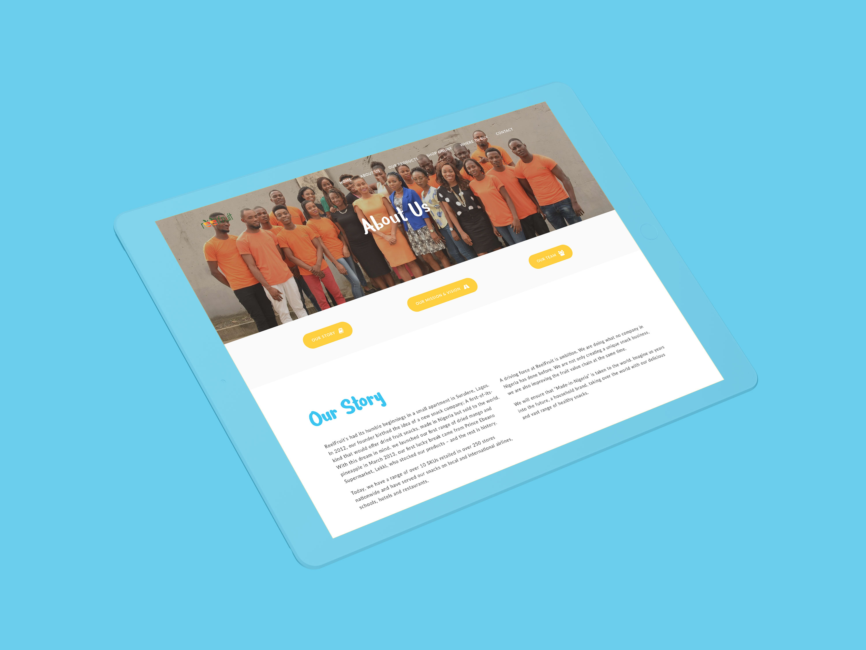
With expanding product offerings, as well as more stores stocking their products, they needed a new website that showcased their products, as well as what they are about as a company, and where to buy their products both offline and online. They needed a site to bridge all these requirements in a manner that was effective, simple, and beautiful.
Client
ReelFruit
Sector
Food
Office
Lagos
Discipline
Web Design
#twentytwenty-Odwa8D {
width: 100%;
max-width: 100%;
}
#twentytwenty-Odwa8D.twentytwenty-hover .twentytwenty-overlay:hover {
background: rgba(0,0,0, 0.5);
}
#twentytwenty-Odwa8D .twentytwenty-before-label:before,
#twentytwenty-Odwa8D .twentytwenty-after-label:before {
background: rgba(255,255,255, 0.3);
}
#twentytwenty-Odwa8D .twentytwenty-before-label:before {
content: “Before”;
}
#twentytwenty-Odwa8D .twentytwenty-after-label:before {
content: “After”;
}
#twentytwenty-Odwa8D .twentytwenty-horizontal .twentytwenty-handle:before,
#twentytwenty-Odwa8D .twentytwenty-horizontal .twentytwenty-handle:after,
#twentytwenty-Odwa8D .twentytwenty-vertical .twentytwenty-handle:before,
#twentytwenty-Odwa8D .twentytwenty-vertical .twentytwenty-handle:after {
background: #ffffff;
}
#twentytwenty-Odwa8D .twentytwenty-before-label:before,
#twentytwenty-Odwa8D .twentytwenty-after-label:before {
color: #ffffff;
}
#twentytwenty-Odwa8D .twentytwenty-handle {
border: 3px solid #ffffff;
}
#twentytwenty-Odwa8D .twentytwenty-horizontal .twentytwenty-handle:before {
-webkit-box-shadow: 0 3px 0 #ffffff, 0px 0px 12px rgba(51, 51, 51, 0.5);
-moz-box-shadow: 0 3px 0 #ffffff, 0px 0px 12px rgba(51, 51, 51, 0.5);
box-shadow: 0 3px 0 #ffffff, 0px 0px 12px rgba(51, 51, 51, 0.5);
}
#twentytwenty-Odwa8D .twentytwenty-horizontal .twentytwenty-handle:after {
-webkit-box-shadow: 0 -3px 0 #ffffff, 0px 0px 12px rgba(51, 51, 51, 0.5);
-moz-box-shadow: 0 -3px 0 #ffffff, 0px 0px 12px rgba(51, 51, 51, 0.5);
box-shadow: 0 -3px 0 #ffffff, 0px 0px 12px rgba(51, 51, 51, 0.5);
}
#twentytwenty-Odwa8D .twentytwenty-vertical .twentytwenty-handle:before {
-webkit-box-shadow: 3px 0 0 #ffffff, 0px 0px 12px rgba(51, 51, 51, 0.5);
-moz-box-shadow: 3px 0 0 #ffffff, 0px 0px 12px rgba(51, 51, 51, 0.5);
box-shadow: 3px 0 0 #ffffff, 0px 0px 12px rgba(51, 51, 51, 0.5);
}
#twentytwenty-Odwa8D .twentytwenty-vertical .twentytwenty-handle:after {
-webkit-box-shadow: -3px 0 0 #ffffff, 0px 0px 12px rgba(51, 51, 51, 0.5);
-moz-box-shadow: -3px 0 0 #ffffff, 0px 0px 12px rgba(51, 51, 51, 0.5);
box-shadow: -3px 0 0 #ffffff, 0px 0px 12px rgba(51, 51, 51, 0.5);
}
#twentytwenty-Odwa8D .twentytwenty-left-arrow {
border-right: 6px solid #ffffff;
}
#twentytwenty-Odwa8D .twentytwenty-right-arrow {
border-left: 6px solid #ffffff;
}
#twentytwenty-Odwa8D .twentytwenty-up-arrow {
border-bottom: 6px solid #ffffff;
}
#twentytwenty-Odwa8D .twentytwenty-down-arrow {
border-top: 6px solid #ffffff;
}
Before & After
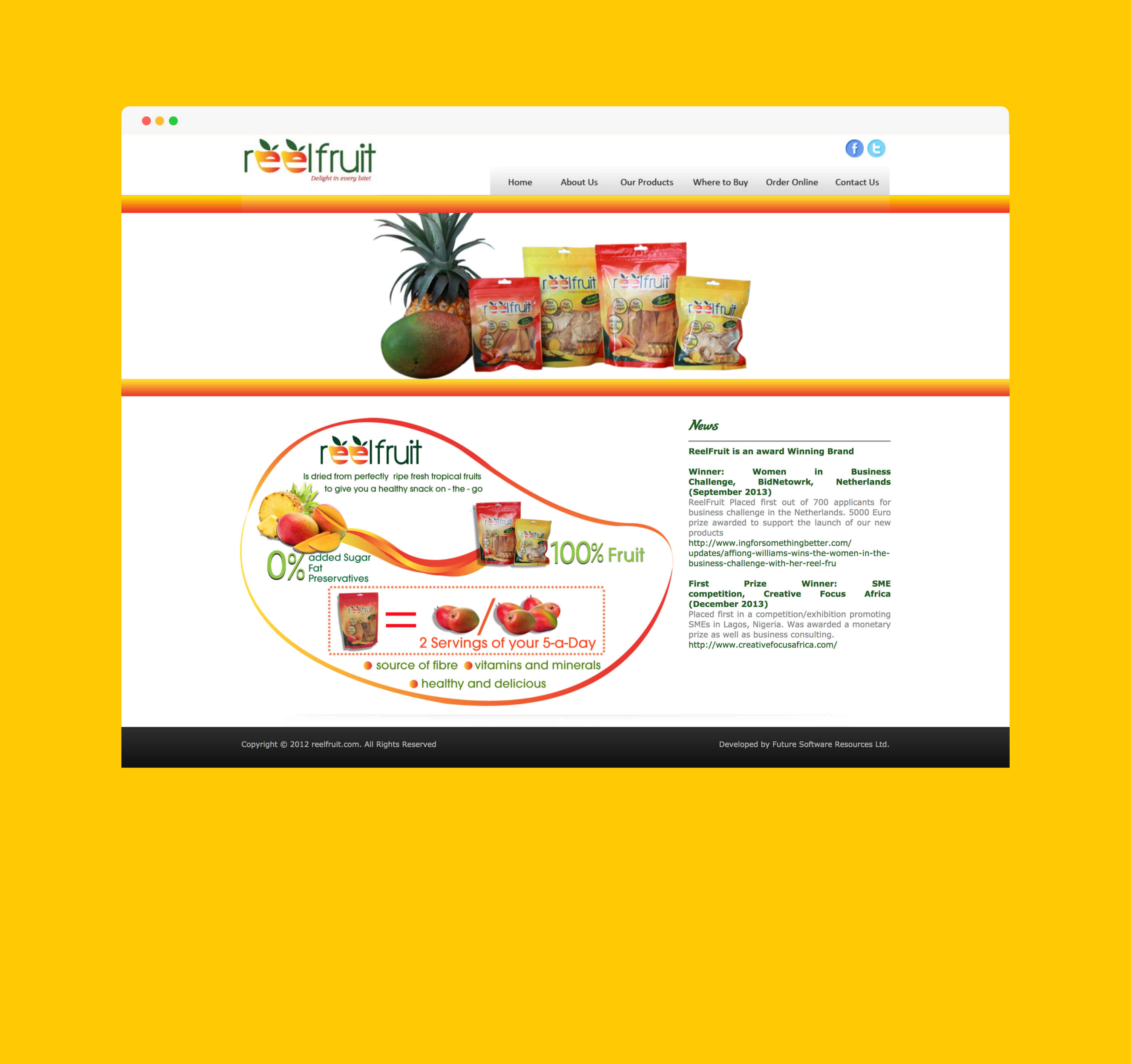
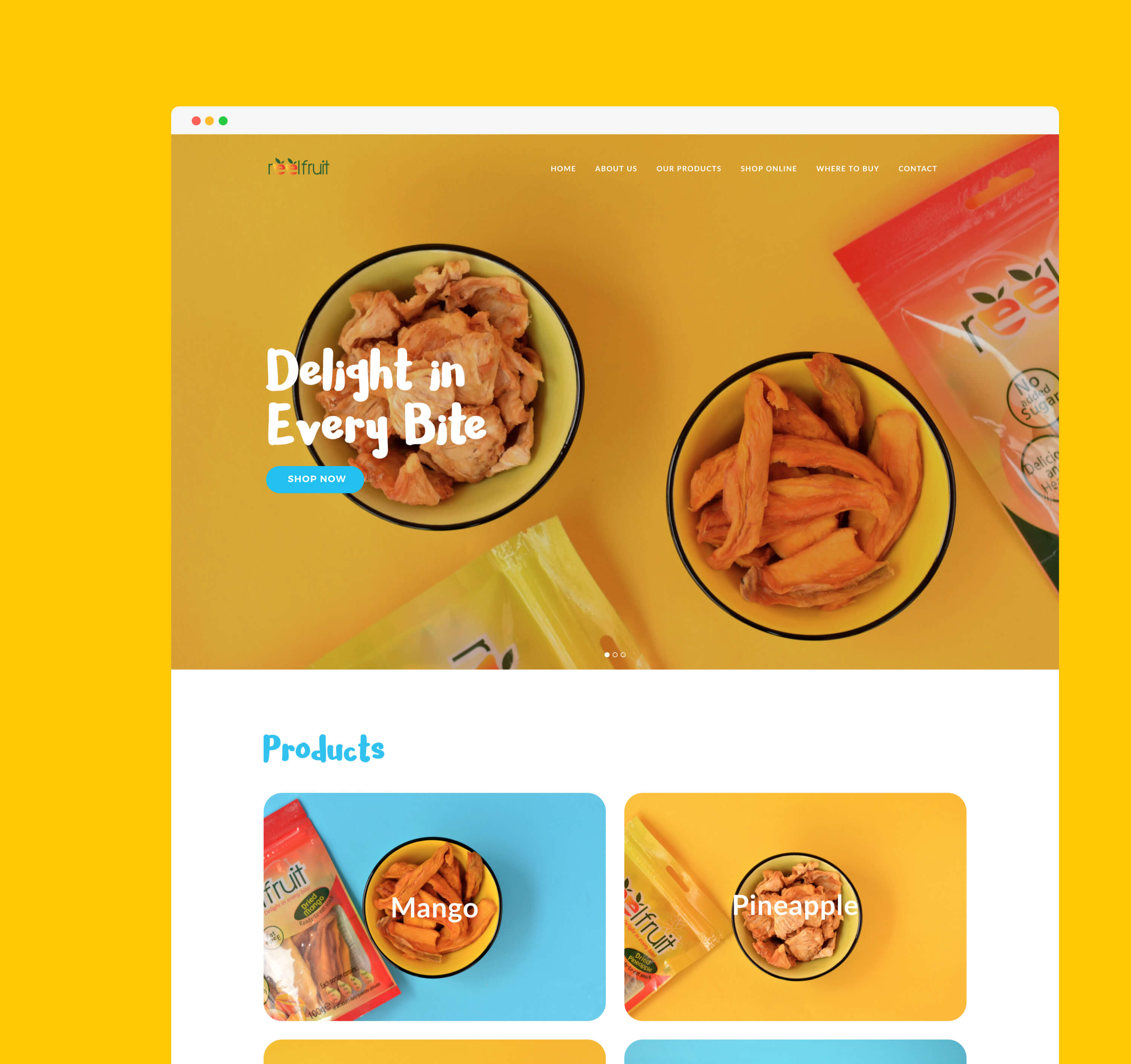
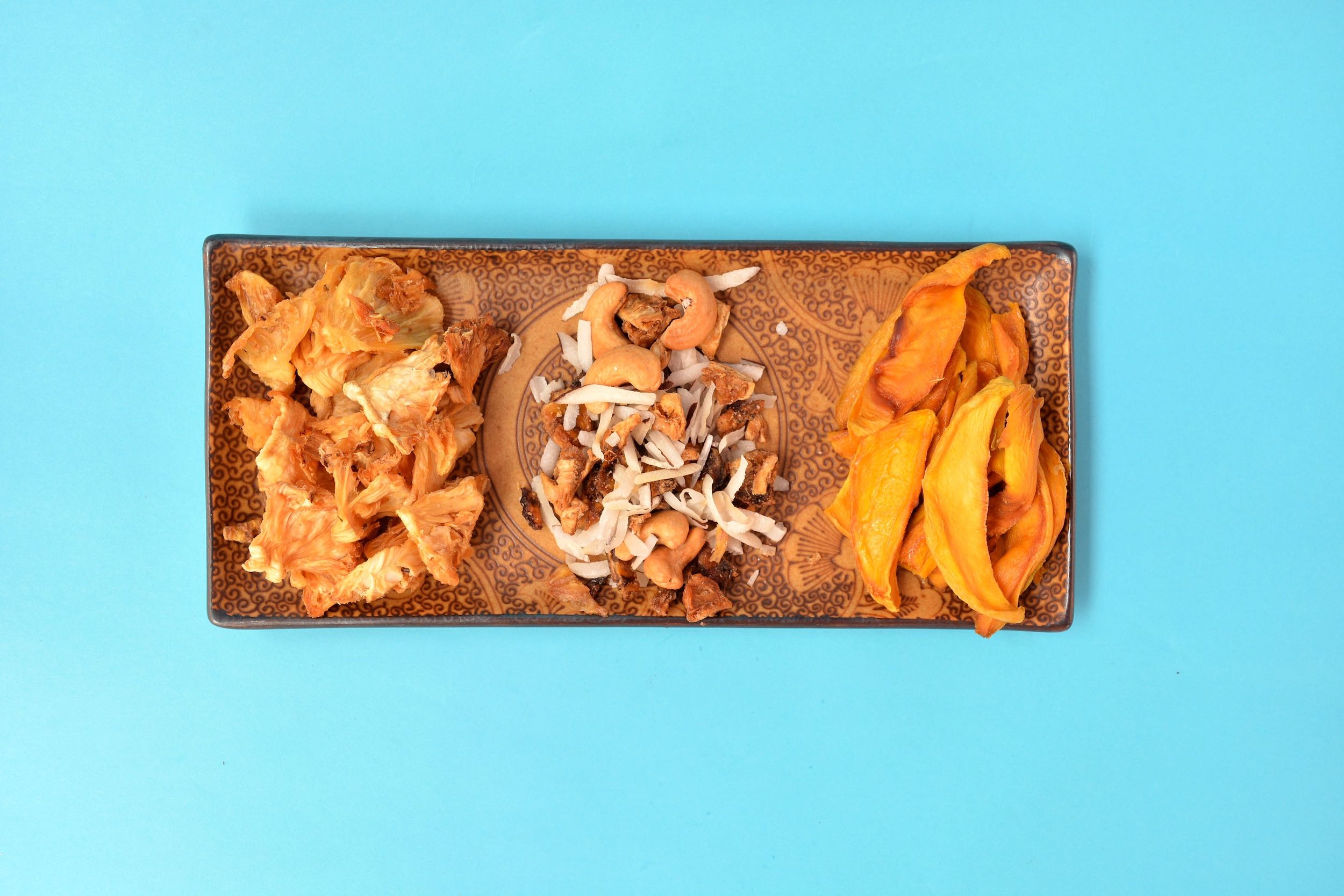
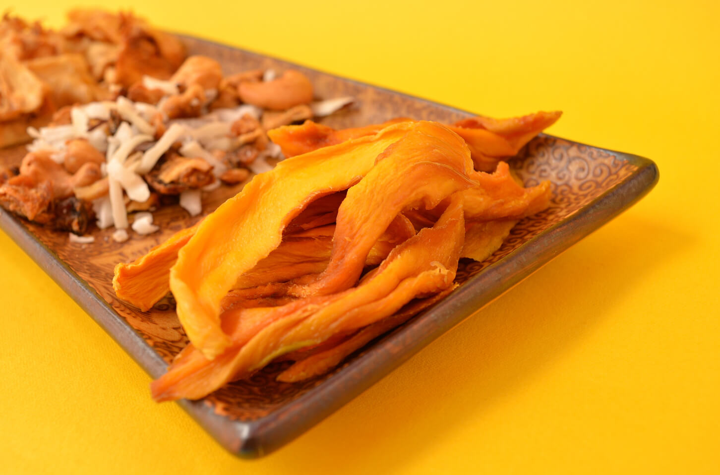
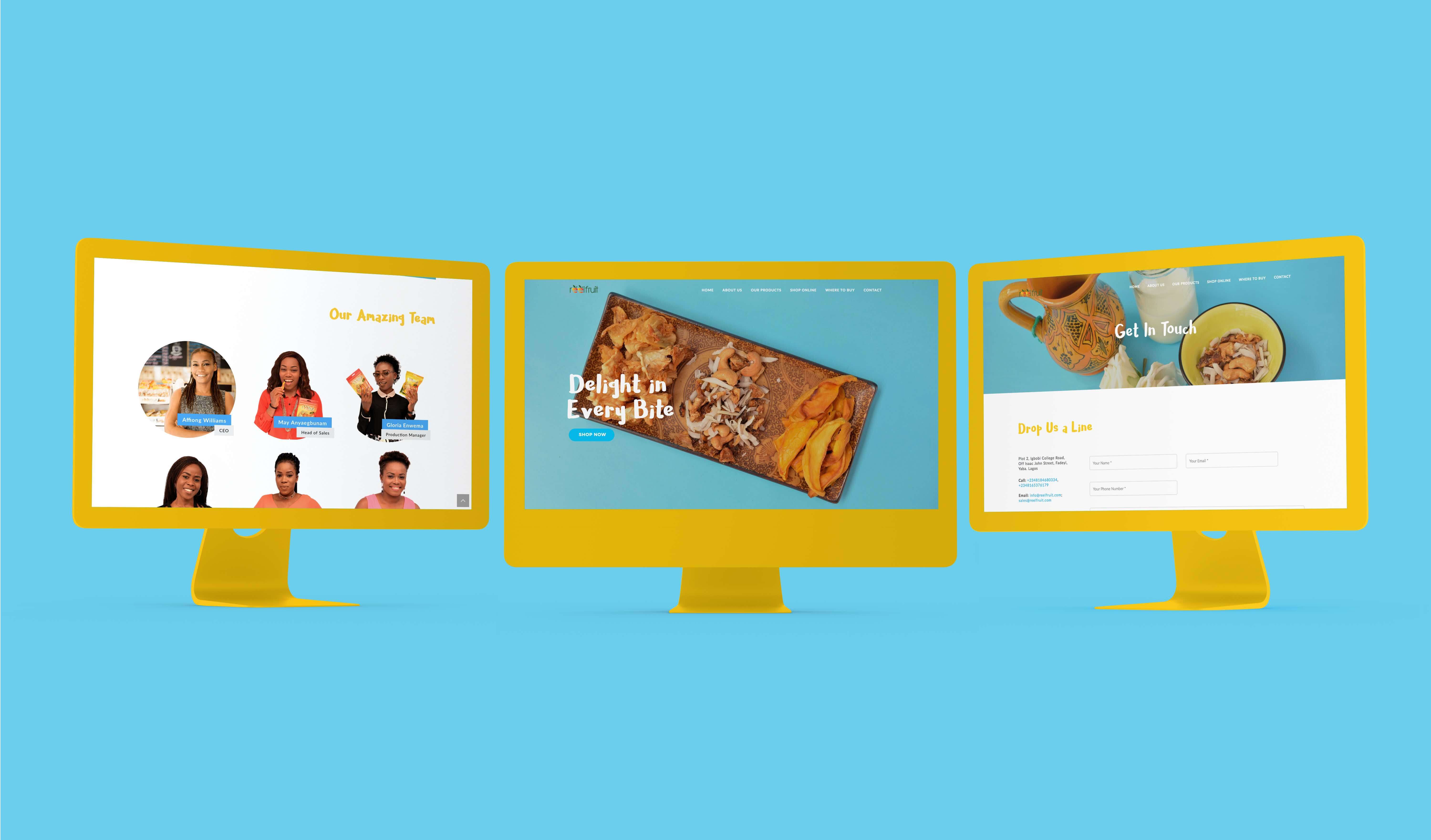
The previous website was…well…you can see for yourself by swiping the toggle above. 😅 Fortunately, it has been replaced by a new site with a better structure and vivid imagery taken by Urbane Aries that puts the content first. On opening the site, you’re immediately acquainted with the products as well as their contents. Both are shown in an aesthetically pleasing manner that visually lets you in on the natural, healthy, and nutritious quality of the products. Clicking on the products shows you the ingredients of the desired product, letting you confirm its natural and healthy content.
Inspiration
We went content first, and by content first, we mean actual content of ReelFruit’s product first. At Akanka, we have always been big fans of ReelFruit. Buying ReelFruit’s products on a weekly basis meant we were pretty intimate with their characteristics before this project began. We used this knowledge to inspire our decisions, creating a site that is vivid and exuberant, while also minimalist.
Typography
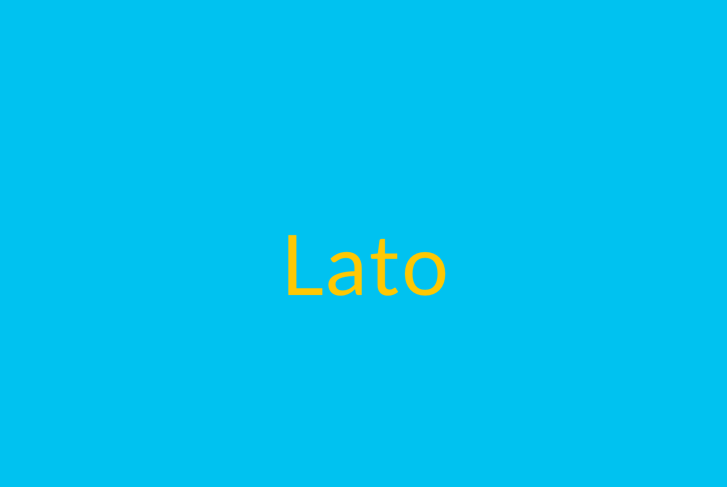
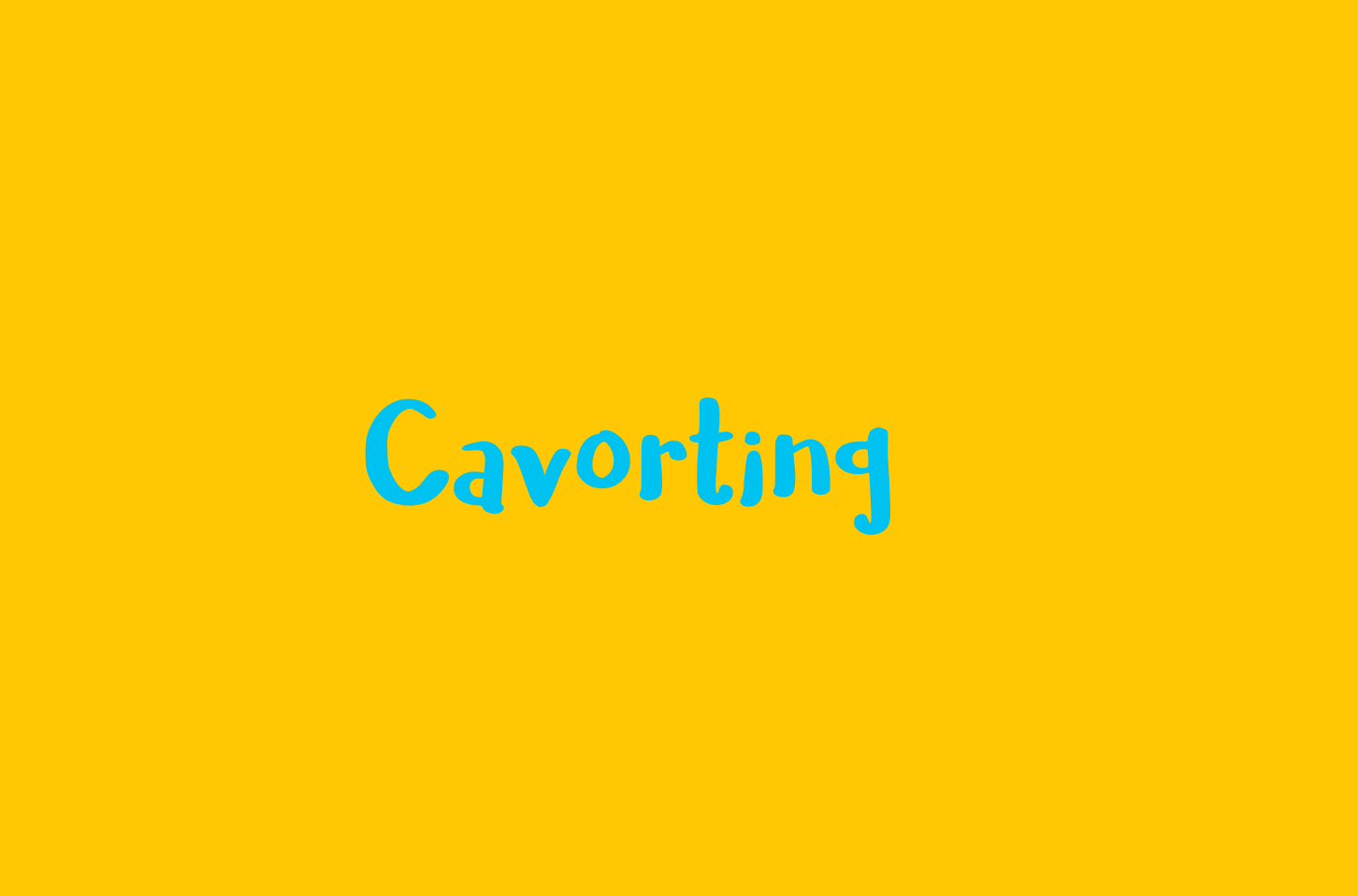
We worked with two typefaces: Cavorting and Lato. These choices were entirely inspired by the content of the ReelFruit products, particularly the textures of the products.
Secondary
We chose cavorting as our secondary font, i.e. the font for our headers. It is a script or handwritten font that has incredibly irregular strokes and narrow apertures and an irregular x-height. These features give it a lot of weight as a header.
Most importantly, as a handwritten typeface, it is natural, with a squishy appearance that resonates closely with the softer contents of ReelFruit’s products like the mango strips.
Color
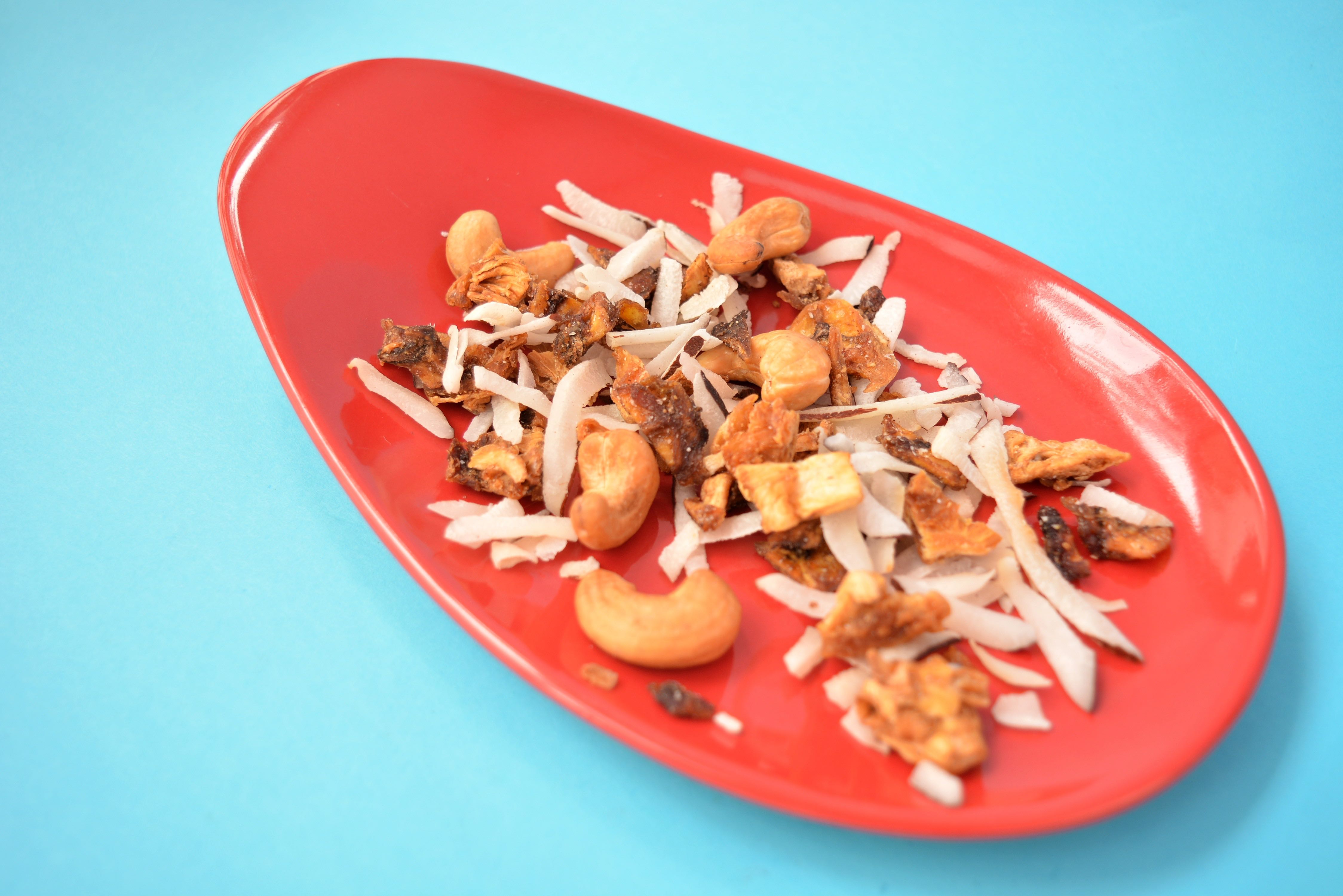
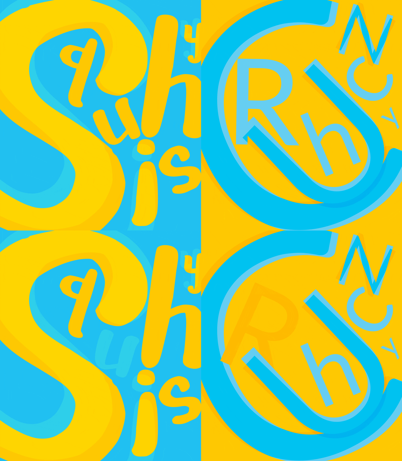
Our color choices also take their cue from the content. The yellow signifies the squishy products, as it captures the color of the juices trapped within them. The blue, chosen to contrast against the yellow, signifies the crunchy products because of their rough harder feel.
Mobile
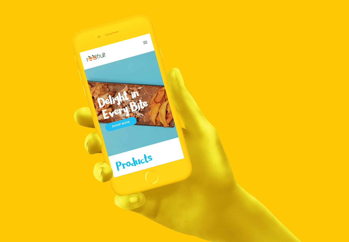
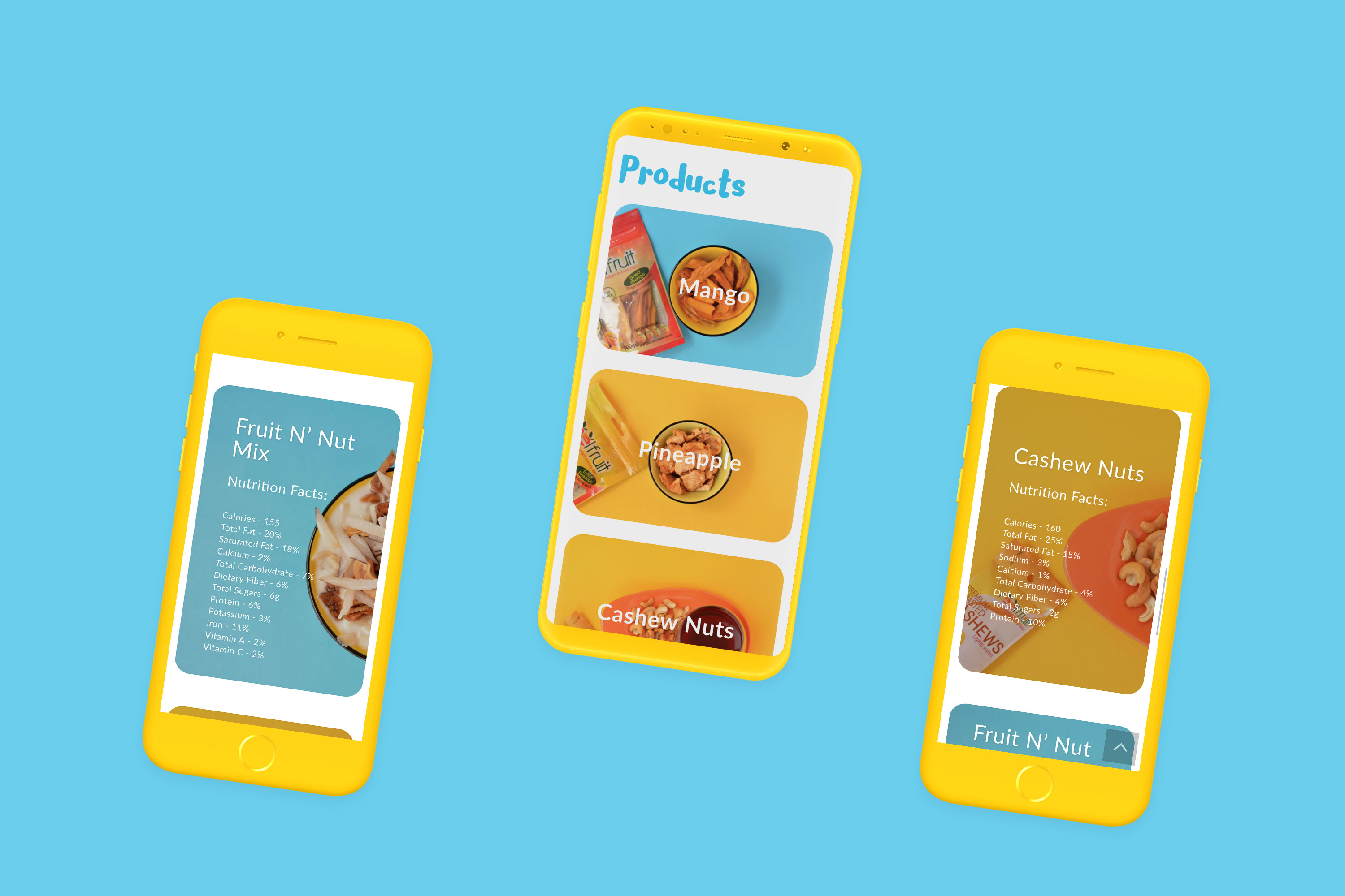
By making use of the soft card-like UI for the products and prioritising mobile responsiveness, we ensured that visitors can easily take in the information about the products with a simple swipe.
Round Up
As consumers of the ReelFruit products, starting this project from a user-centered position resulted in a website that acts as a beautiful showcase for ReelFruit’s products while also providing the necessary information in a clearer and presentable manner. Enough of the talk, go check out the live site here. 😄
More Case Studies
Akanka 3.0
Welcome to our latest version