
Brighton Property Development
Brief
Brighton Property Development (BPD) is a property development company that builds, masterplans, and develops high-quality properties in Nigeria. They are equipped to handle developments that include residential, commercial, retail and industrial properties.
The goal of the identity design was to create a minimalist identity that captured the goal of the BPD in a manner that was consistently applicable across all its communications.
Client
Brighton Property Development
Sector
Real Estate
Office
Abuja
Discipline
Brand Identity
Inspiration
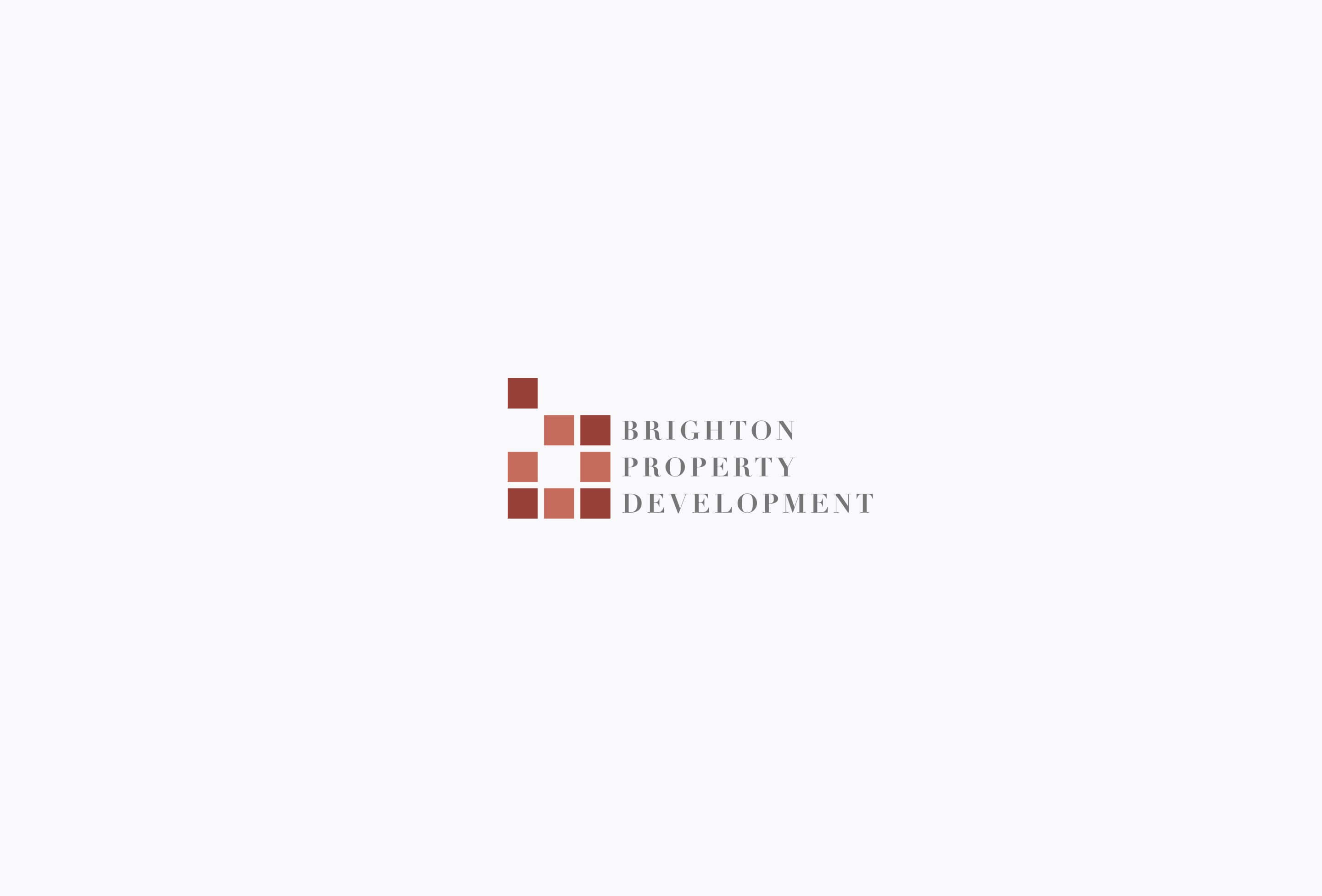
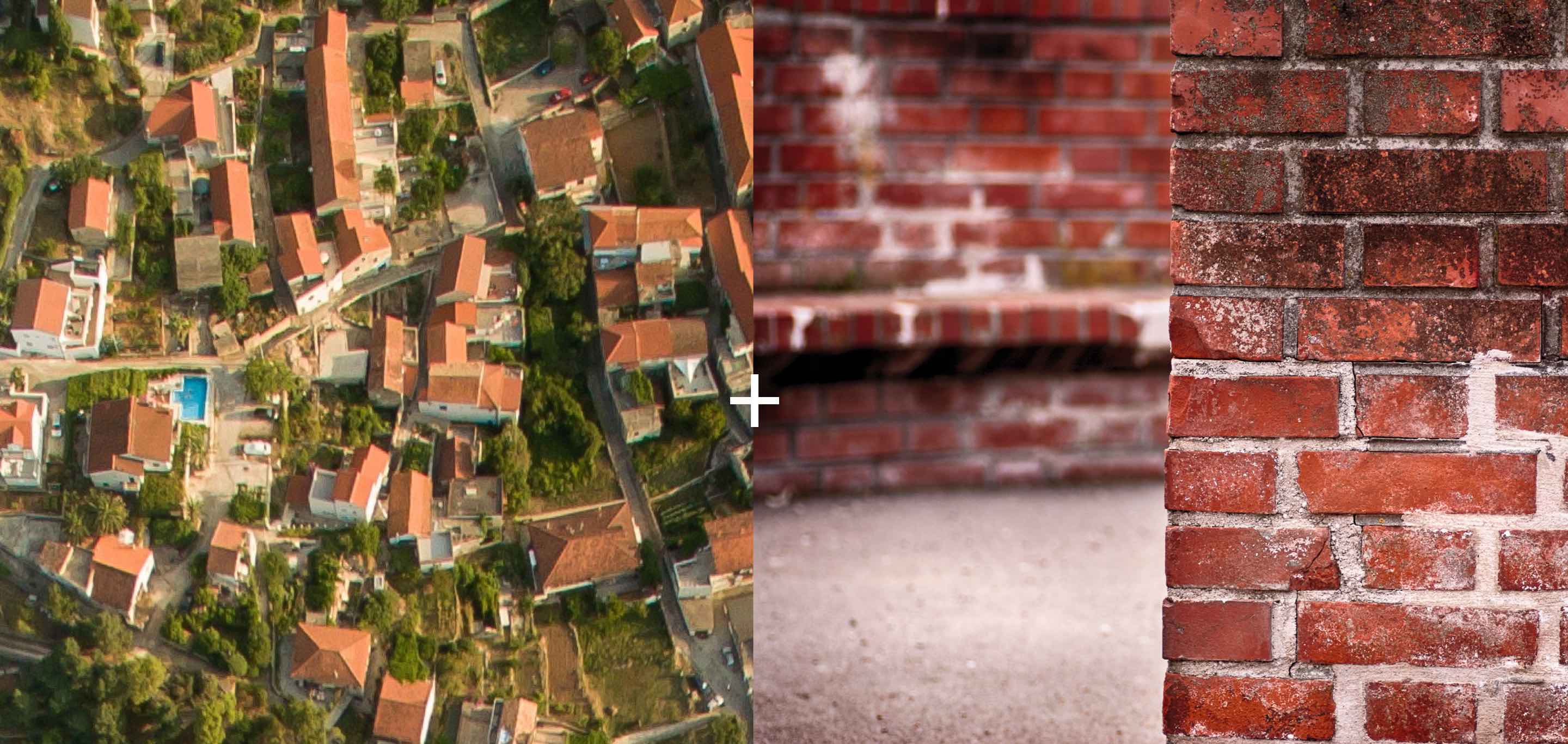
In order to create this mark, we took inspiration from the aerial view of buildings in a grid as well as the interlocking bricks in a brick wall. Both of these have a direct reference to building and represent it from two different perspectives. There is a necessary and balanced contrast in their perspective, with the aerial view offering a holistic view that’s more technical, while the brick wall offers a more personal, close and intimate view in a category of business where the synchronicity of the two is essential.
Secondary inspiration for Mark & Animation
The mark also represents the acronym of the letters B, P, and D in differing orientations. This expresses its versatility, as well as the adaptability of the company to any situation.

Color
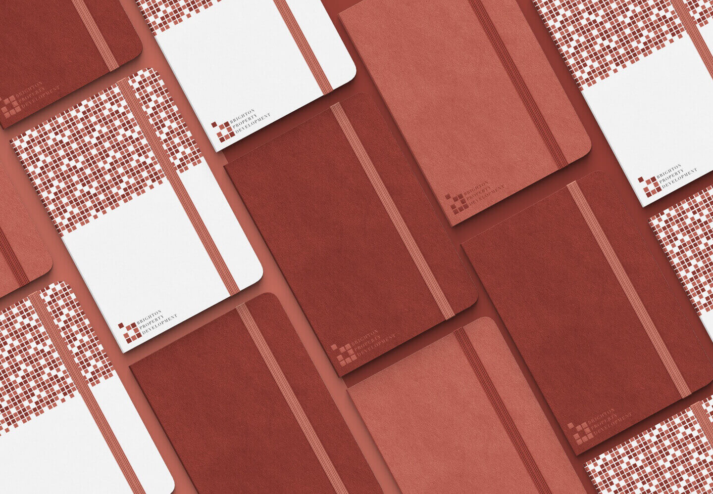
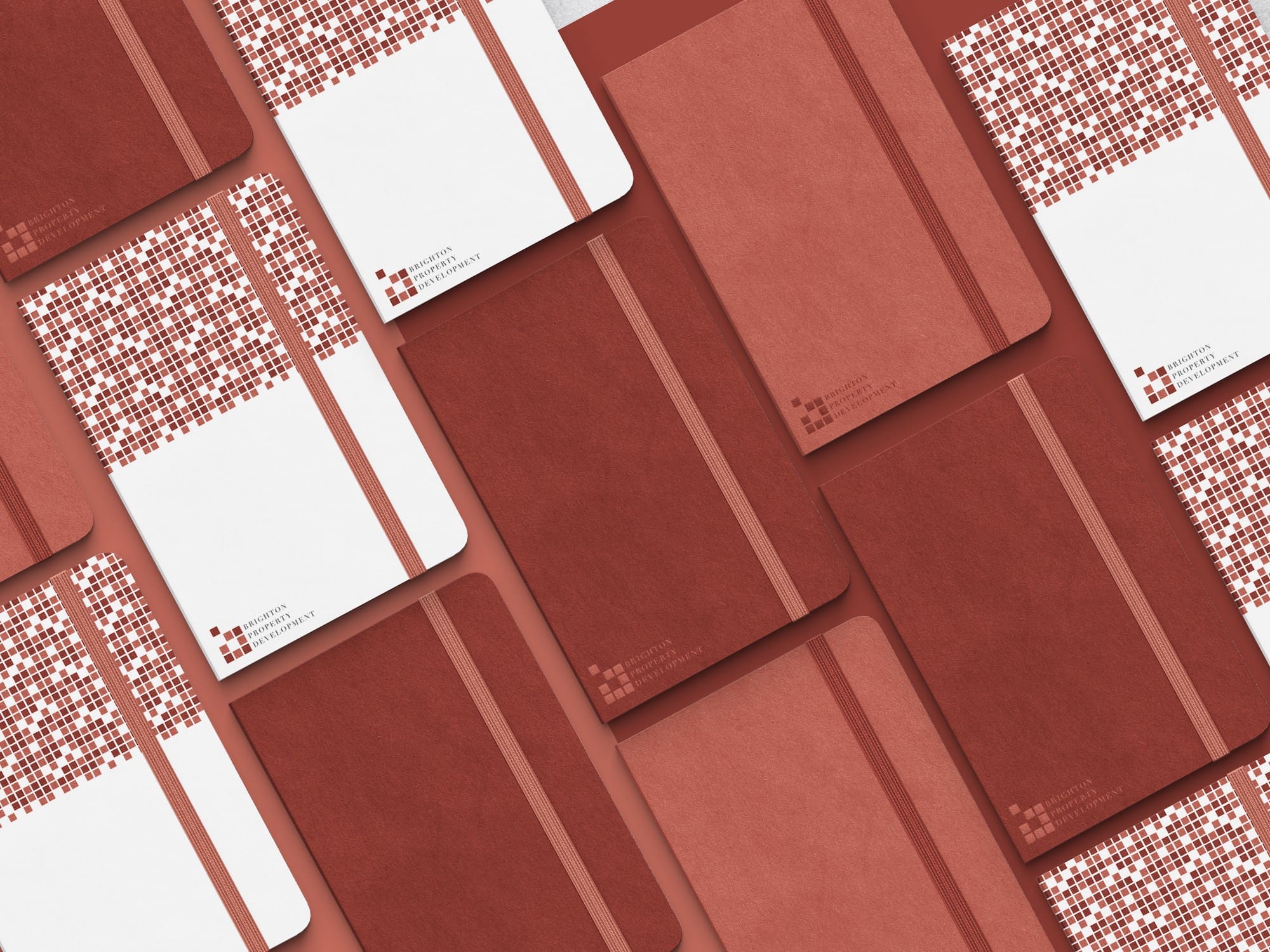
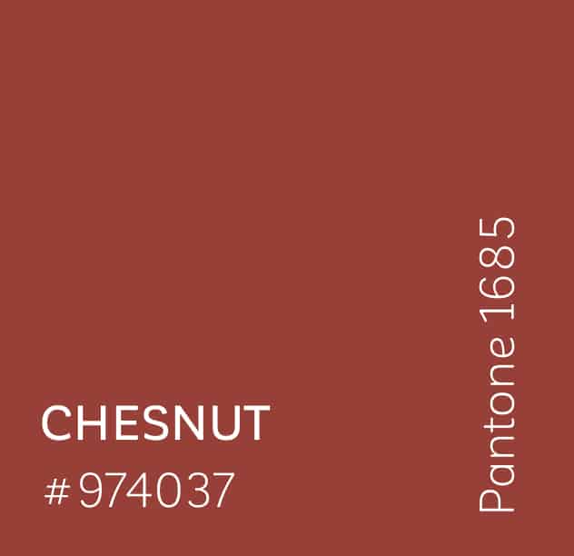
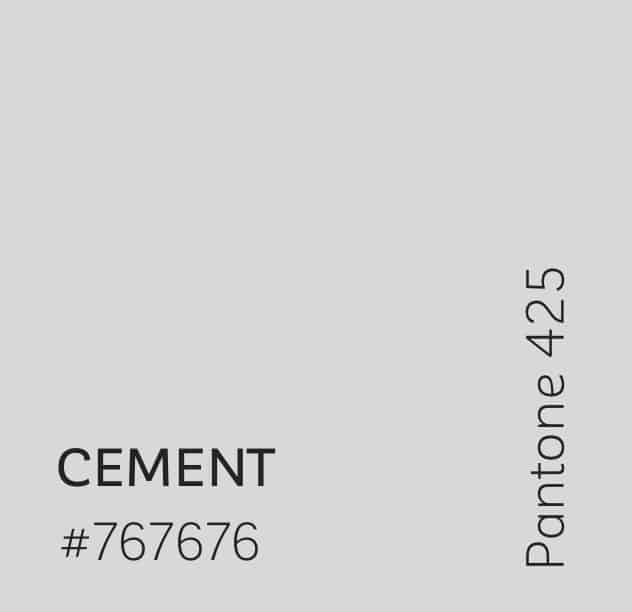
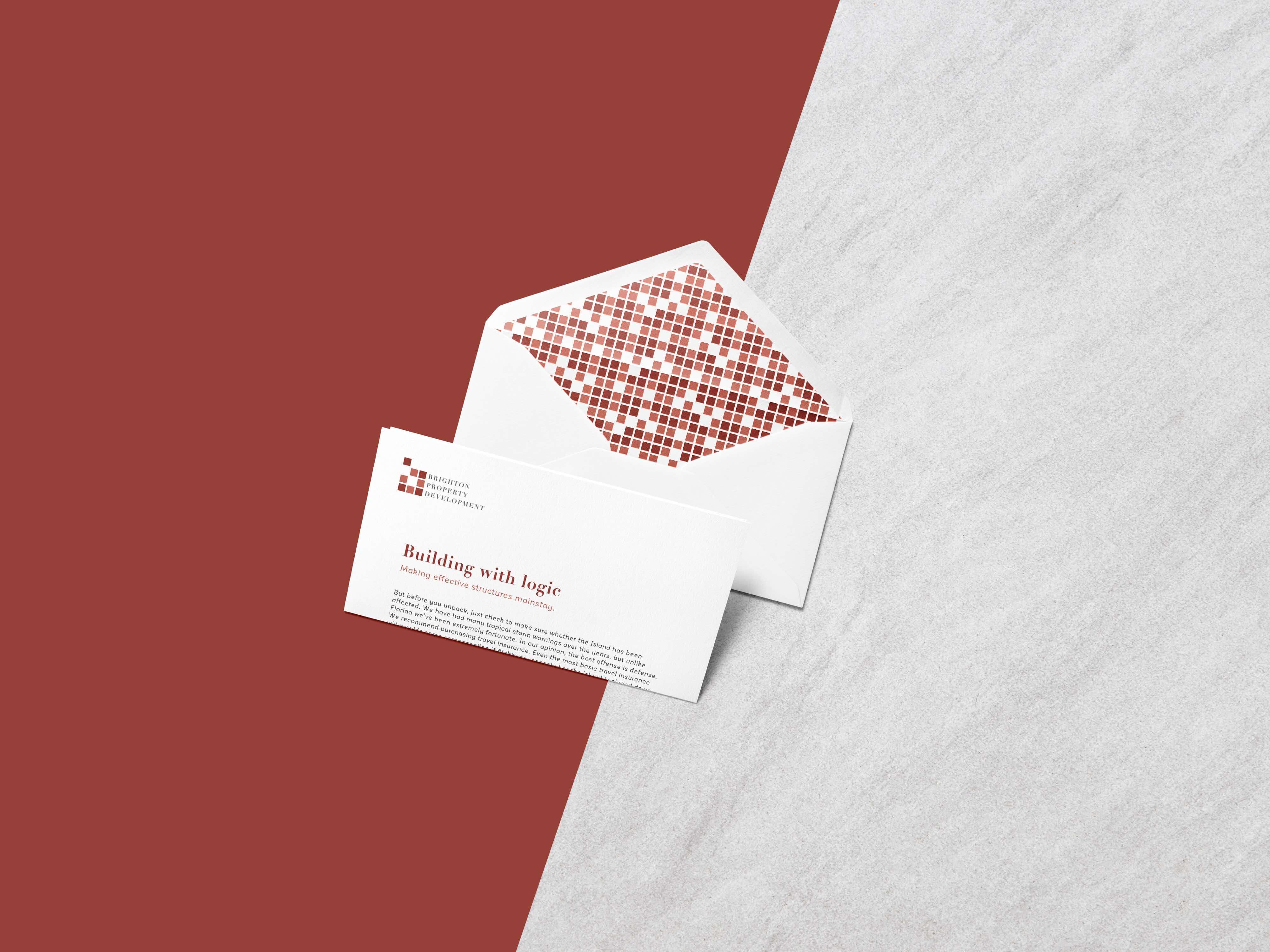
We chose a muted color palette that took its primary color inspiration from a brick wall, a chestnut seed; and its secondary color inspiration from cement. These were carefully fine-tuned to compliment each other. Allowing both co-exist interchangeably as background and object. This allows for vast use in the visual identity’s application across company assets. Our placing it with white as a secondary color creates an effective contrast that helps balance the palette.
Logotype – Typography
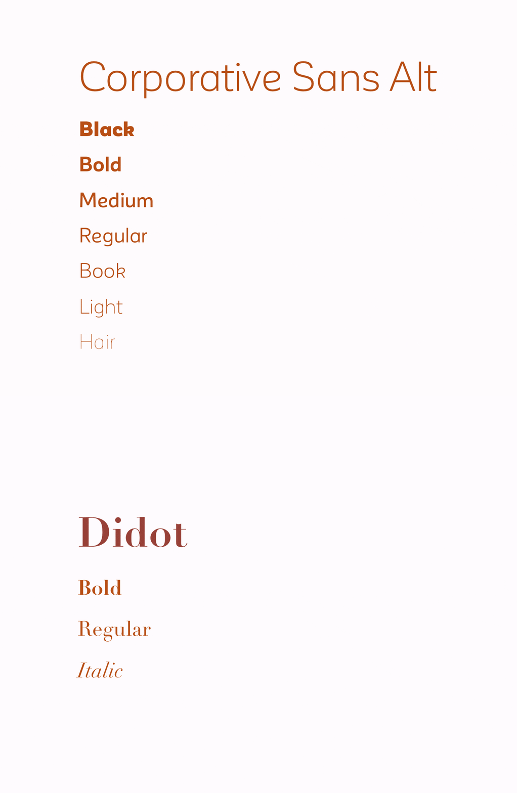
Our chosen typefaces for this identity were a serif and a sans-serif; Didot and Corporative Sans typeface. Didot is in a classification known as modern, or Didone. It’s a beautiful typeface that brings to mind pillars with its thick stroke.
Contrasting Didot is corporative sans which comes in a vast array of styles, however, we went minimal on its selection, working mainly with the weight set to light. This heavier stroke of Didot to the incredibly slim stroke of Corporative Sans typeface creates the perfect contrast necessary to have both stand out.
Logotype
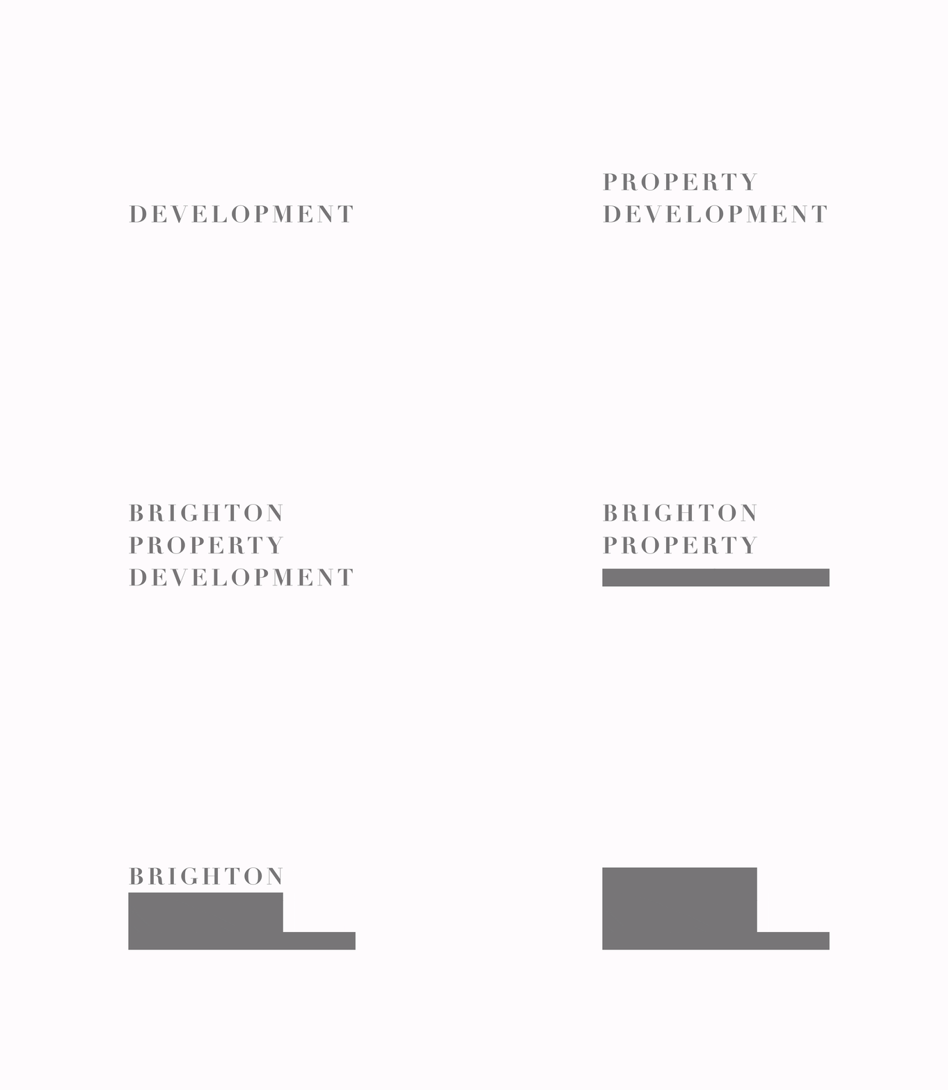
The vertical stacking of the logotype was chosen to depict the building up that takes place in property development. Each word is left aligned with adequate leading and tracking between them. It also alludes to the stability existent in the company.
Pattern
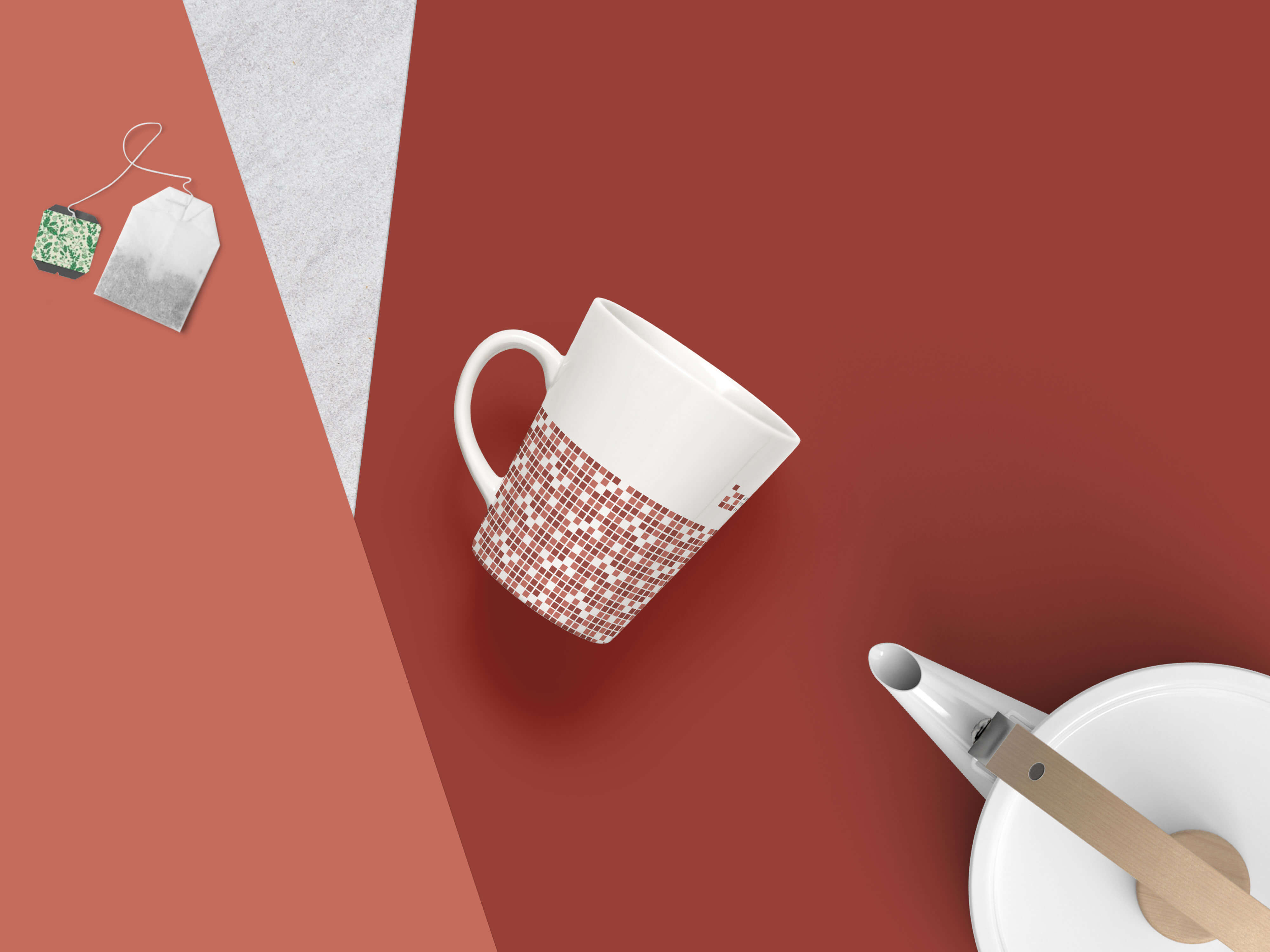
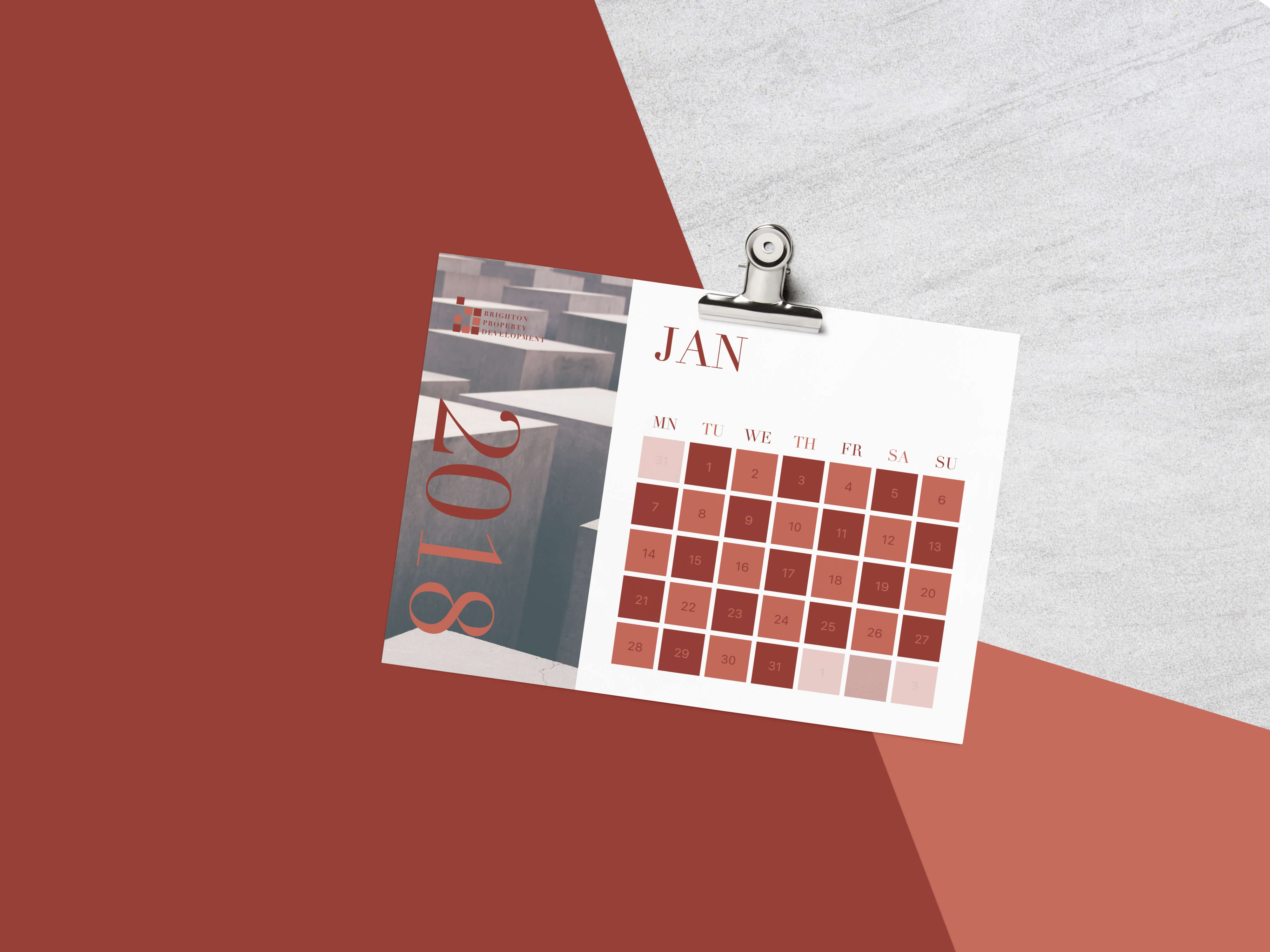
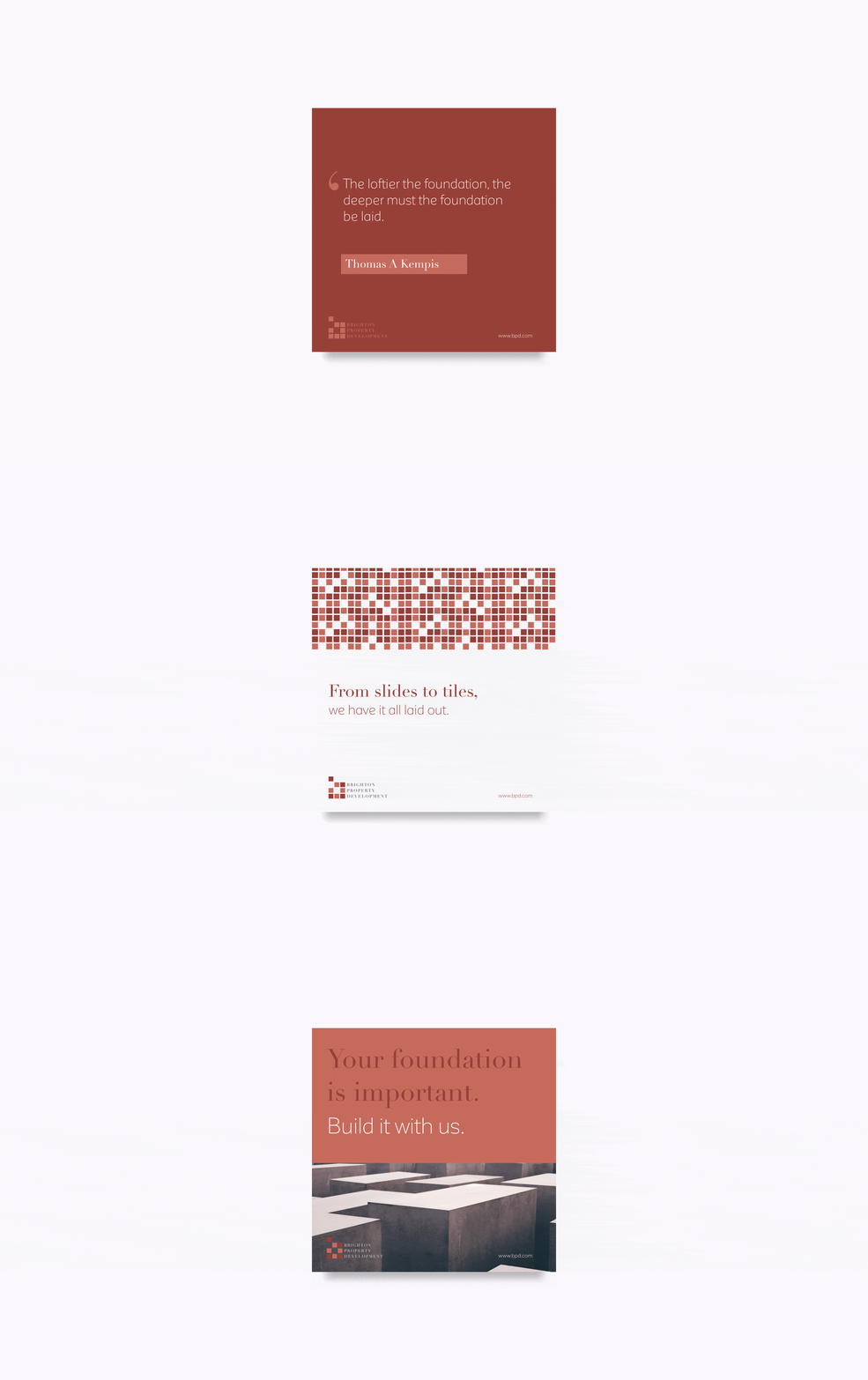
An important aspect of identity design is being able to create an identity that transcends beyond the logo and is able to extend to the supporting materials in an appropriate, discernable and aesthetically pleasing manner. We achieved this with the patterns which give the identity an allure. It is reminiscent of the popular 1980s Tetris game. The patterns formed serves as a projection of their goal to be a major property development with a vast expansion that fills up as many spots as possible.
Tone of Voice
We assigned the identity a tone of voice that’s factual and concise. What makes it different is while it has a matter-of-fact tone to it, there’s usually a play on words that lightens it up, therefore allowing it become one message with multiple tones. The tone is kept consistent but is also adapted to fit the context.
Catalog
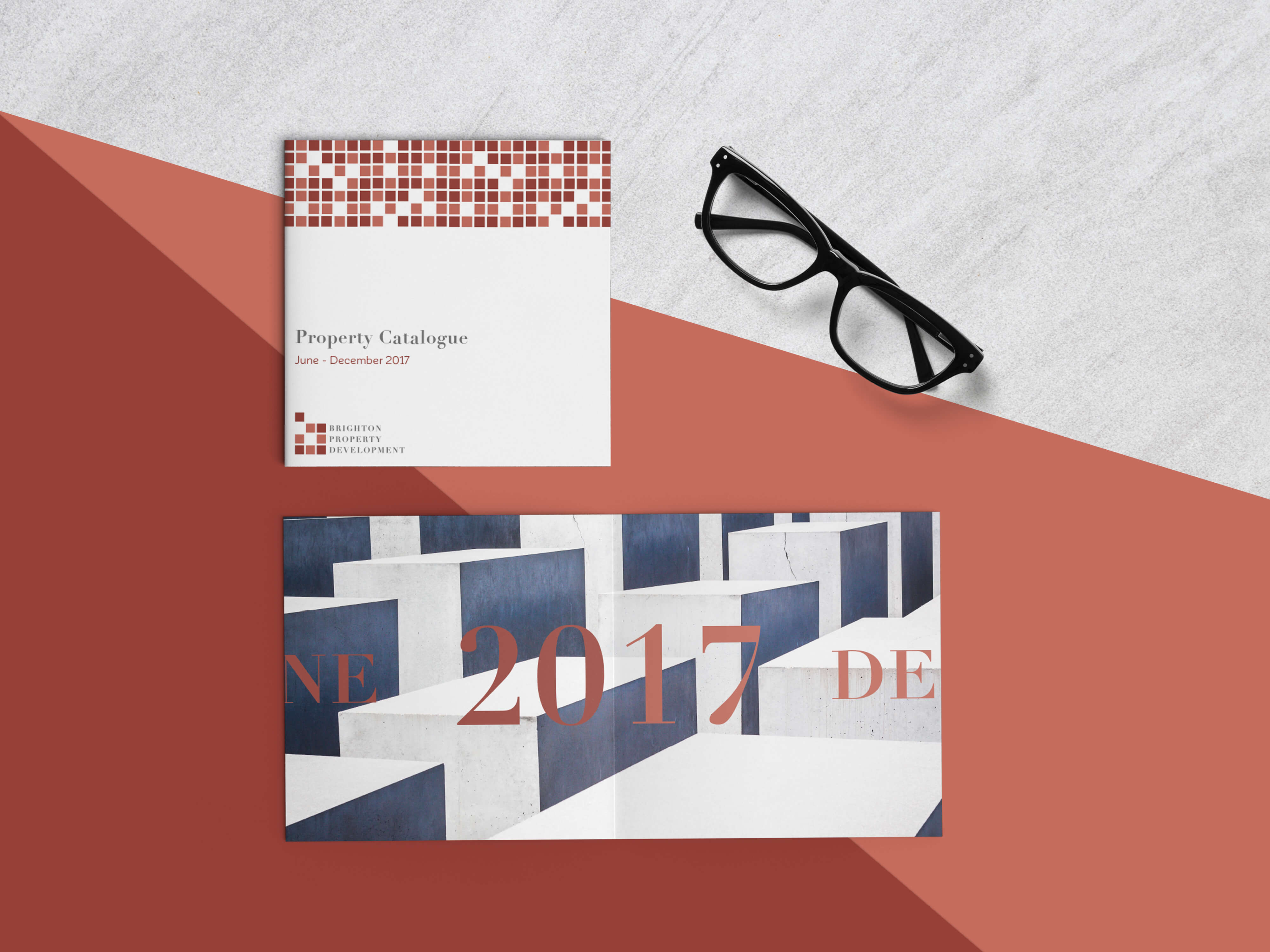
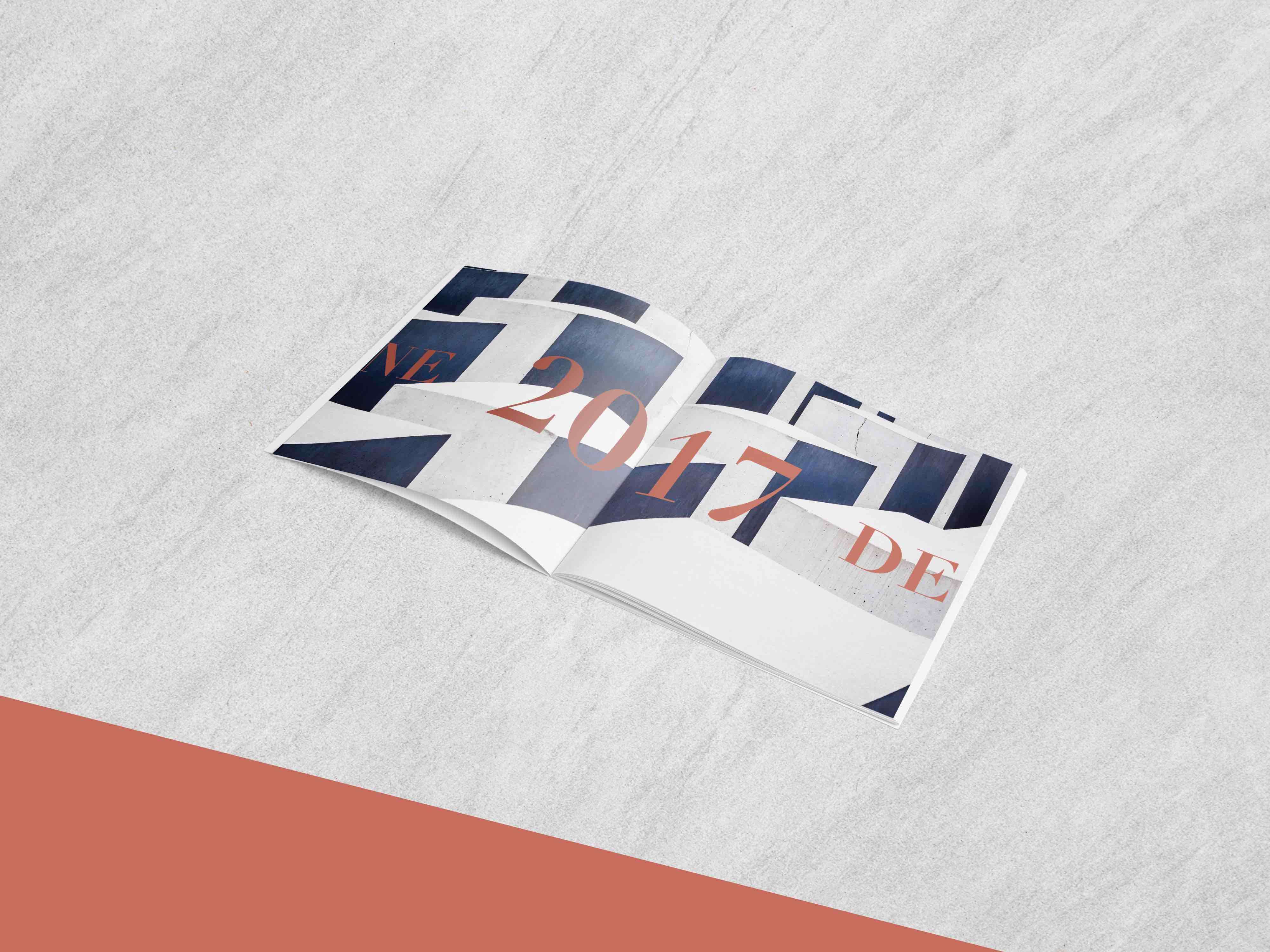
The catalog depicts the combination of color, typography and pattern, all elements derived from the logo. Every aspect of it is considered in line with the brand identity, from the square booklet, to the images and to the tone of voice.
Style Guide
We created a style guide in order to give clear direction through a set of rules on how the company should apply its identity in its marketing materials.
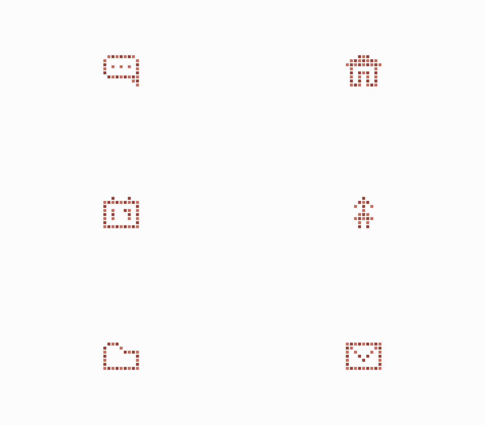
Iconography
The icons versility allowed us create a family of icons for BPD making sole use of the block elements with alternating colors as seen on the logomark.
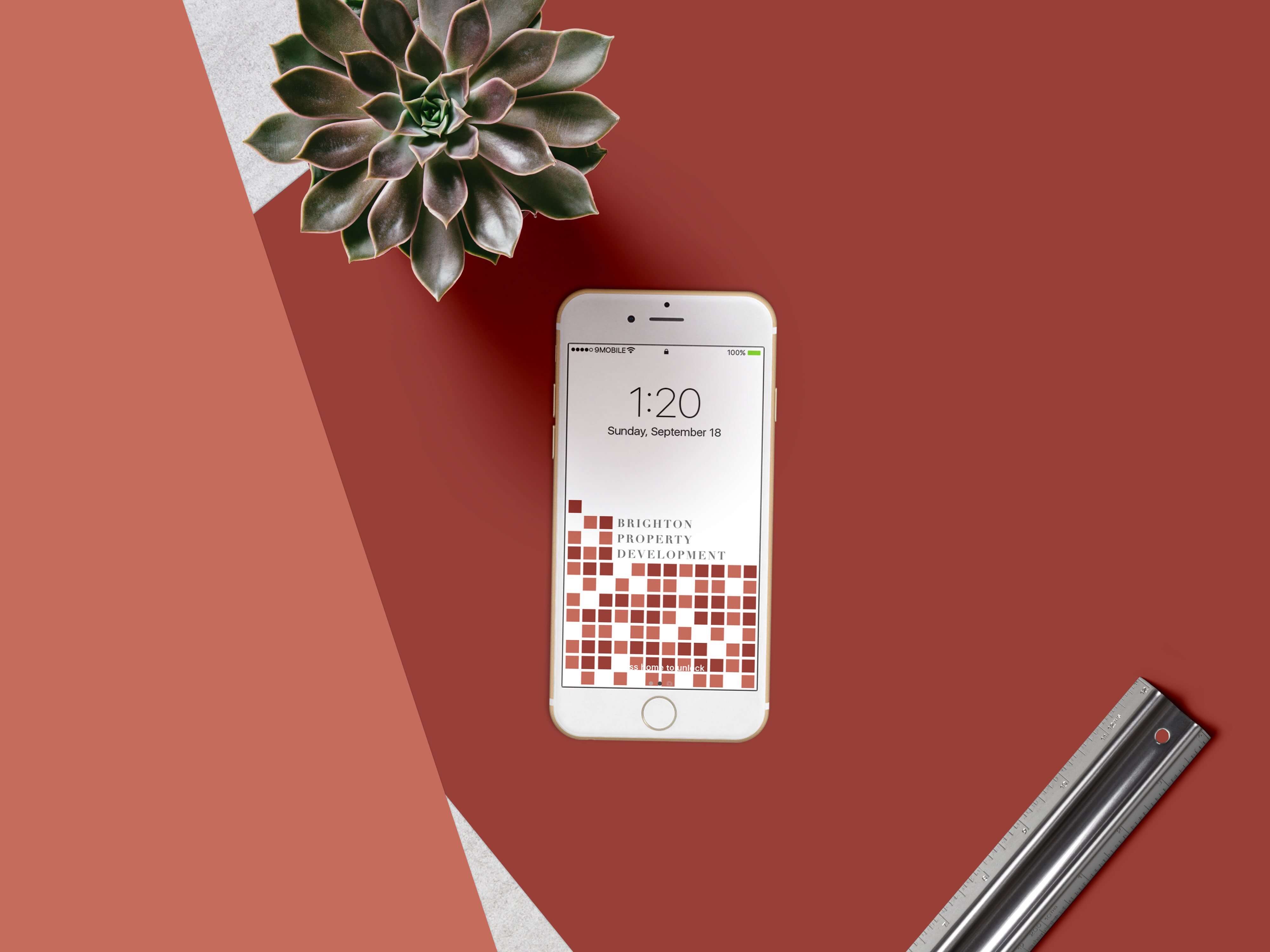
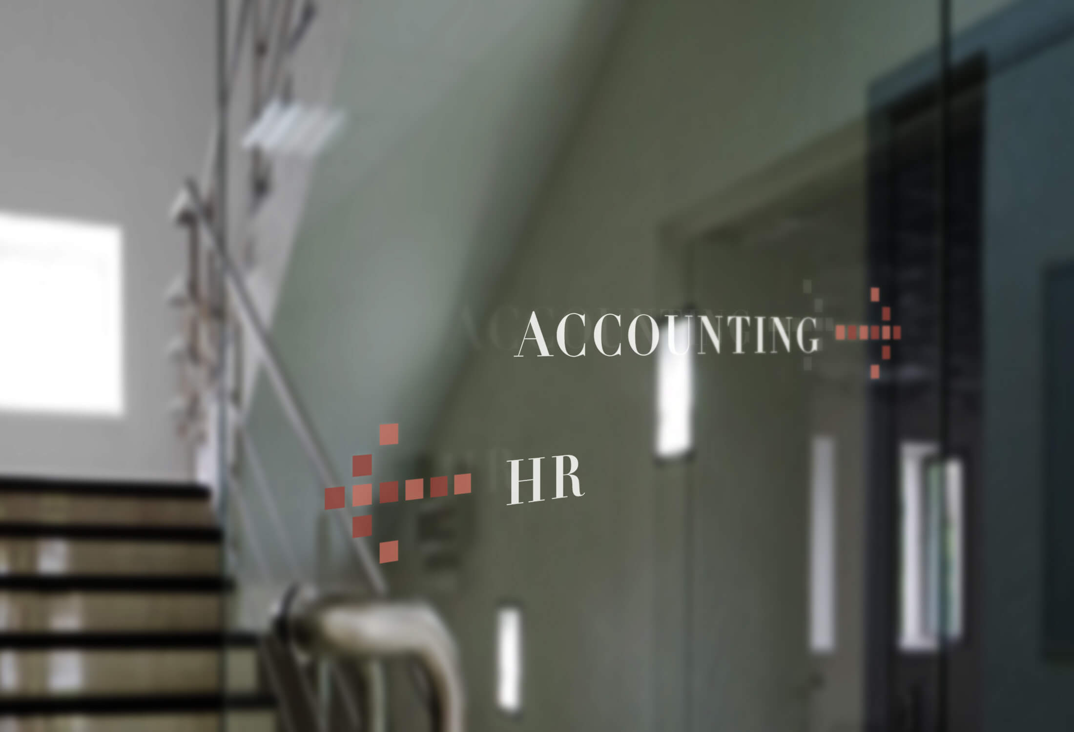
Assets & Applications
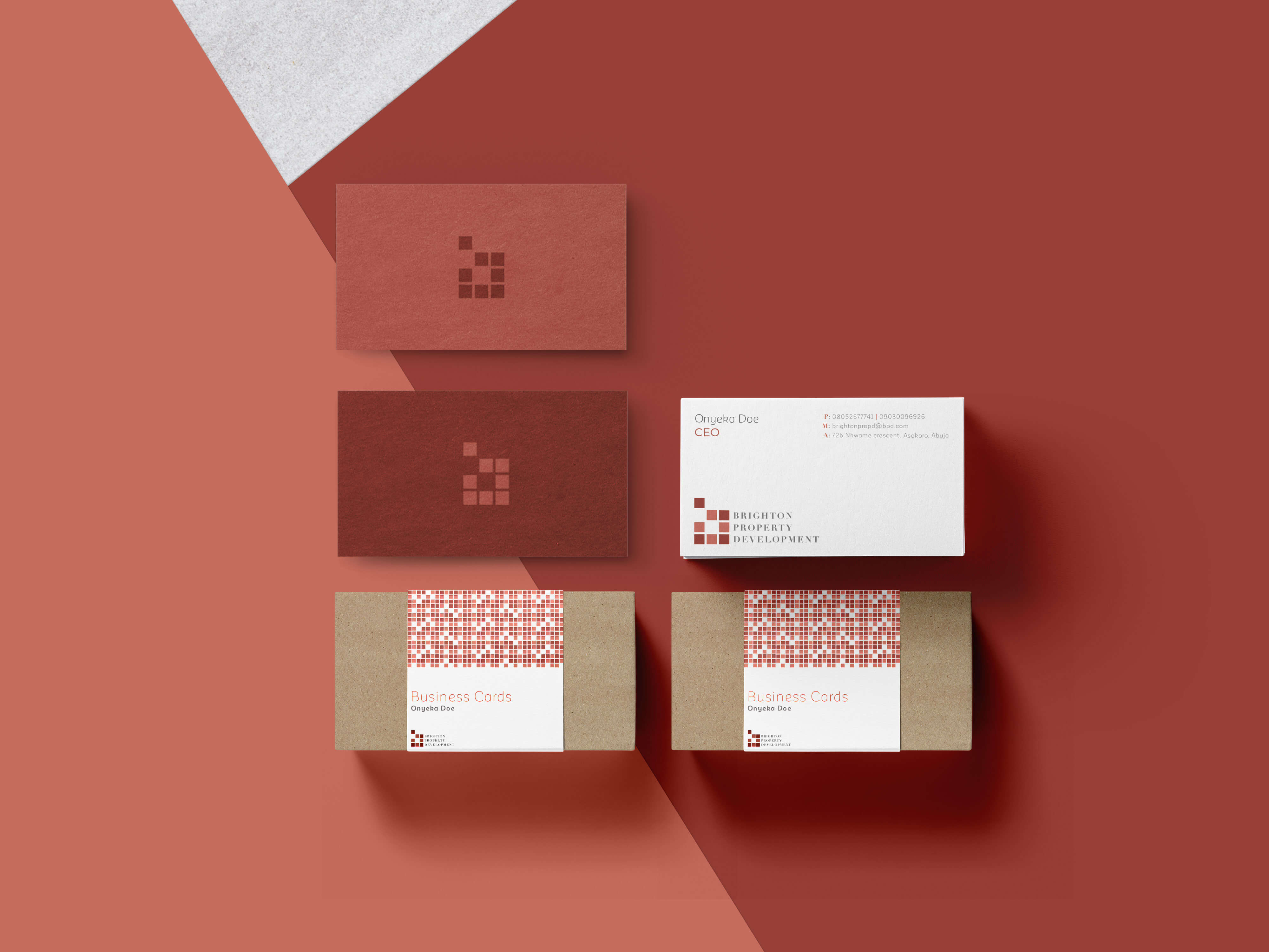
Creating a minimalist identity with a complementary color palette and typography allows us to carry it effortlessly and consistently making for a system that can be consistently implemented in other company assets.

More Case Studies