
R2S 2017 Report
Brief
Project Read2Succeed is a non-profit organization that seeks to improve the literacy level amongst children in public primary schools. They focus on improving student’s performance, supporting the class teachers, and positively impacting the school environment, with an immediate goal of improving the state of public primary school education – one classroom at a time.
This was their first report and they needed it to adequately present their story through the use of clear, concise and engaging design that makes adequate use of content while giving them a vibe divergent from what is expected of non-profits.
Client
R2s Africa
Sector
Education
Office
Abuja
Discipline
Editorial

Inspiration
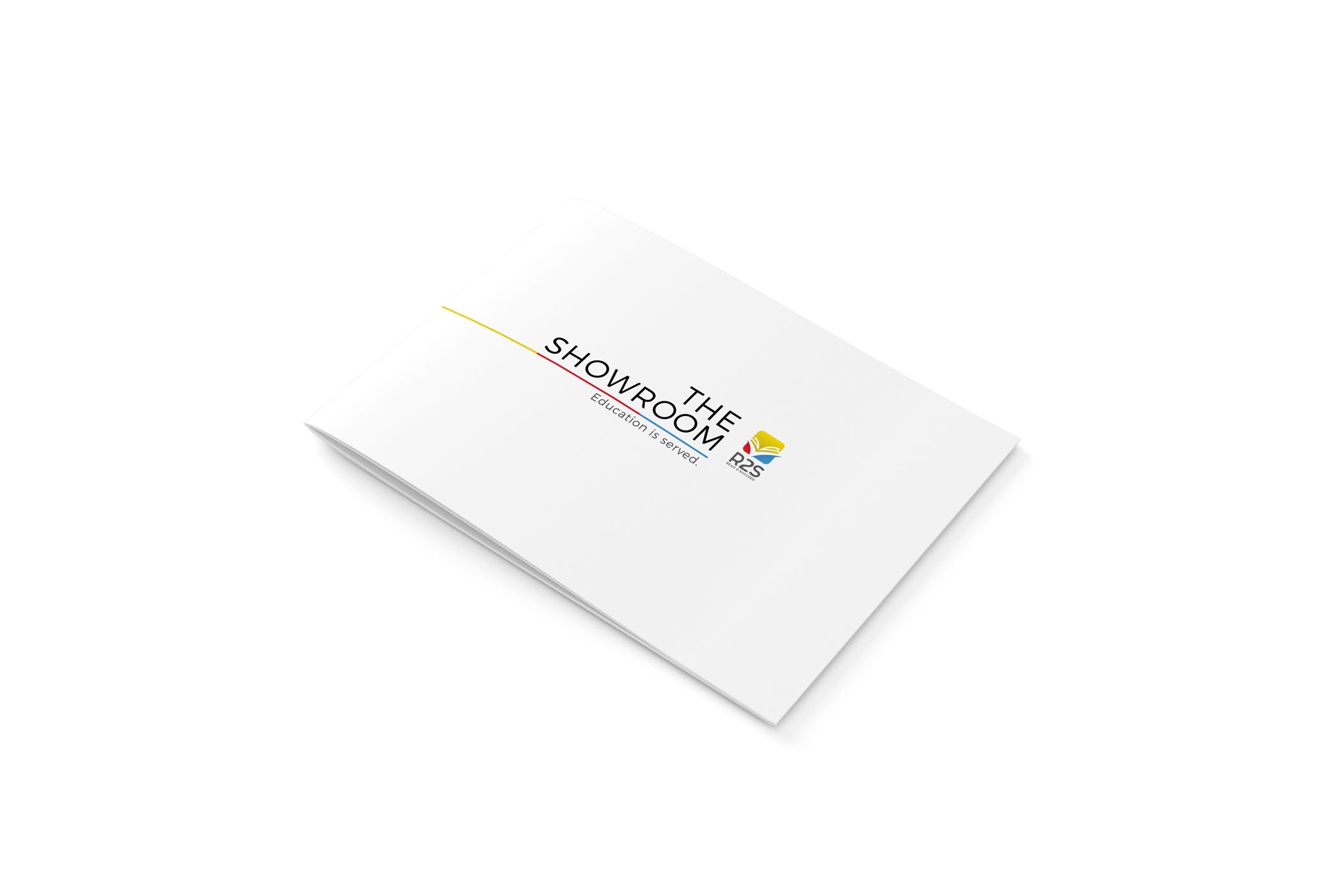
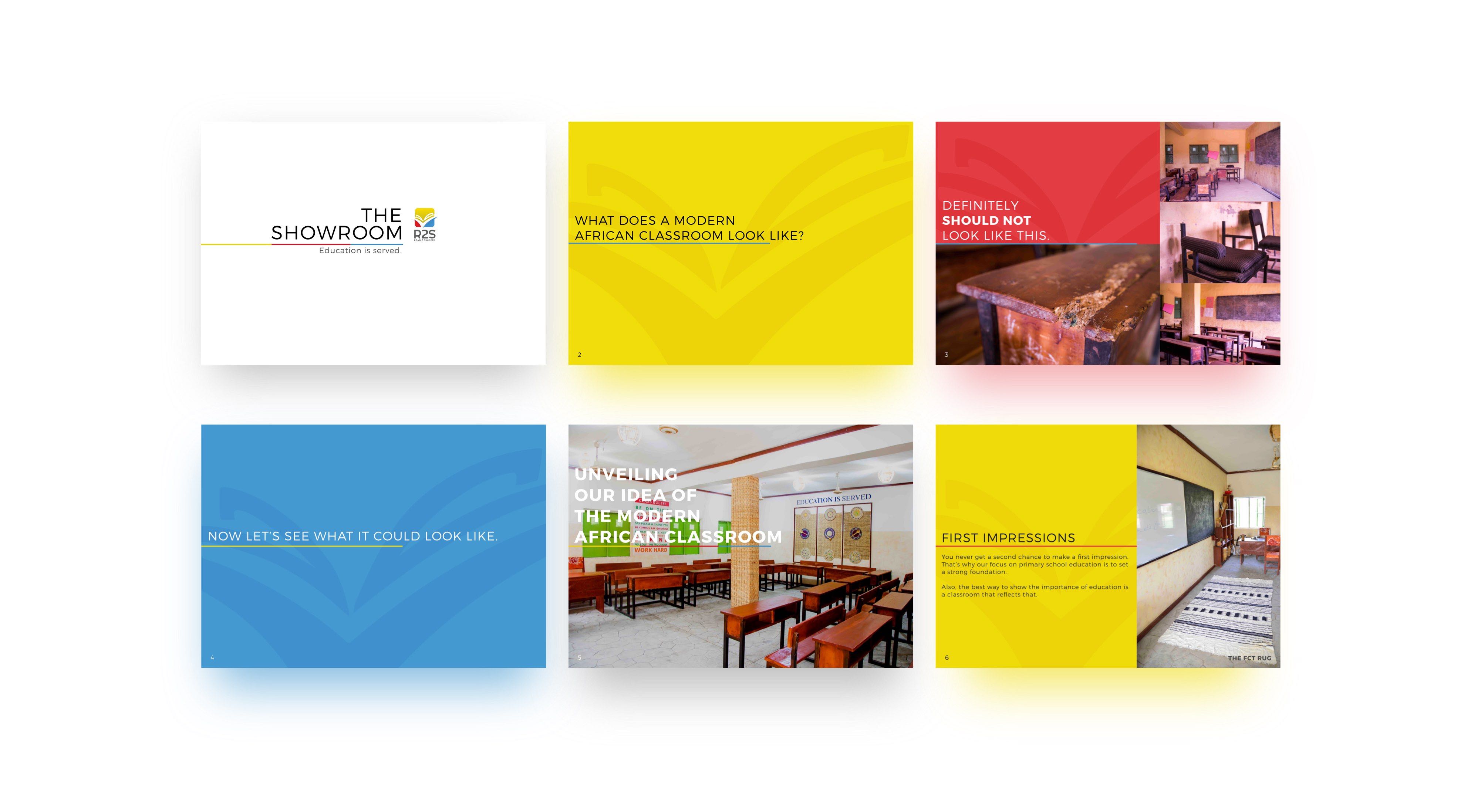
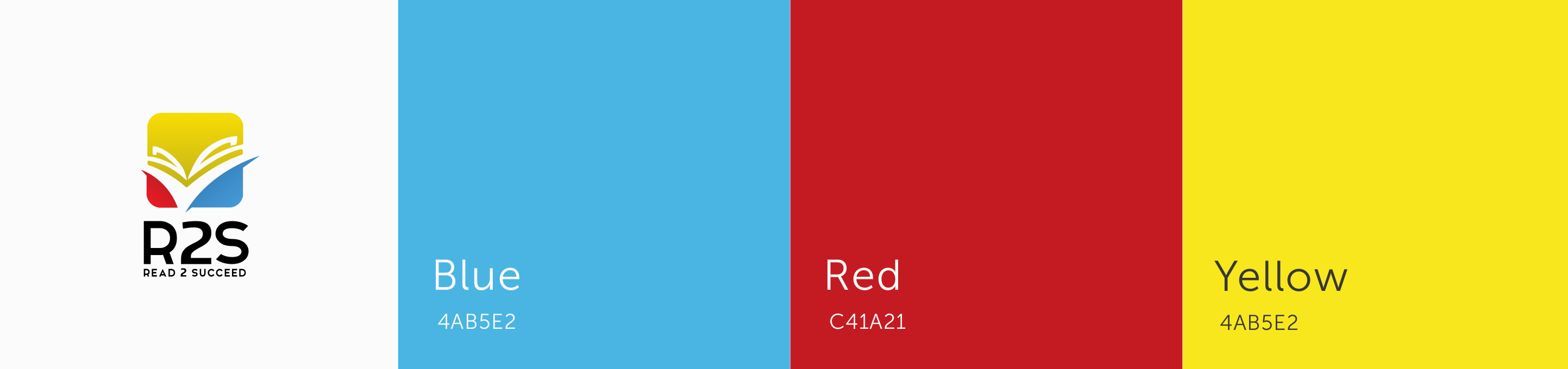
Drawing inspiration from the R2S brochure which designed in the past, we adopted a couple of core elements into the new brochure. They include the line which serves as an anchor for the header text and the color palette which features the primary colors, red, blue and yellow from R2S’s logo. The elements were chosen because they maintain visual consistency with the brochure while giving the report room for a different design aesthetic.
Cover
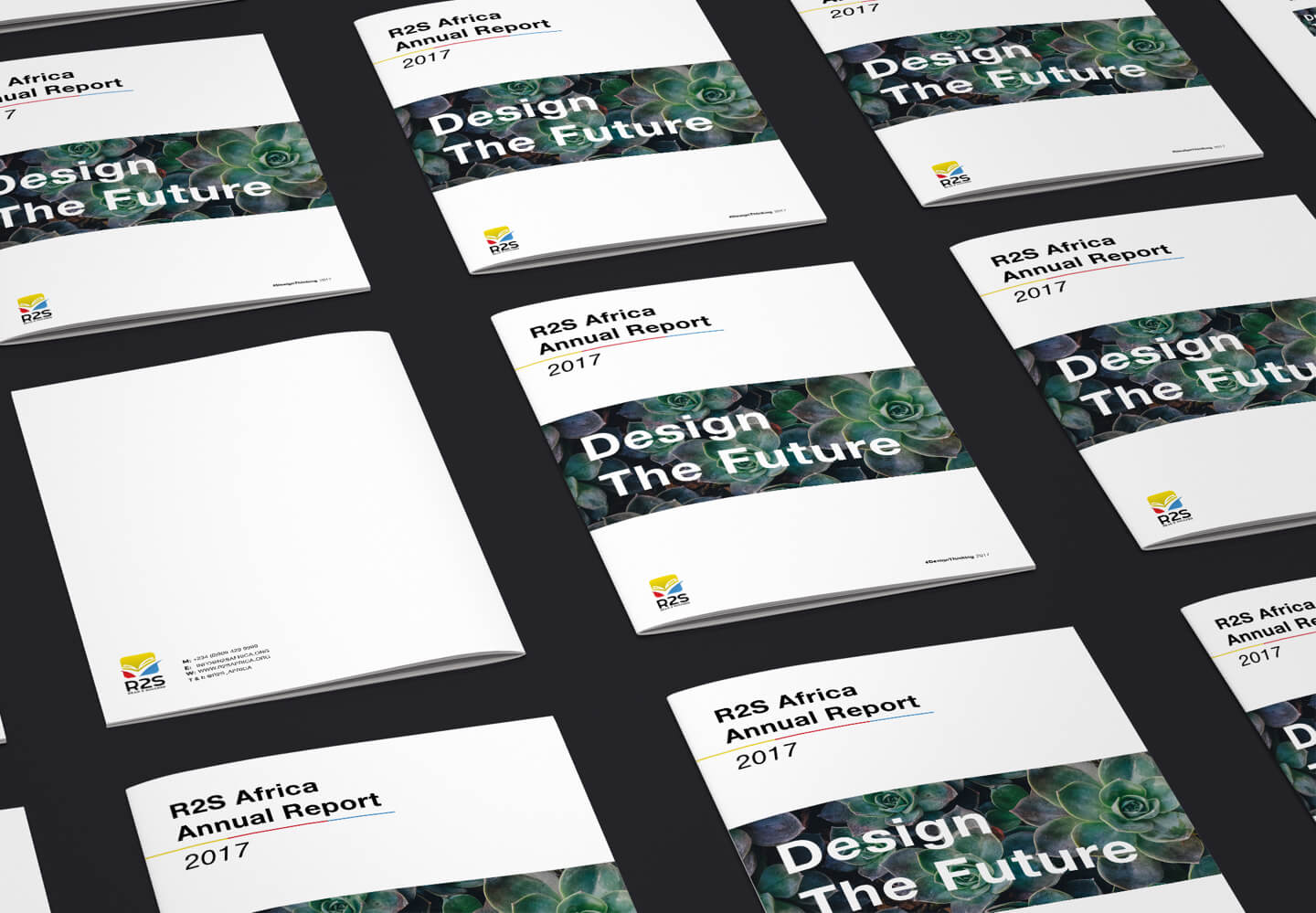
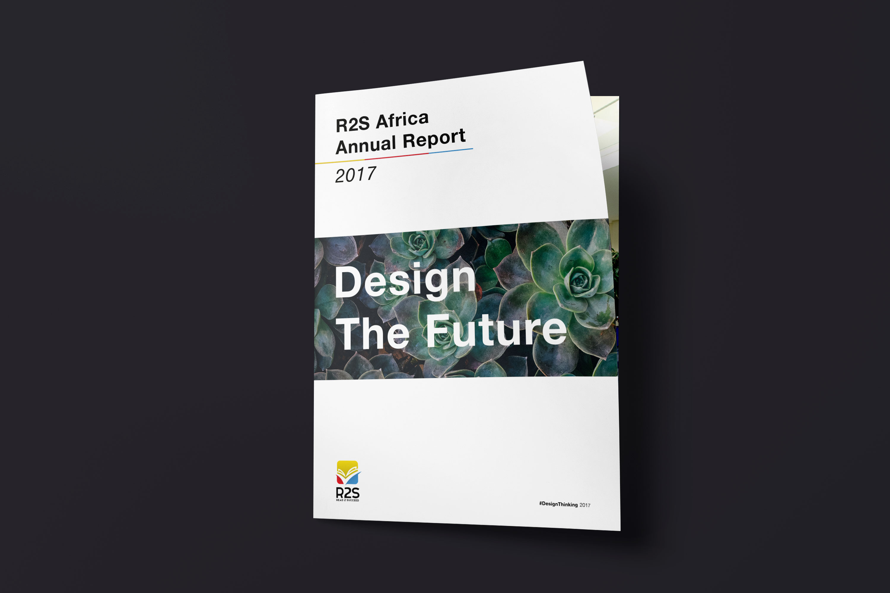
We designed a cover that makes use of bold type. The cover acts as a visual guide for the rest of the report, with elements arranged in the same position in the report as the cover.
The title, rendered consistently in the same font size and weight appears at the top right, this anchors readers expectations to where the headers are placed in the report.
We ensured there was adequate whitespace on the cover. This allows each element to stand out in the composition.
It features an image, taken by Annie Spratt, of a succulent plant. By storing water, succulent plants are able to prepare for the future. This allows them survive during harsh periods or in ecosystems that contain scarce water sources. This ties into the theme of the report titled “Design The Future”, as it links up the goal of R2S with the succulents which design their future in a manner that enables them not only survive but thrive beautifully.
Color
We used the colors, blue, red and yellow. These are primary colors adopted from the R2S logo. The colors are bold, allowing them serve as accent colors but also partly muted, giving them a pastel feel that makes them comfortable to stare at when serving as background colors.
Typography
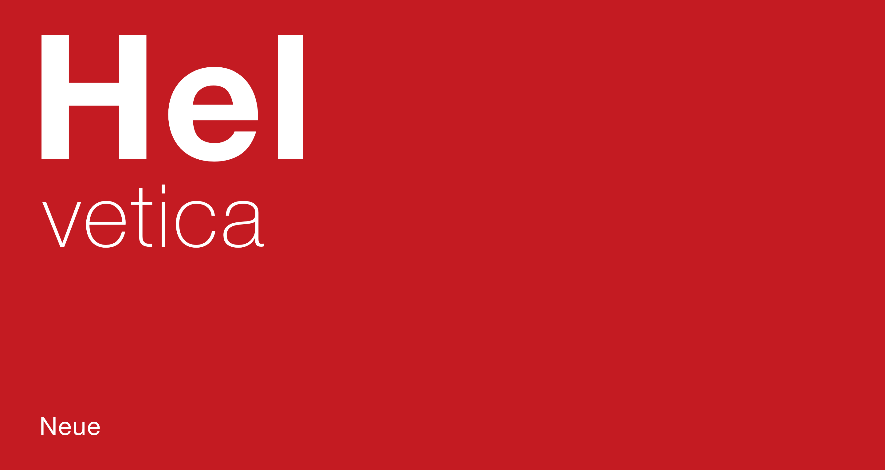
Our chosen typeface for this report was Helvetica Neue. Helvetica is a grotesque sans serif and one of the most popular typefaces in the world. We wanted to work with a typeface that had a feeling of consistency to it, as it is a great way to tie back to the cover’s theme of resilience and preparation for the future. It’s also a clean and versatile typeface with high legibility that allows it work effectively for both header and copy text. We worked with 3 weights set at regular, bold and light. This made the report uniform as well as created adequate contrast and hierarchy across its elements allowing readers effectively know what content to pay immediate attention to.
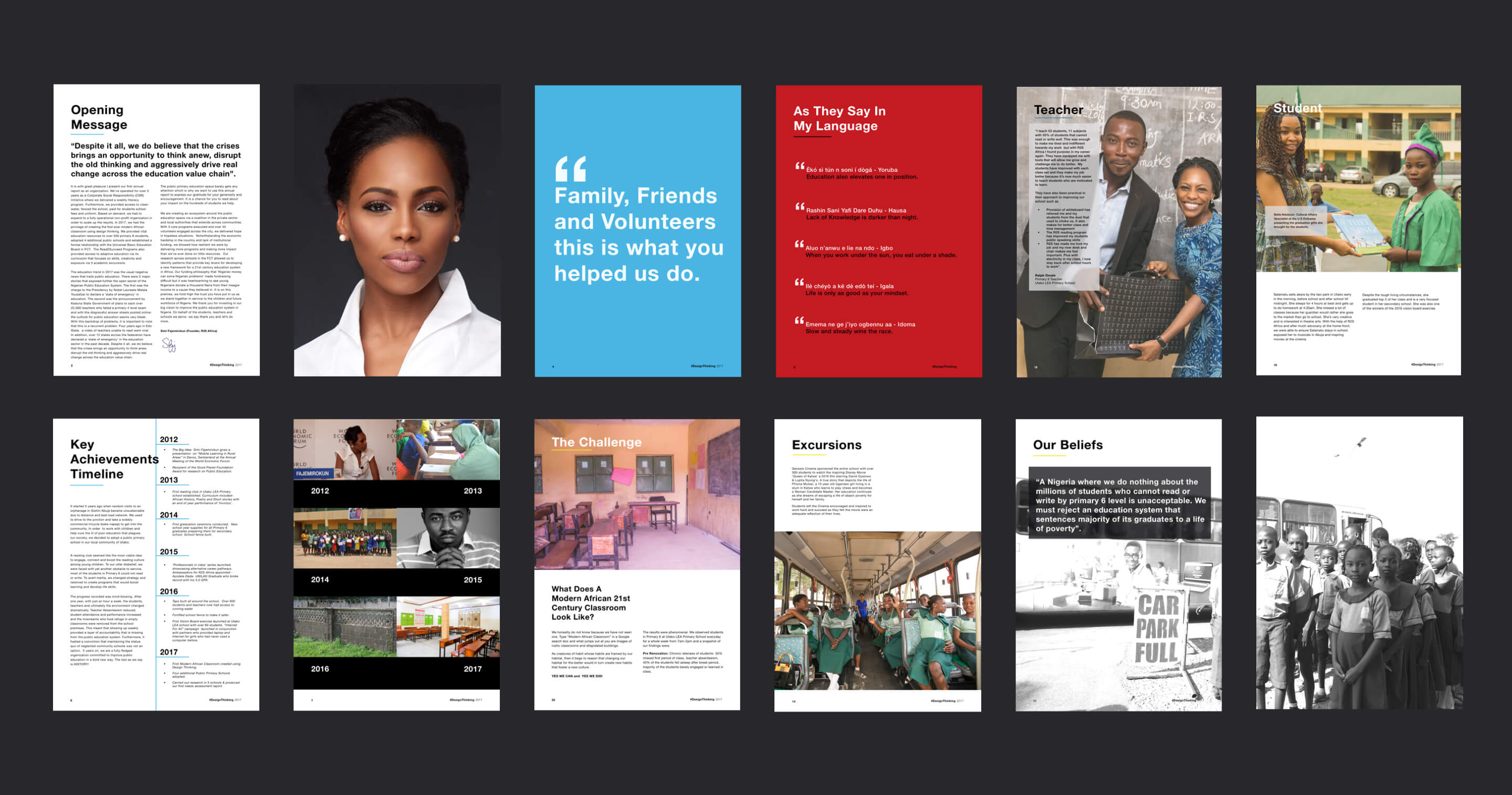
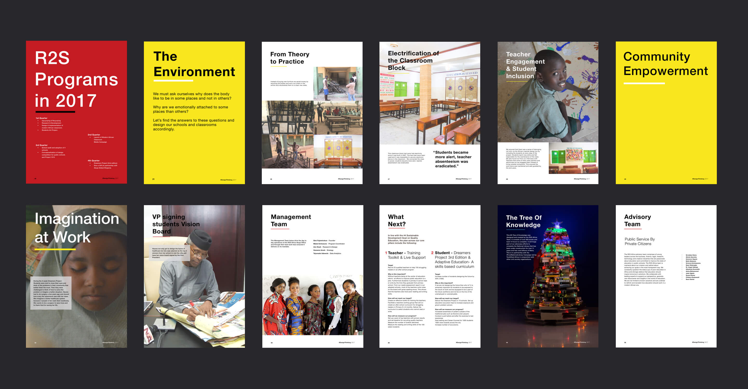
Style
We chose the International Typographic Style (or Swiss style) for the same reason we chose Helvetica — it’s a clean, versatile and highly legible style that makes use of a grid and asymmetric layouts with left aligned text. All these characteristics enable information to be displayed in the most straight forward manner.
This style also works incredibly well with photography, which was perfect for this project given the repository of great pictures R2S had gathered of its activities. These pictures were taken by Jesi Chun, Tolu Cole and Emeka Okolo.

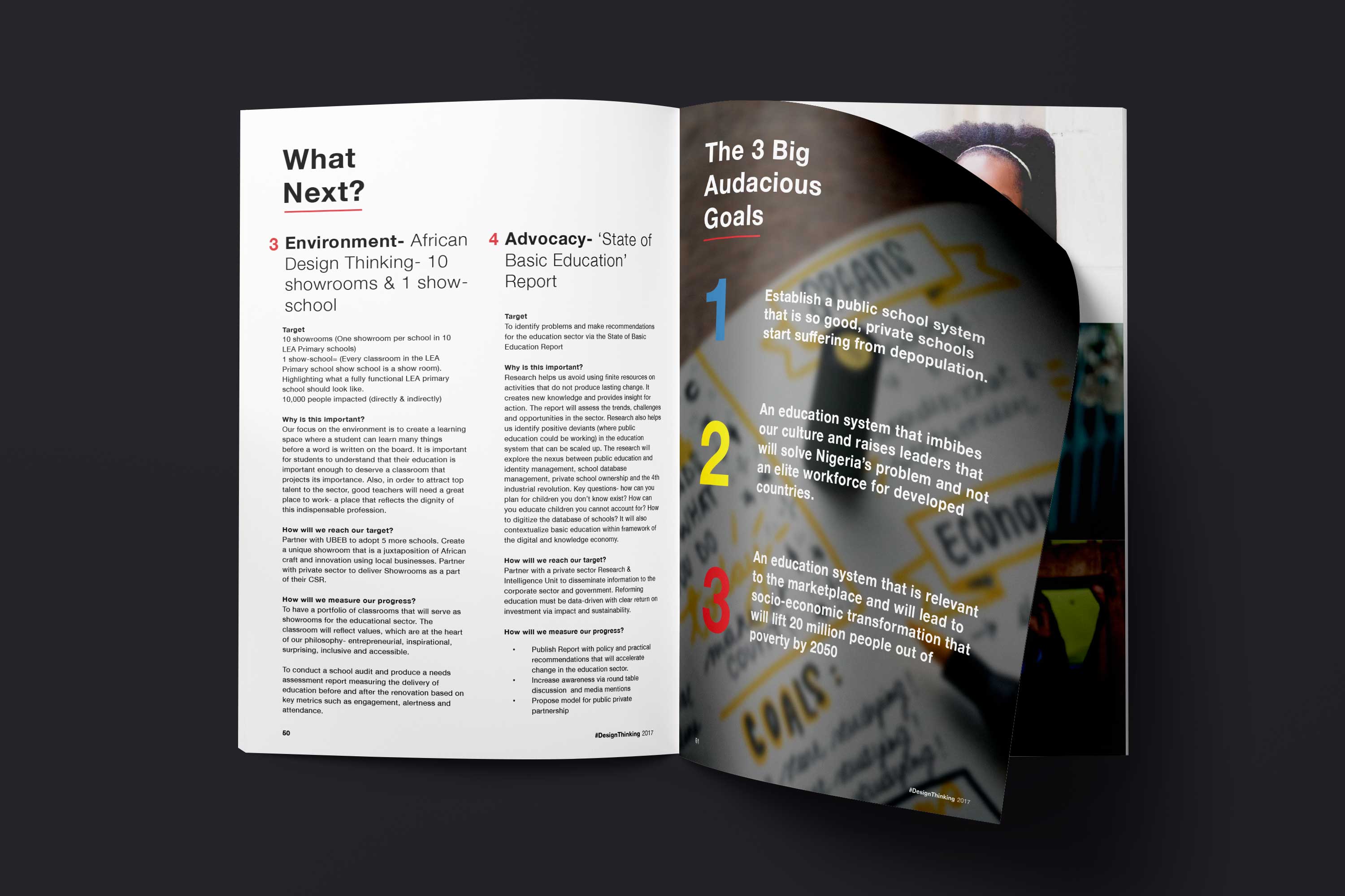
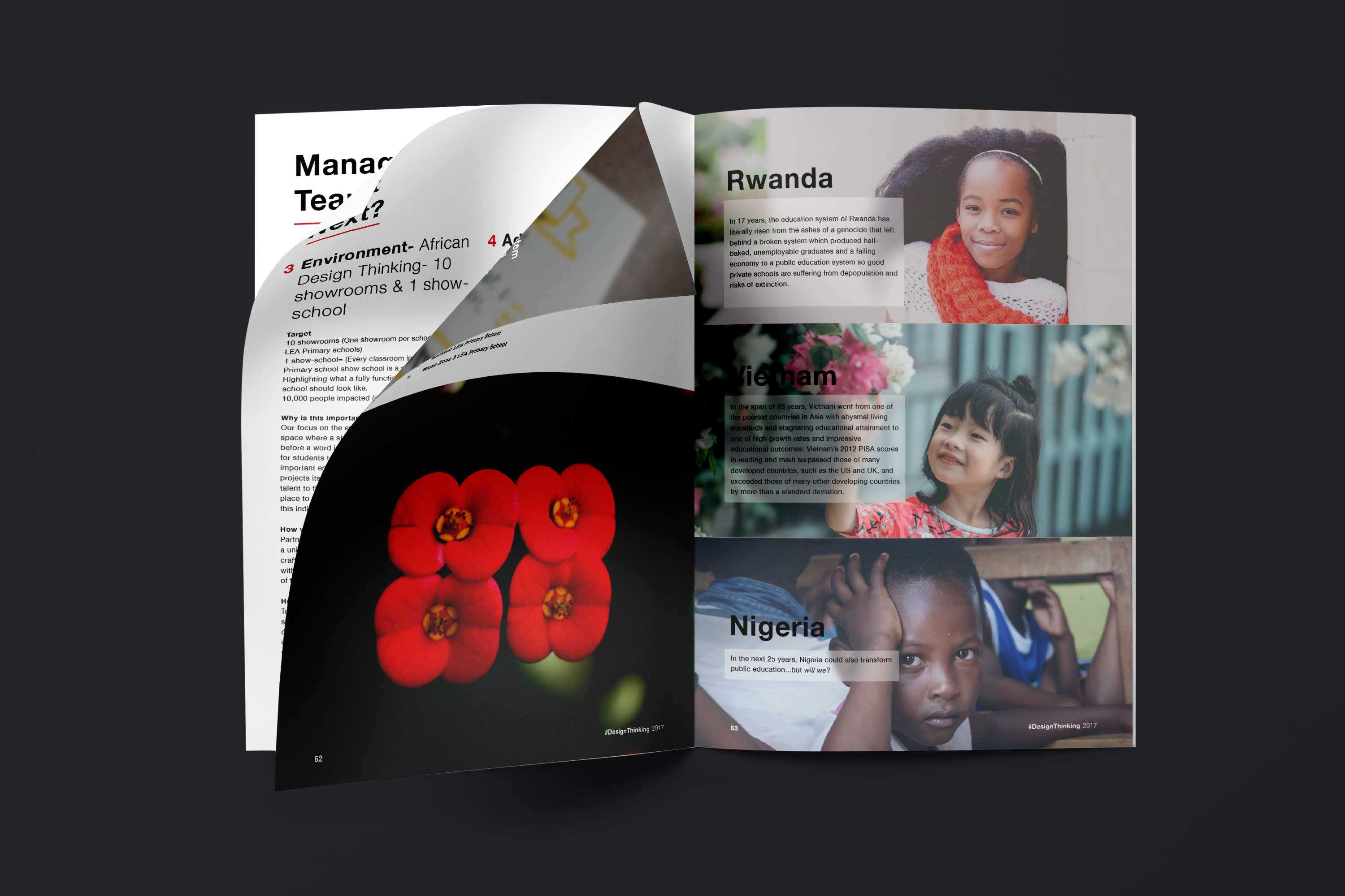
Product
The cumulation of the design decisions we made is a clear, concise, and engaging product that differentiates R2S from the common aesthetics often utilized by non-profits. A report that gives R2S a gravitas beyond the norm. Most importantly, a report comprehensively created through design thinking to tell the message of how this organization has utilized it to achieve their goals, and in preparation for their future, and the futures of others they aim to impact.
More Case Studies
Akanka 3.0
Welcome to our latest version