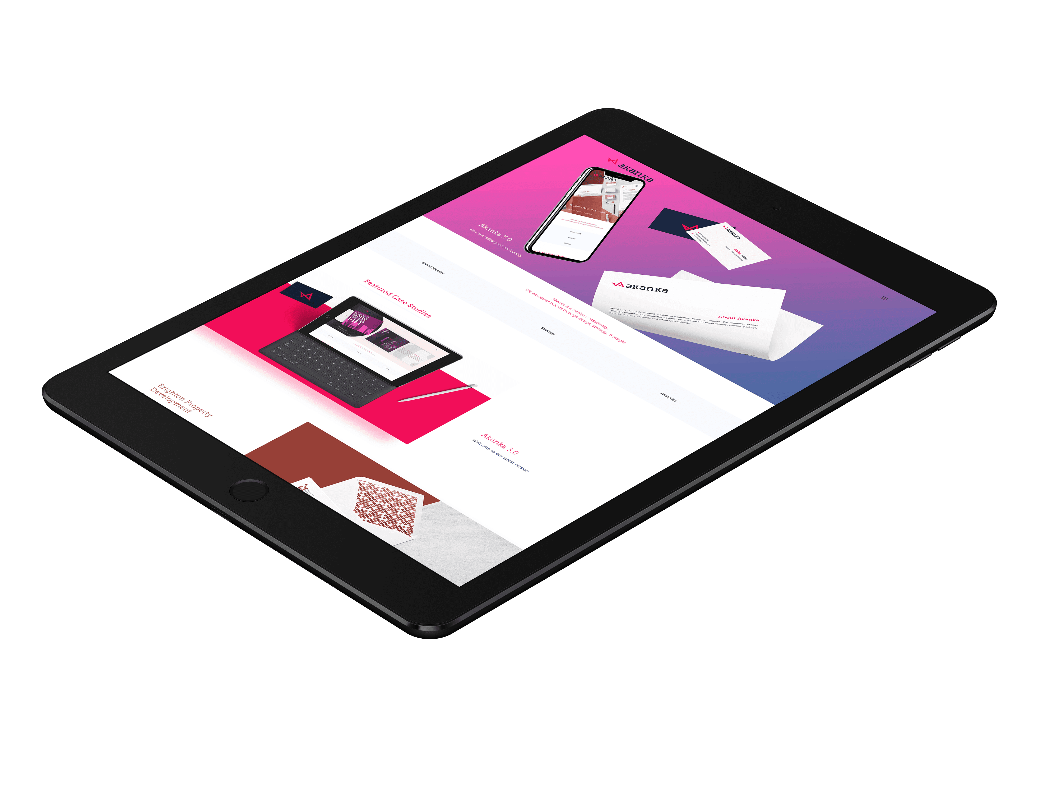
Akanka 3.0
Brief
After 2.5 years of designing identities for a lot of companies, we decided it was time to pay some attention to our identity. We regularly got compliments about our identity and website, with clients listing our logo as one they wanted their logo to look like and complimenting our site as beautiful. We appreciated all these compliments — but really, our identity was dated, and our site did not adequately reflect us. Despite having only existing for 2 years and starting with no design experience, we’d evolved — and it was time to reflect that.
We have always treated Akanka like an app, with periodic updates, and with each update referred to in-app nomenclature; hence Akanka 1.0, 2.0, and the current 3.0. This has allowed us consistently evolve as we are reminded by this nomenclature that our design and features are never complete inspiring us to consistently evolve and adopt new features.
With Akanka 3.0, we have created an identity system that unifies our brand identity as well as expands our services. We hope you love it as much as we do 🙂
Client
Akanka
Sector
Design
Office
Abuja
Discipline
Brand Identity
Web Design
UI/UX
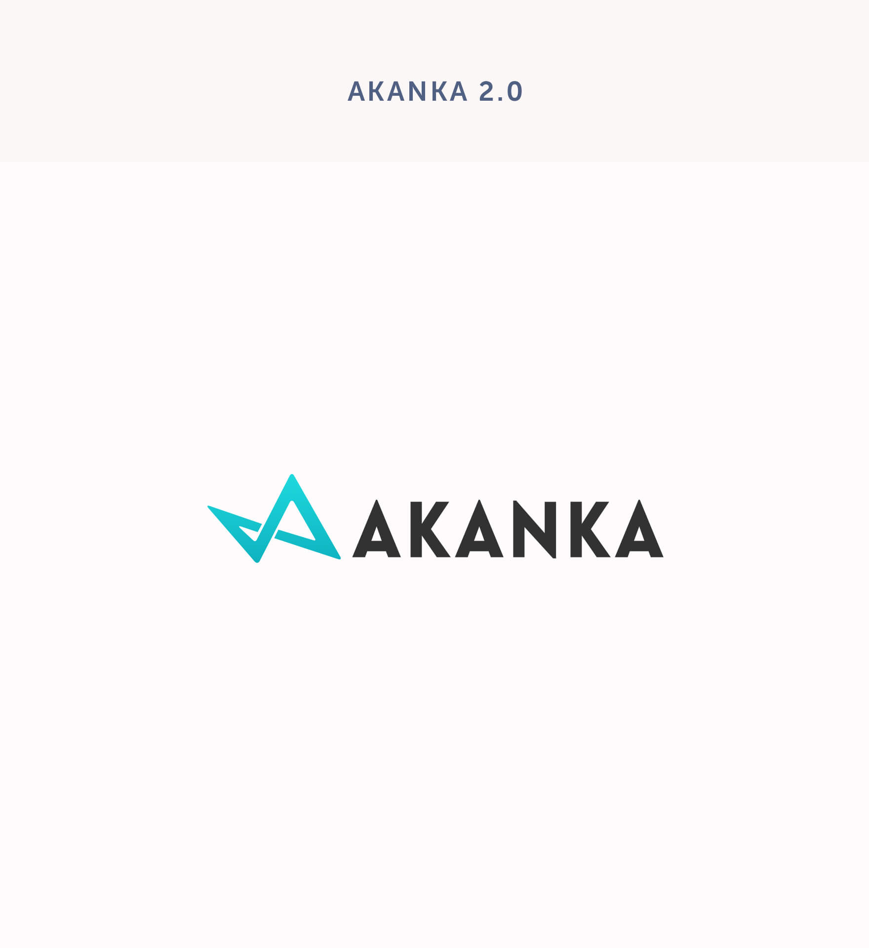
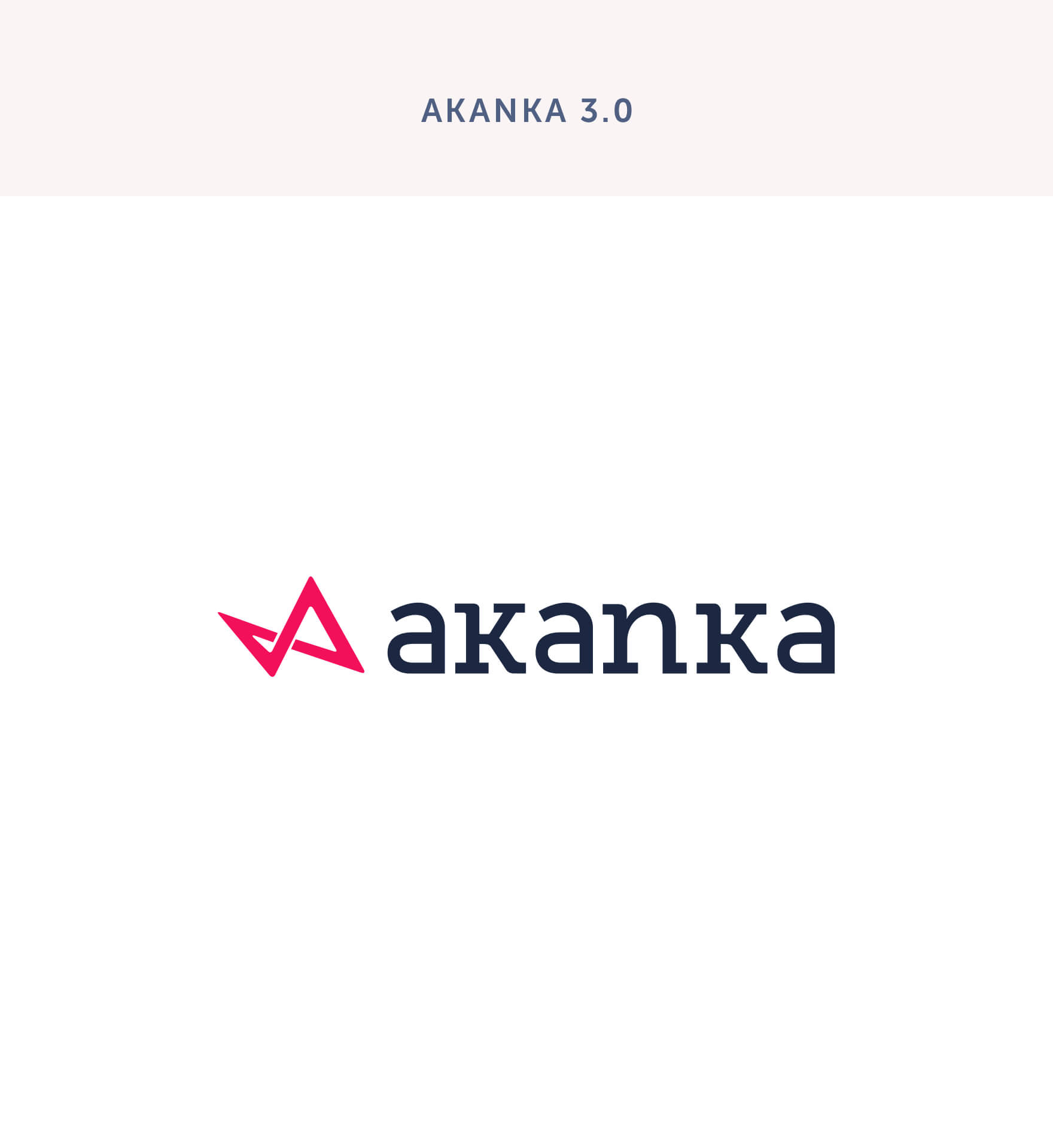
Versions
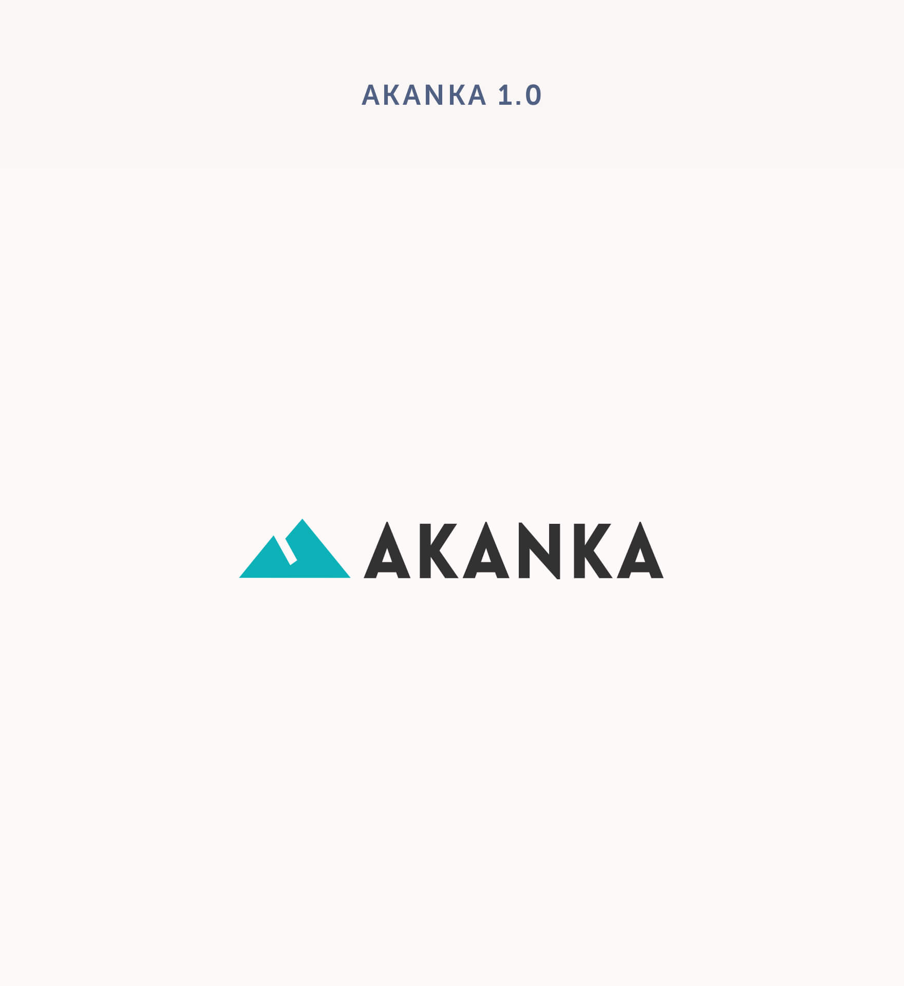
We’ll let you in on a self-deprecating Akanka secret; our 1.0 mark wasn’t designed by us. It was an icon we got when we didn’t know what a vector was and way before Akanka intended to become a design agency. We adopted it with the intention for it to convey stability while looking like an A. That really was it. It was arguably a clean, simple and sturdy logo on its own, but it really didn’t tell our message.
By Akanka 2.0, we had a changed business model, more experience, as well as new goals. For Akanka 2.0, we crafted a new line art logo mark. The logotype remained the same.
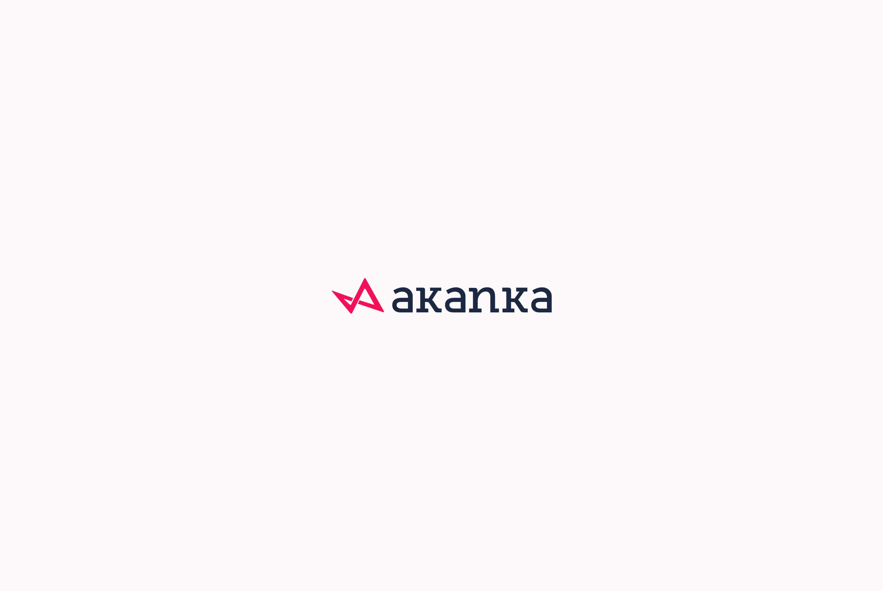
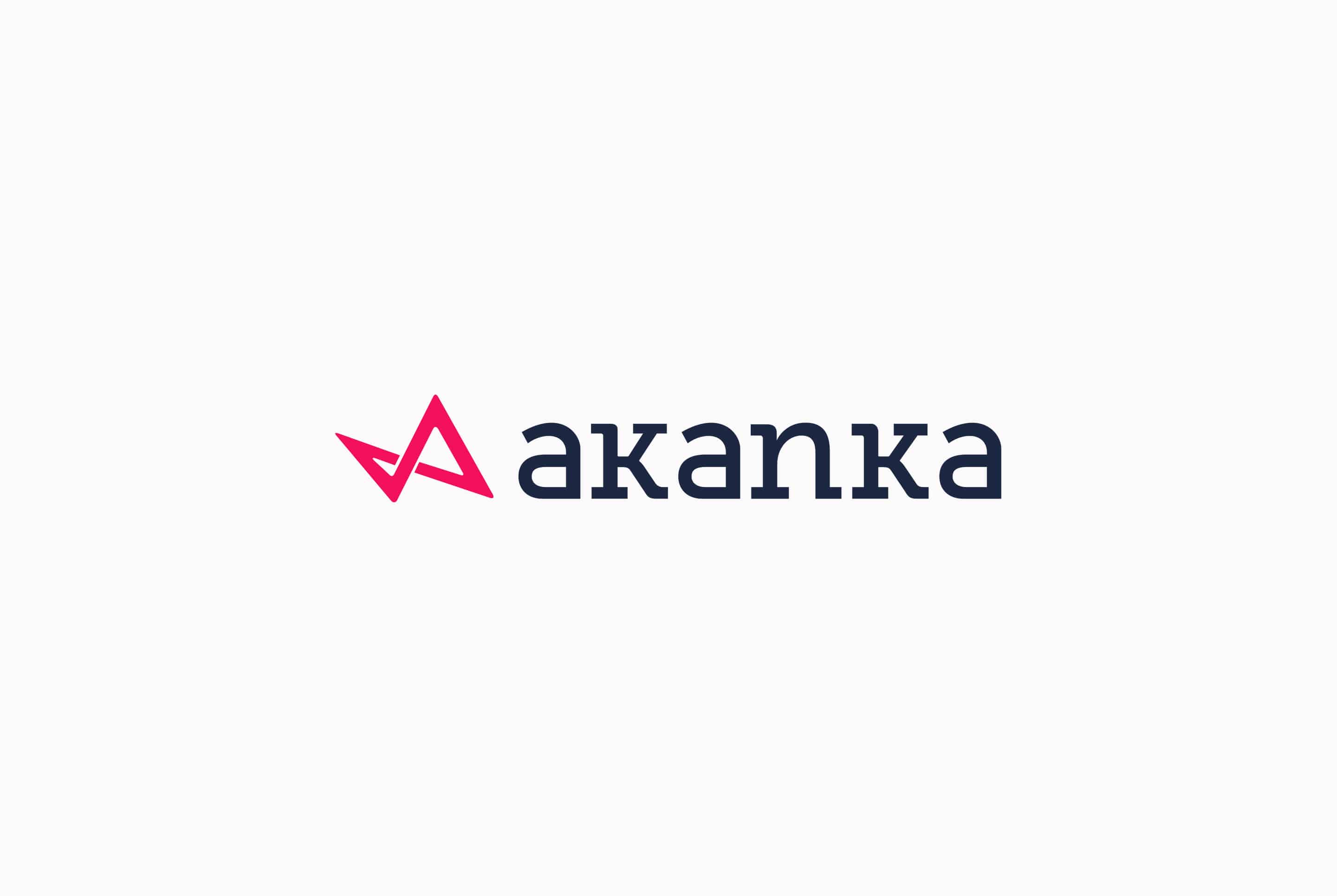
With Akanka 3.0 we changed the logotype and color thus completing the transition away from 1.0. The color change was essential as it makes our entire logo a lot more dynamic and befitting of our revamped personality.
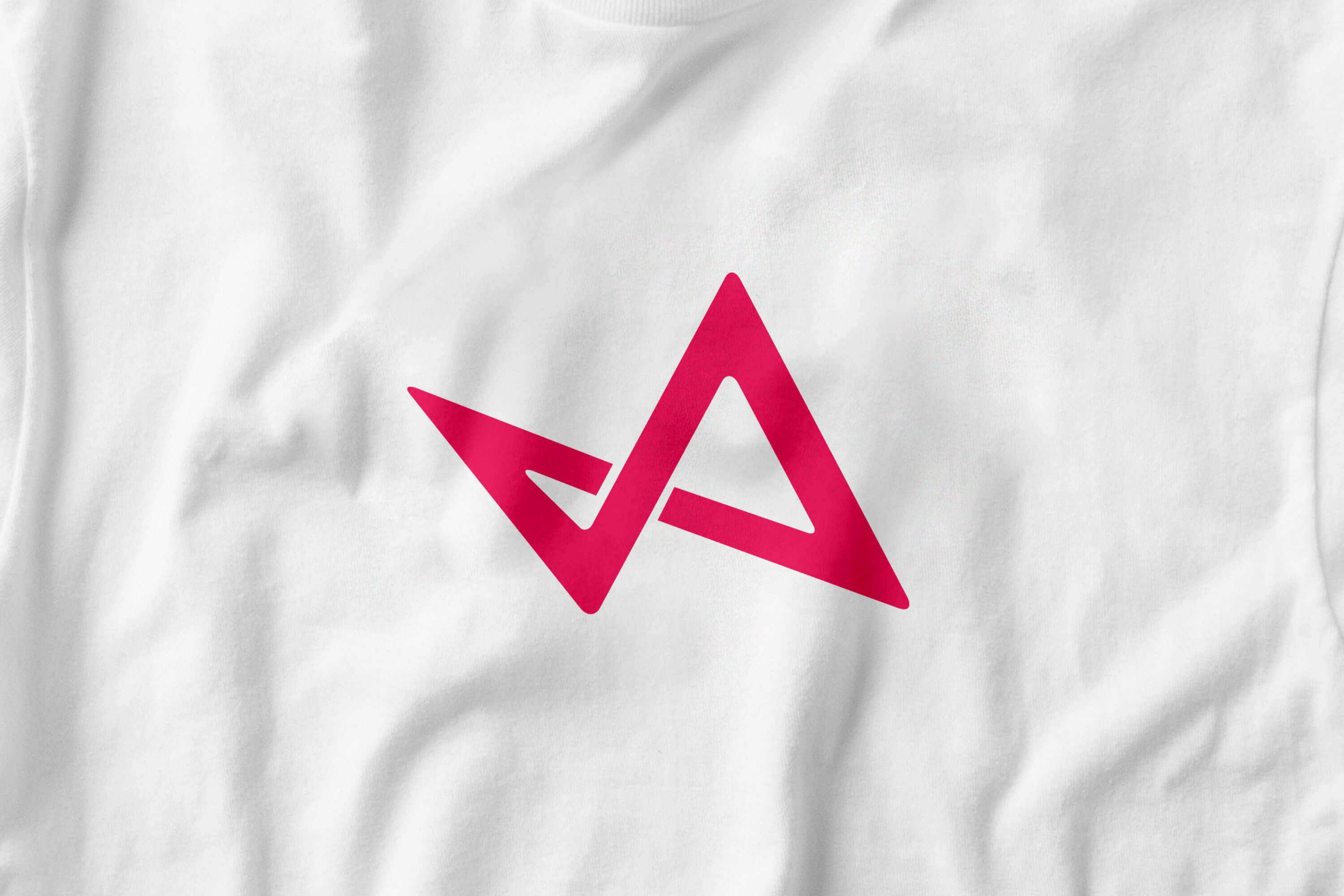
Mark Creation Process
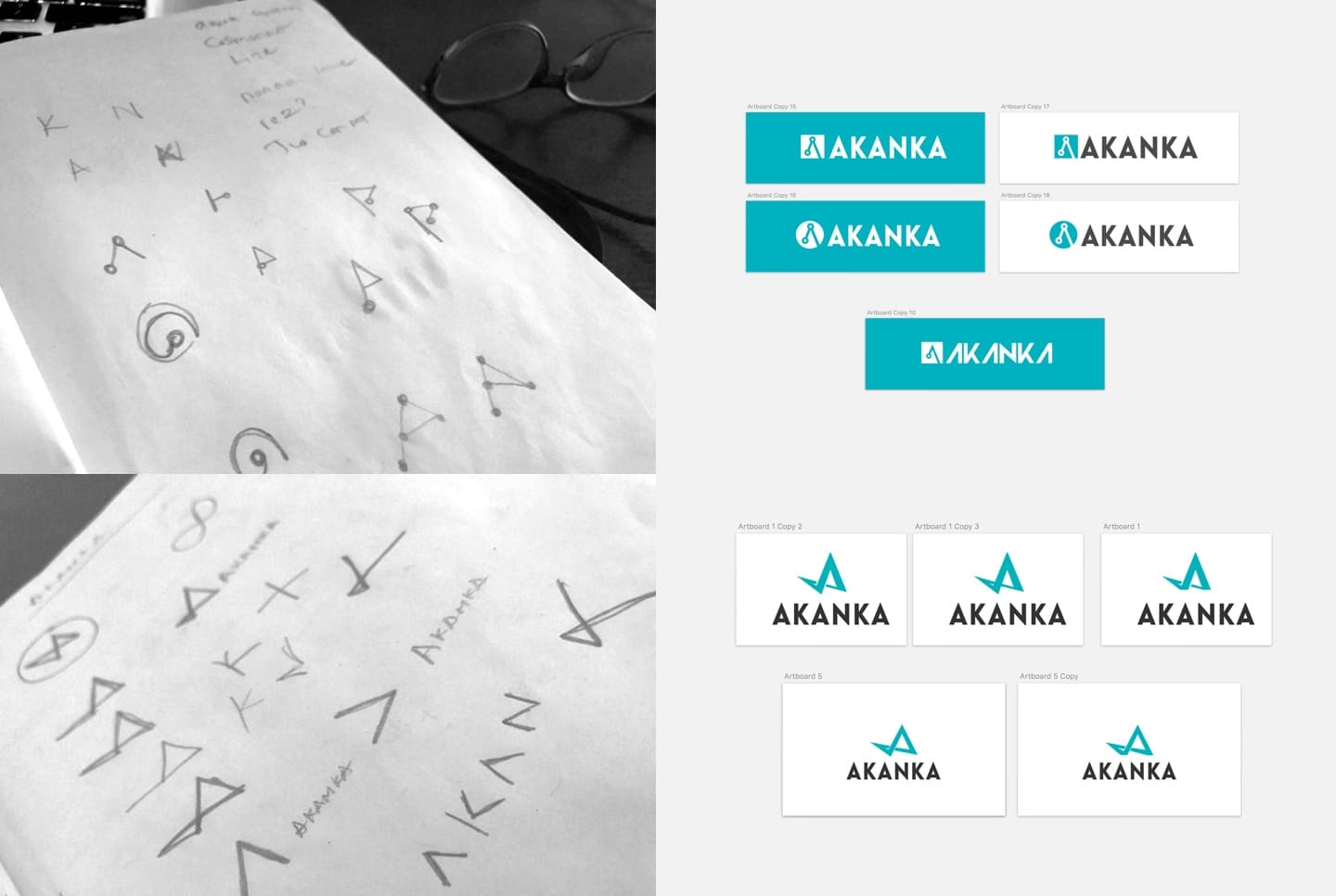
Going into Akanka 2.0. The goal was to create a more dynamic mark, something that had a feeling of motion to it. We experimented around various concepts, from the use of a vector point (dropped that as while it served as a cool concept, it would have been esoteric and its reference only understood by designers) to rocket A about to lift off. After more introspection and reflection on our identity, outlook, vision, and goal, we arrived at a mark that perfectly captured us.
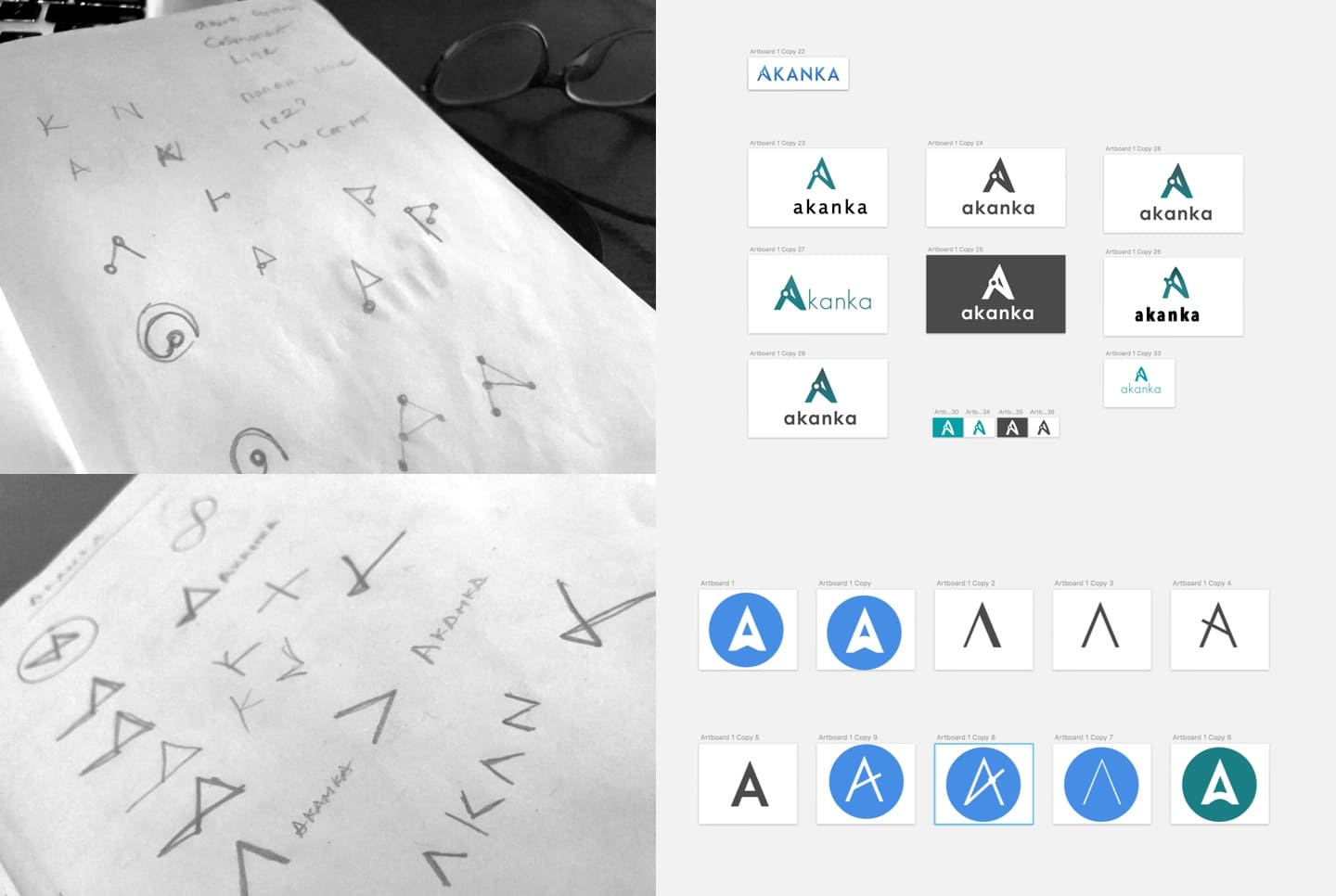
Mark
The result was a dynamic mark that represented our vision to be a minimalist, dynamic, and spontaneously creative design consultancy.
It featured primary and secondary inspirations. Its primary inspiration was gotten by merging the abstract form of every letter of Akanka into a single mark. It also takes inspiration from the infinity symbol, representing how we rapidly and consistently improve as we infinitely refine our creativity and our processes. It also depicts the letter A casting a big, bold and clear shadow which represents the impact Akanka aims to have.
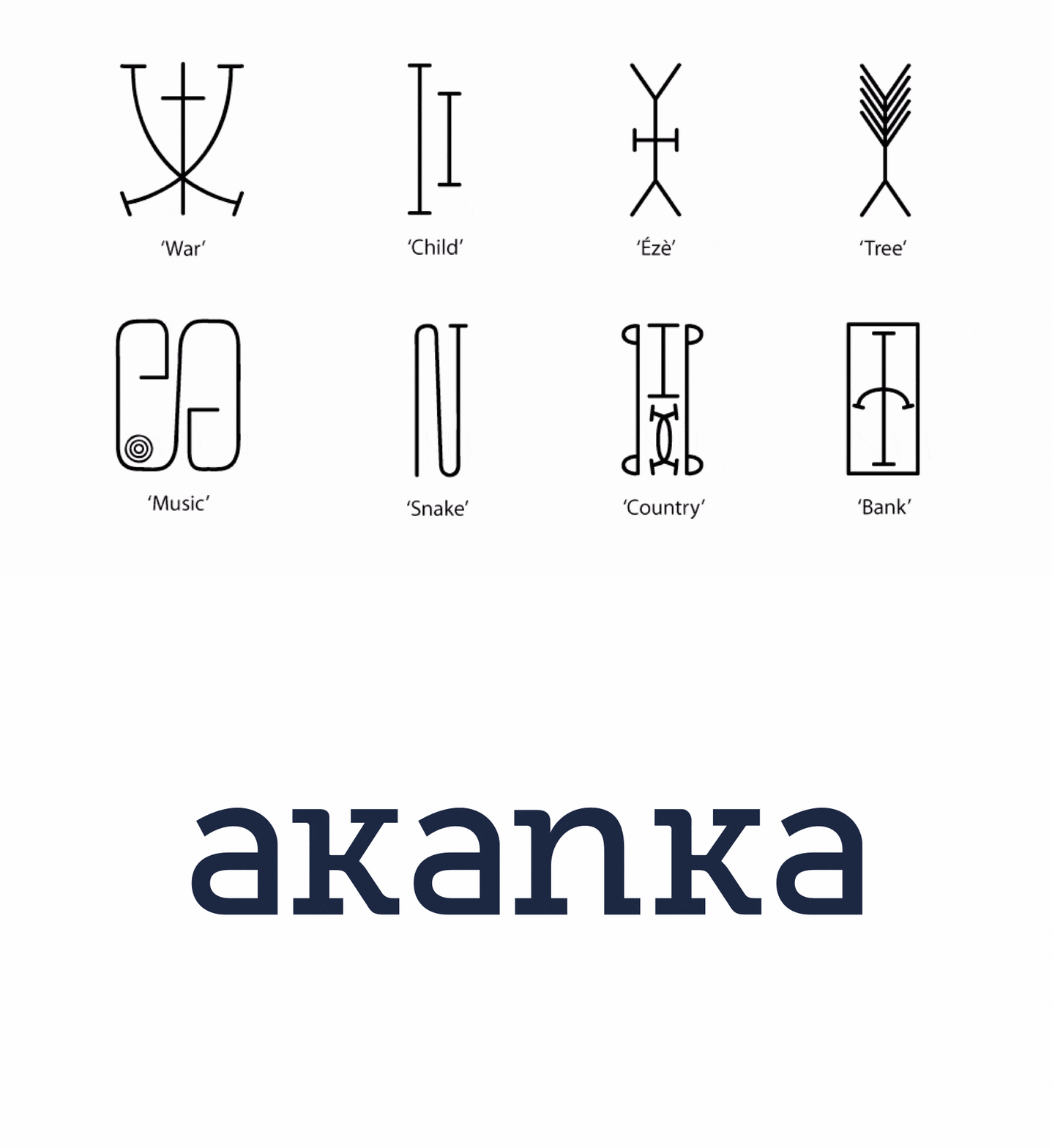
The other primary inspiration comes from our name, Akanka, which means ‘style’ in Igbo, a language spoken in southeastern Nigeria. We took inspiration from it though Nsibidi, a system of symbols that is an ideographic script and that includes logographic elements. Nsibidi is indigenous to what is now southeastern Nigeria, the same region the inspiration for our name, Akanka, comes from.
The mixture of these inspirations gives rise to a dynamic mark that sets the tone for our entire identity.
Applications
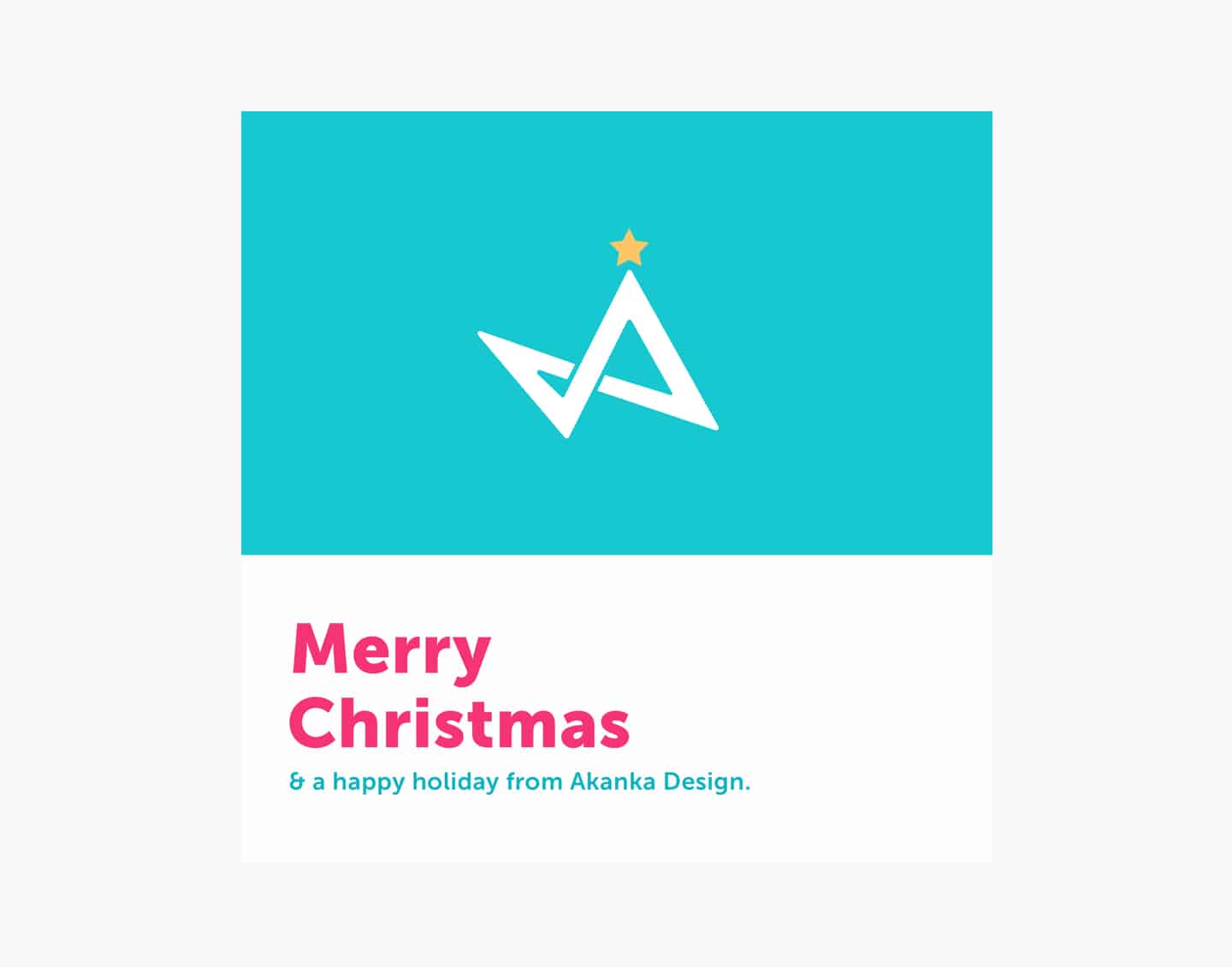
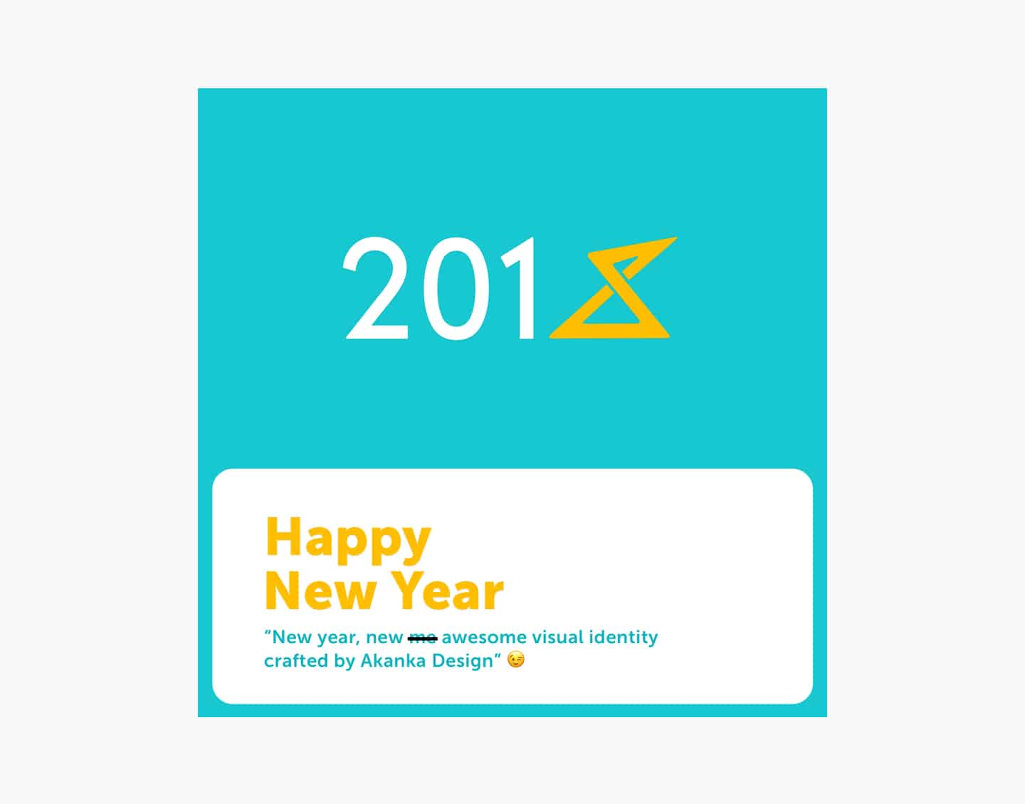
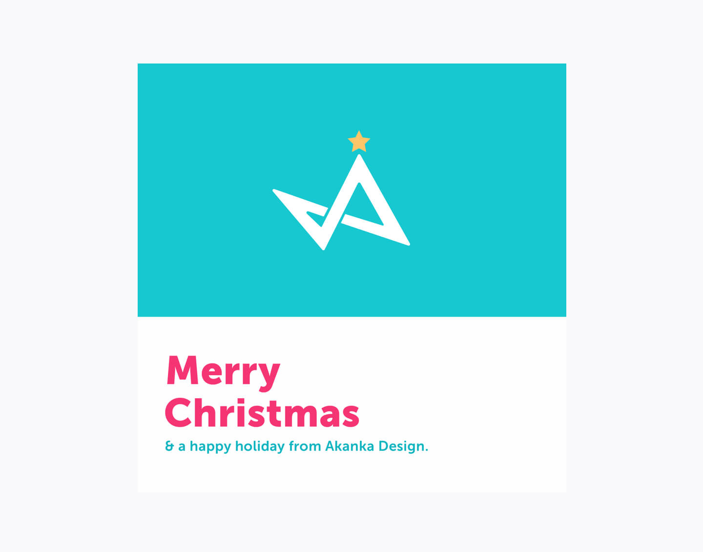
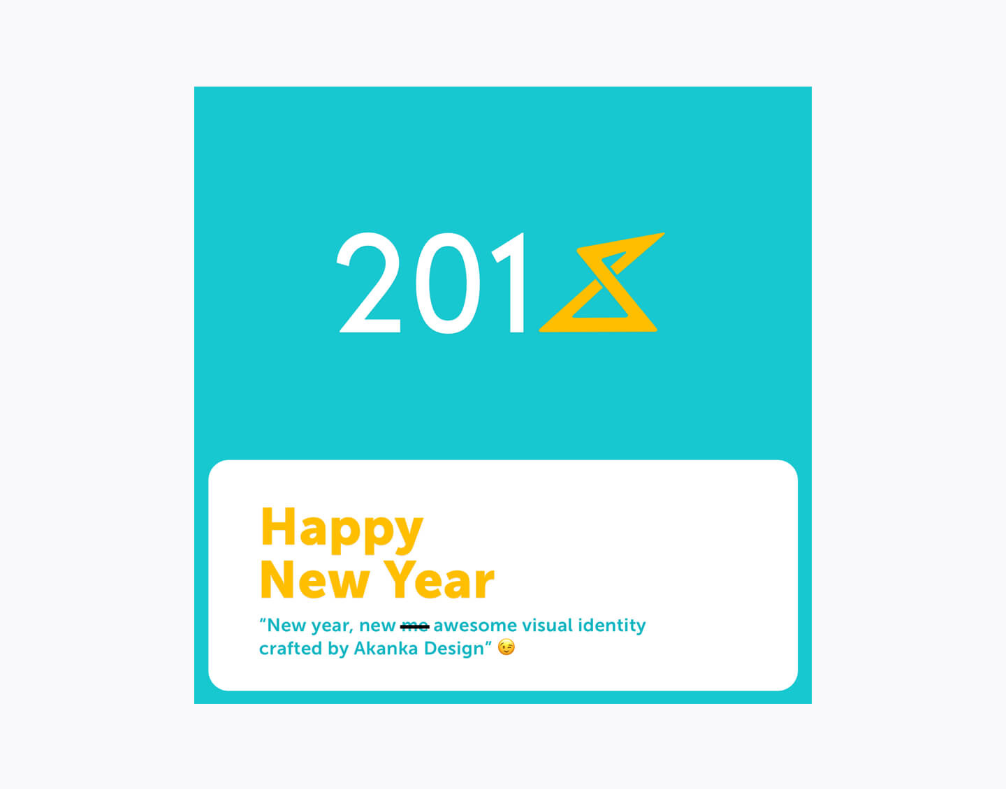
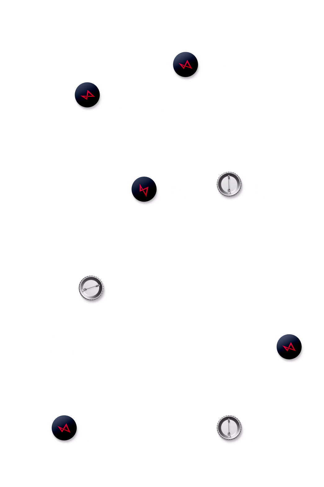
Our Akanka logo mark’s dynamism is shown in its ability to be used in depicting multiple messages crafted for differing context. It has been used in an abstract manner as a Christmas tree with the star at the top of the tree. It is also used in the 2018 new year greetings to depict an 8. More applications are to be showcased in the future.
Logotype
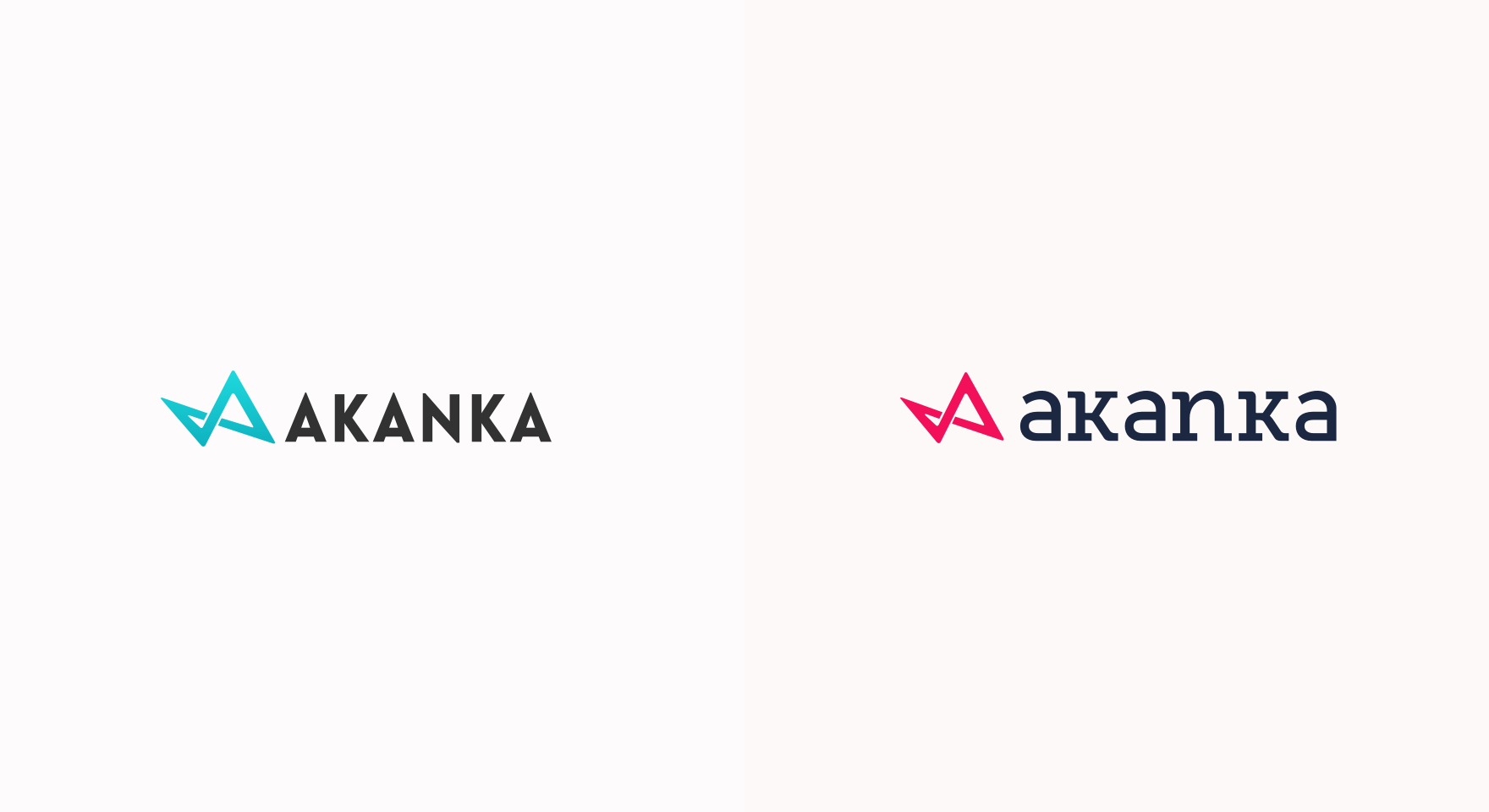
The old typeface, lovelo, wasn’t too shabby. It was a geometric typeface with an even thick stroke, it aligned with the mark, but also lacked contrast beside it, which made the logo feel too aggressive with so many pointed, sharp and aggressive edges. It resonated with the mark in terms of style, but in this case, the complement was producing an unintended result – it felt aggressive and unfriendly. This strayed visually from one of our goals, which was to remain dynamic while keeping a balanced, open and friendly, yet professional relationship with our clients.
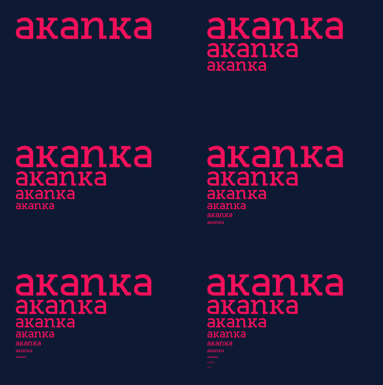
The change in logotype was a big update to our identity as it allowed us achieve what was missing from the old one and much more. We achieved this with the new logotype by combining a serif and a sans-serif i.e. Museo sans and Museo slab, for the purpose of character variation. We most importantly customized them in a manner that blends and contrasts at the same time. At first glance, you probably wouldn’t notice the A is a sans-serif and not a slab. This was inspired by our mark, which exists as a line in different planes, with a diagonal shift and a dynamic feel. This quality gets extended to the entire frame work of our identity, with our logotype serving as its first missionary.
Museo sans features a customized double storey sans-serif “a”, with the counter adjusted to give a clean geometric feel that aids uniformity while also striking an appealing and energetic contrast to the slab typeface. We adjusted the ascenders of the K down to the X-height, this keeps all the characters at even height allowing for a balanced and compact feel. These decisions, along with the adequate tracking allows for a logotype that renders appropriately in large and small sizes formats. Most importantly, it has a welcoming vibe that says “We are friendly, sturdy, consistent, kinda academic and very much eclectic.”


Typography
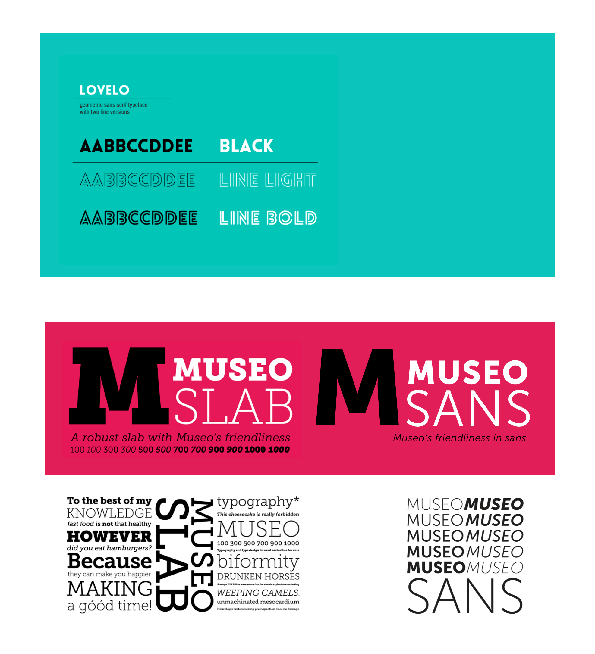
For Akanka 1.0 and 2.0 typeface, Lovelo was our chosen typeface. It wasn’t a great typeface as it only had three styles, two of which were decorative, hence not useful to us.
After a lengthy deliberation about what typeface would serve us in our new journey with Akanka 3.0, we realized it had always been on the journey with us. It was Museo, the primary typeface for our Akanka 2.0 website.
Using Museo, we realized it was pretty awesome. It was a super typeface that came in both serif and sans-serif styles. This makes it great for font pairing as well as establishing hierarchy.
Museo Slab is a robust slab serif that adequately contrasts Museo sans, making them truly perfect for each other. Museo slab keeps the stability with its heavy details that bring mass and impact, giving it a presence that allows it to communicate efficiently on screen. This allows us to create hierarchy as it serves at larger sizes as our headings.
Museo sans, as with Museo slab is a sturdy and low contrast typeface. It is a geometric and highly legible sans-serif typeface that is very suitable for any display and text use. We love it for its clean airy look and also for its open aperture that allows us to avoid situations where parts of letters blur together at smaller sizes. These features allow it adequately serve as our sub-header and body type.
Color
The other biggest change to our identity, our color, was necessary. Our old color, turquoise, had become frequently used by other companies. But not only it had become a crowded space with turquoise, we observed it wasn’t adequate for our new identity.
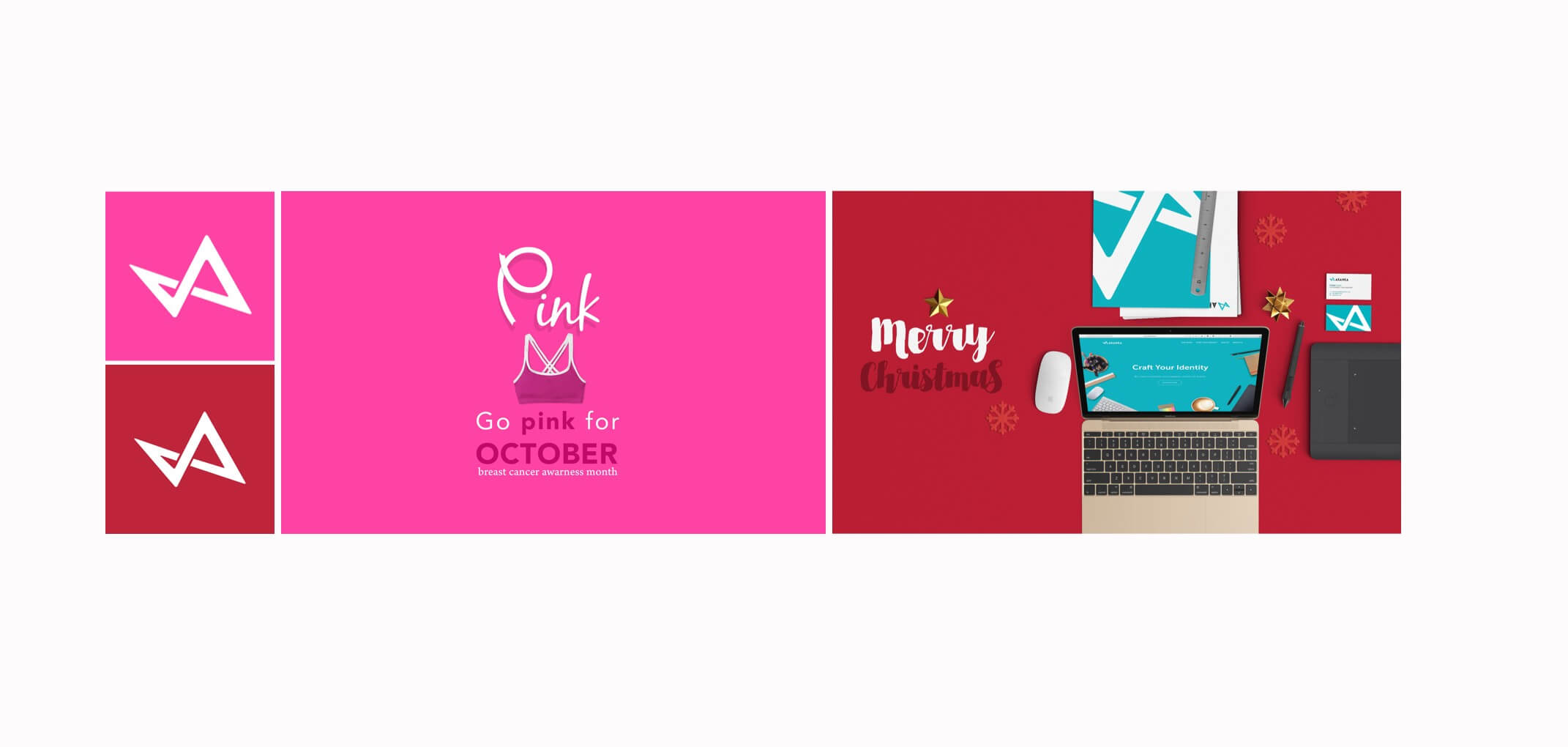
In the past, we changed our color on our social media pages to match holidays and for social causes. In doing this, we had used two bright colors, Pink during the Breast cancer awareness month, and Christmas red for the Christmas season. Our first impression on switching to these colors was how much they brought out the motion and energy in our new mark. While things had felt static and cold with turquoise, it was the opposite with these two bright warm colors we used. These colors resonated with our dynamic and carefree nature which made it inevitable that we transition to something within their range.
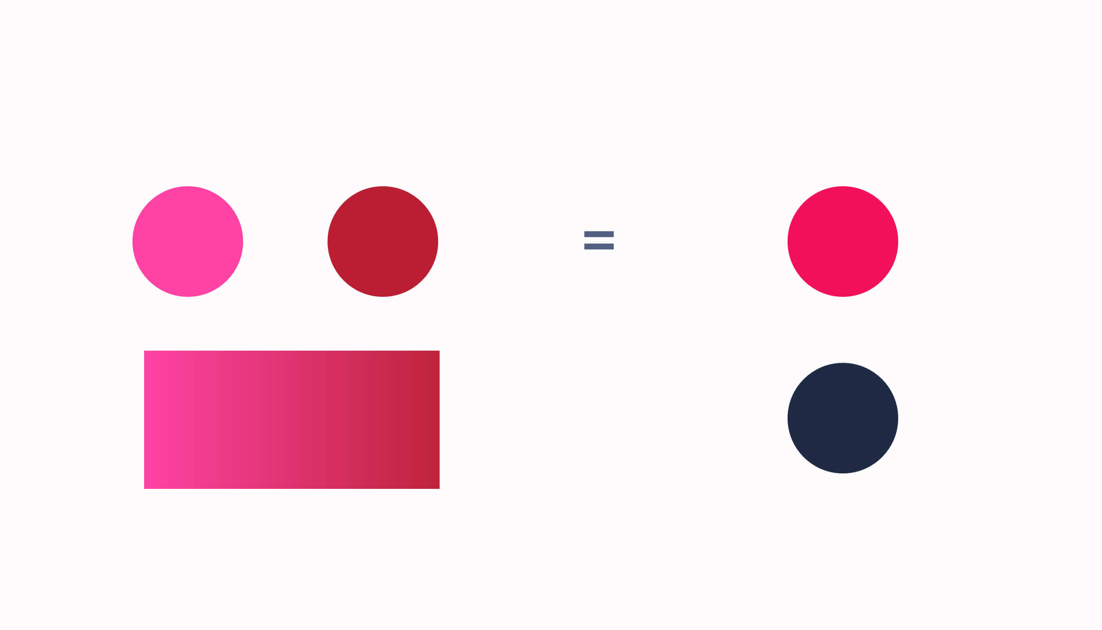
We chose a color from the midpoint of the gradient between both colors. With some additional adjustment in tone, we arrived at the color that became the perfect Akanka color, we call this ‘Anunu’.
We also chose to work with a rectangular color scheme. This color scheme uses four colors arranged into two complementary pairs. The benefit of this is it offers plenty of possibilities for variation. However, for now, we’ll only be working with the complementary color for Raspberry, which makes for a perfect reciprocal color as it contrasts perfectly with it. This contrast allows us to assign it as the dominant background color, helping to accentuate raspberry. We call this color ‘Uhie ocha’. And yes — the names we assigned our colors also take direct inspiration from the cultural origin our name Akanka was derived from.

Patterns
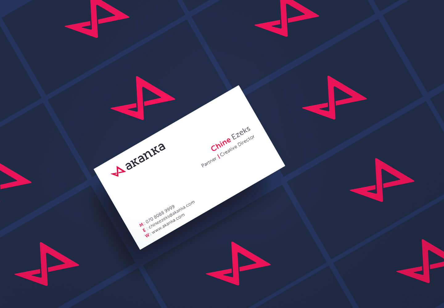
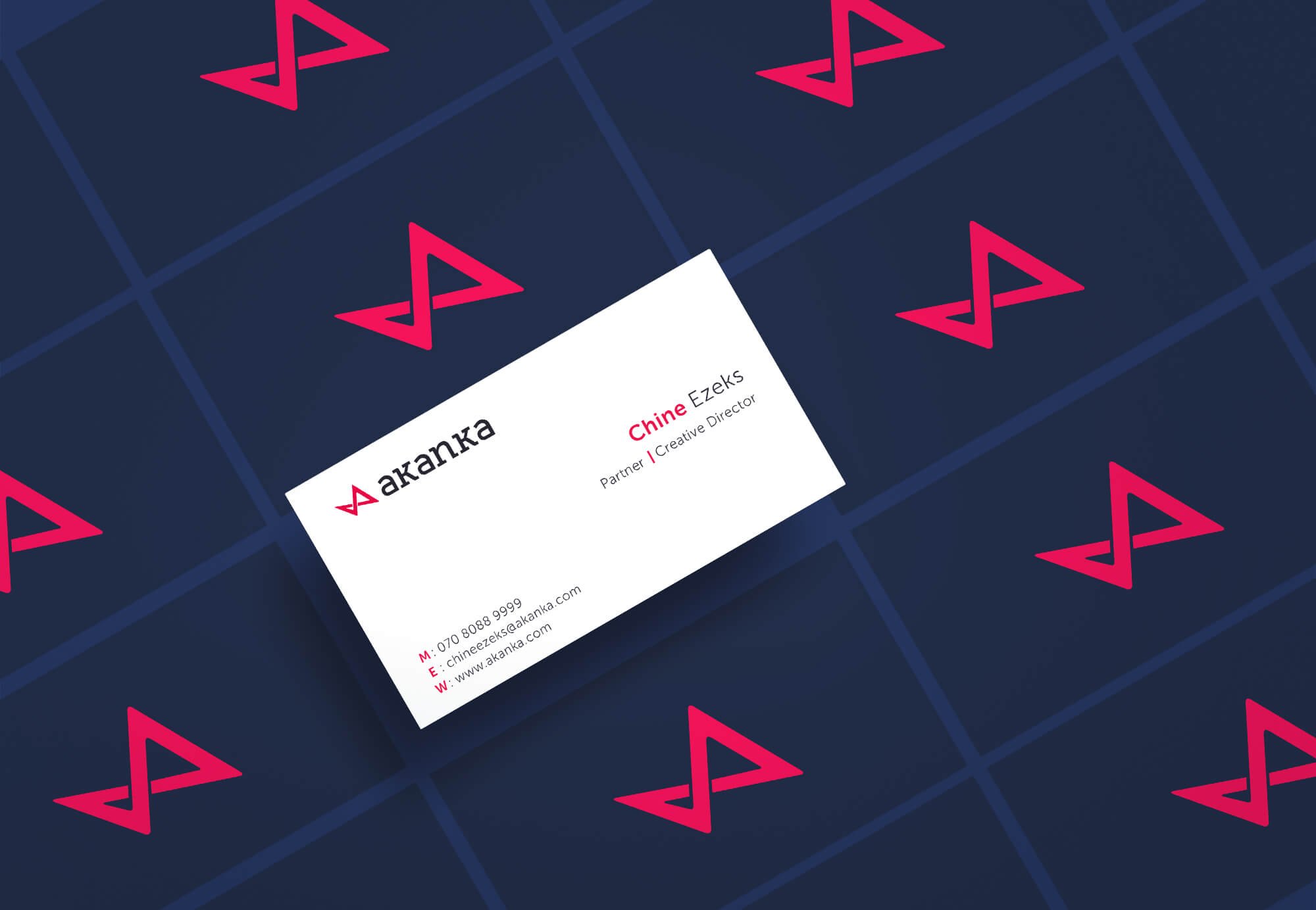
Patterns are a great way to add texture to an identity. As with every other element in the identity, our pattern follows our mark in its dynamic nature. We took the logo mark and blended it in its own stroke. This gives us unpredictable patterns that not only serves to liven up our layout but can also be used as windows to display graphical content in a manner that resonates with our identity.
Iconography
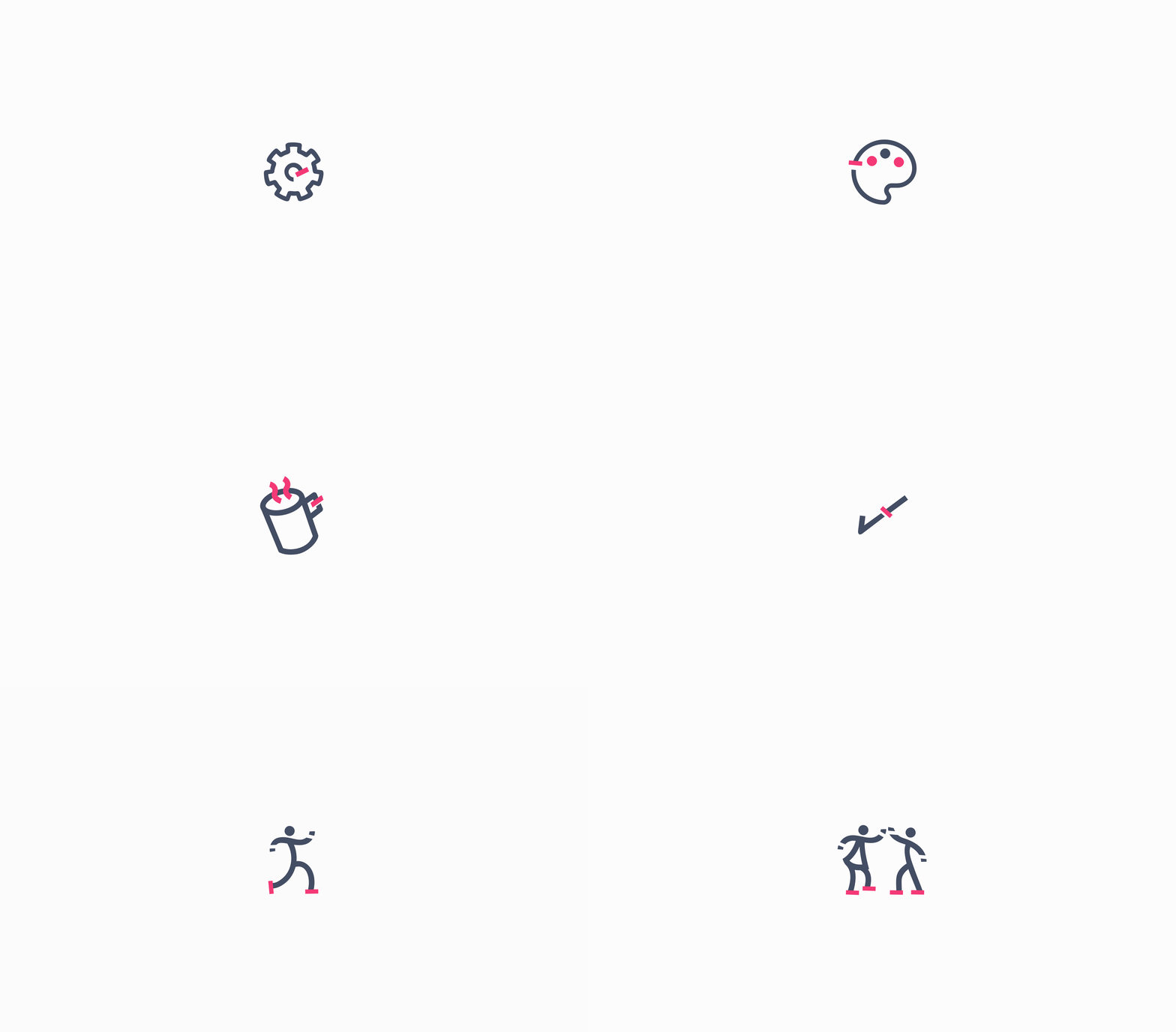
Icons are a great way to communicate information in a concise manner and we have an ever-expanding bunch that will be utilized across our marketing materials.
Our icons are entirely inspired by our logo, which is inspired by the Nsibidi symbols. It features the serifs rendered in our color, Anunu while the majority of the stroke is rendered in Uhie ocha. They are also simple and geometric designs that are designed for simplicity and also optimal rendering across all our collaterals.
Voice
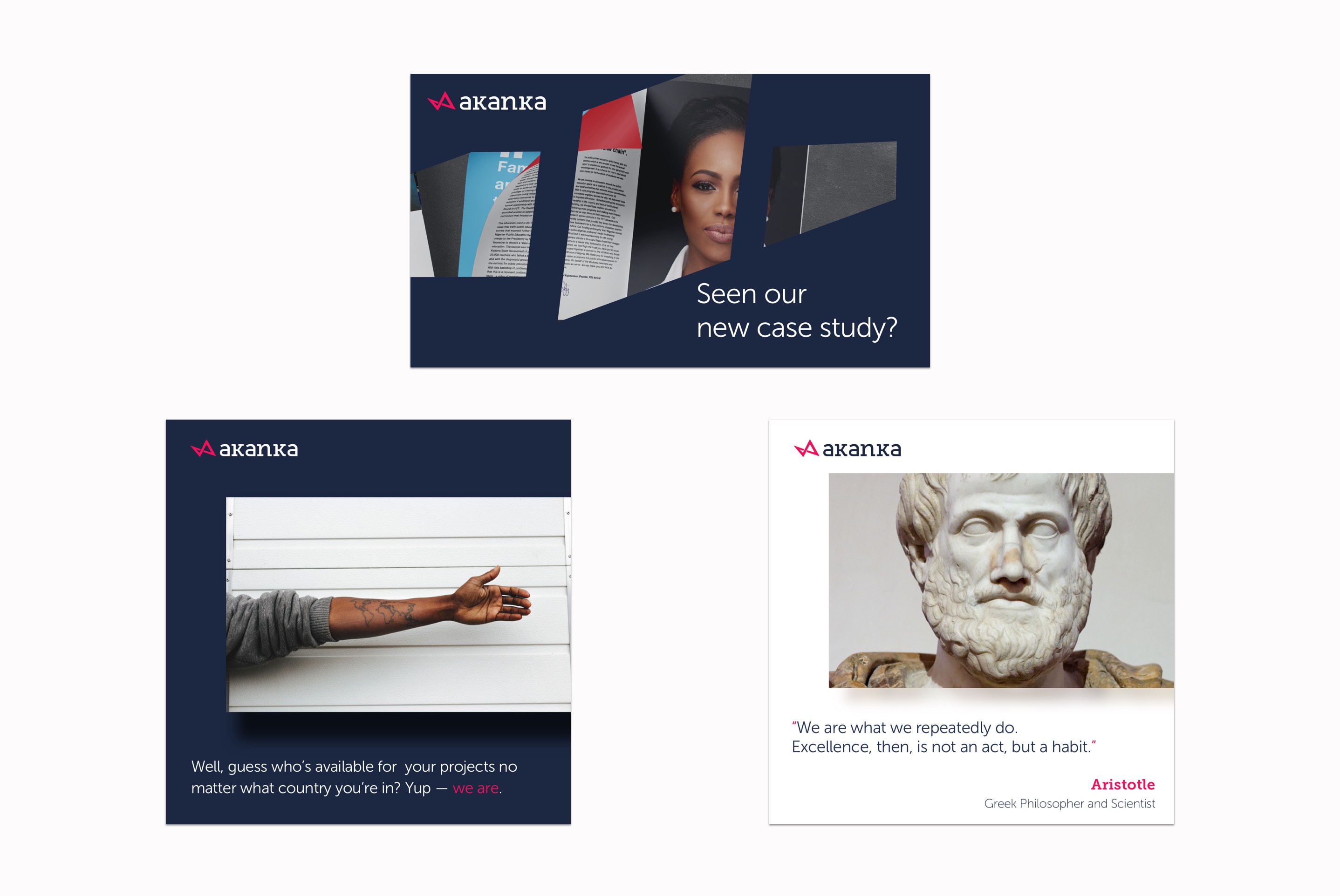
Our voice is crafted from values we treasure and exude as a business; intelligence, creativity and friendliness, and also from a deep consideration of our organization, audience, and our service.
We don’t do formal speak, we use smileys — a lot…. 🙂 and we don’t avoid using esoteric terms because we believe that’s the only way it can stop being esoteric. We project the attitude of the kind of clients we want and love to work with – and just like our identity, we are lively and pleasantly unconventional.
Layout
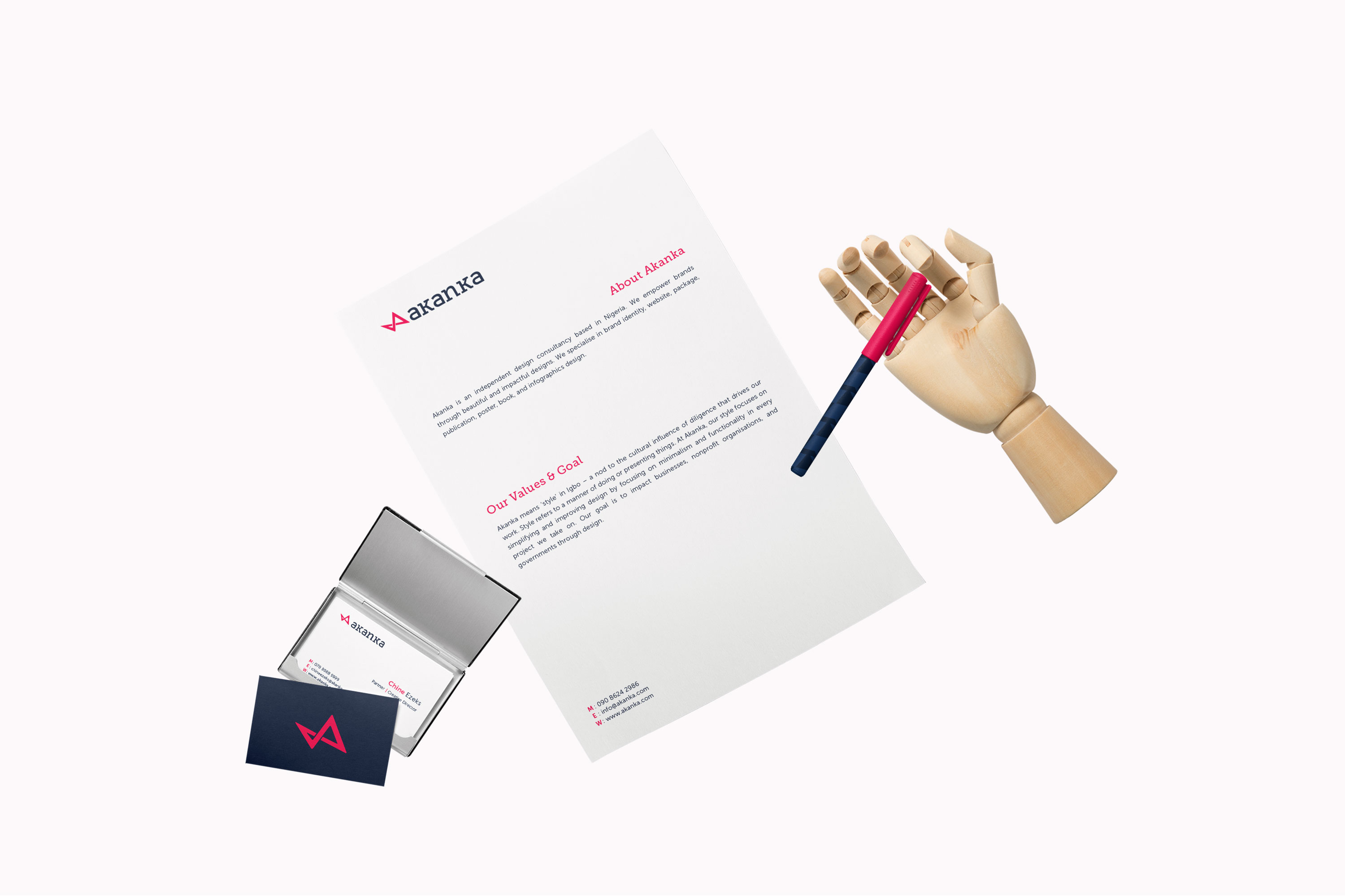
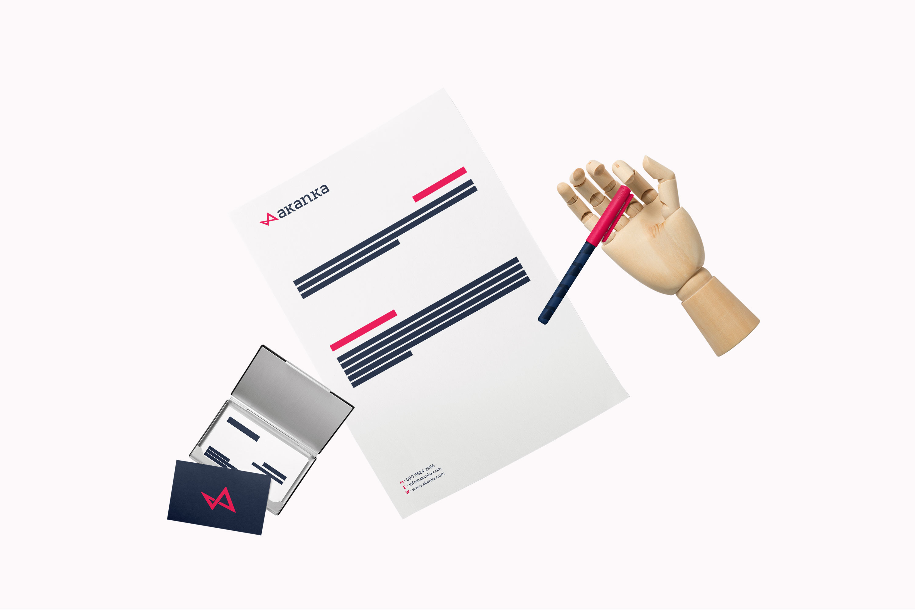
There’s a zigzag arrangement to things you can’t help but notice. It’s a core part of our identity that takes direct inspiration from our logo mark which is pretty dynamic, with lines that go in a left to right and back manner. It’s pretty much a Z-layout on crack. In a nutshell, it allows us to increase visual prominence by placing information in spots where the eye would naturally fall. It most importantly, like the rest of our identity, feels dynamic. We’ll talk more about this in our subsequent post on the changes in our web identity 🙂
We make use of oblique lines using to convey the sense of movement seen in our logo mark. By arranging elements in this alternating angular manner, it gives a sense of dynamism and contrast (which are overarching and repeated elements central to our entire visual identity and can be seen from our color choice to the use of serif and san-serif font in our logomark). These lines also allow us break the overall information into digestible pieces by accentuating the different blocks of information. This also helps with establishing hierarchy and aids visually by placing information in spots where the eye would naturally fall.
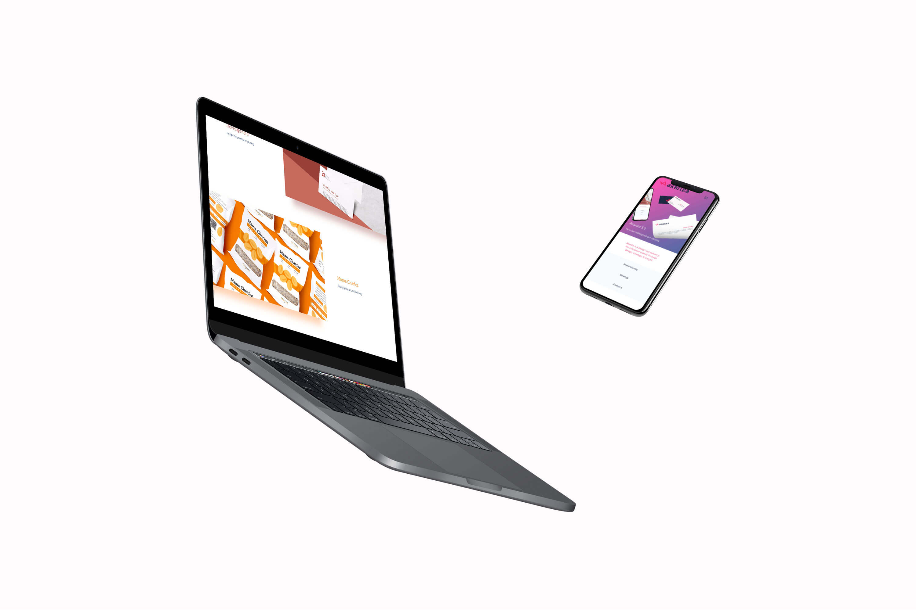
Web
From the home page to the portfolio view, we’ve incorporated a lot of changes into the new website that makes it radically different from our 2.0 website. The goal was to make things feel lighter, introduce an ample deal of motion, and retain our candy colorful feel as a way of differentiating ourselves.
Most importantly there’s a lot more content — a lotttt more. This, as well as our logo identity, determined a lot of the direction we took with our web redesign. We’ll be putting up a more expansive case study on the web design soon.
More Case Studies