
Mama Charles
Brief
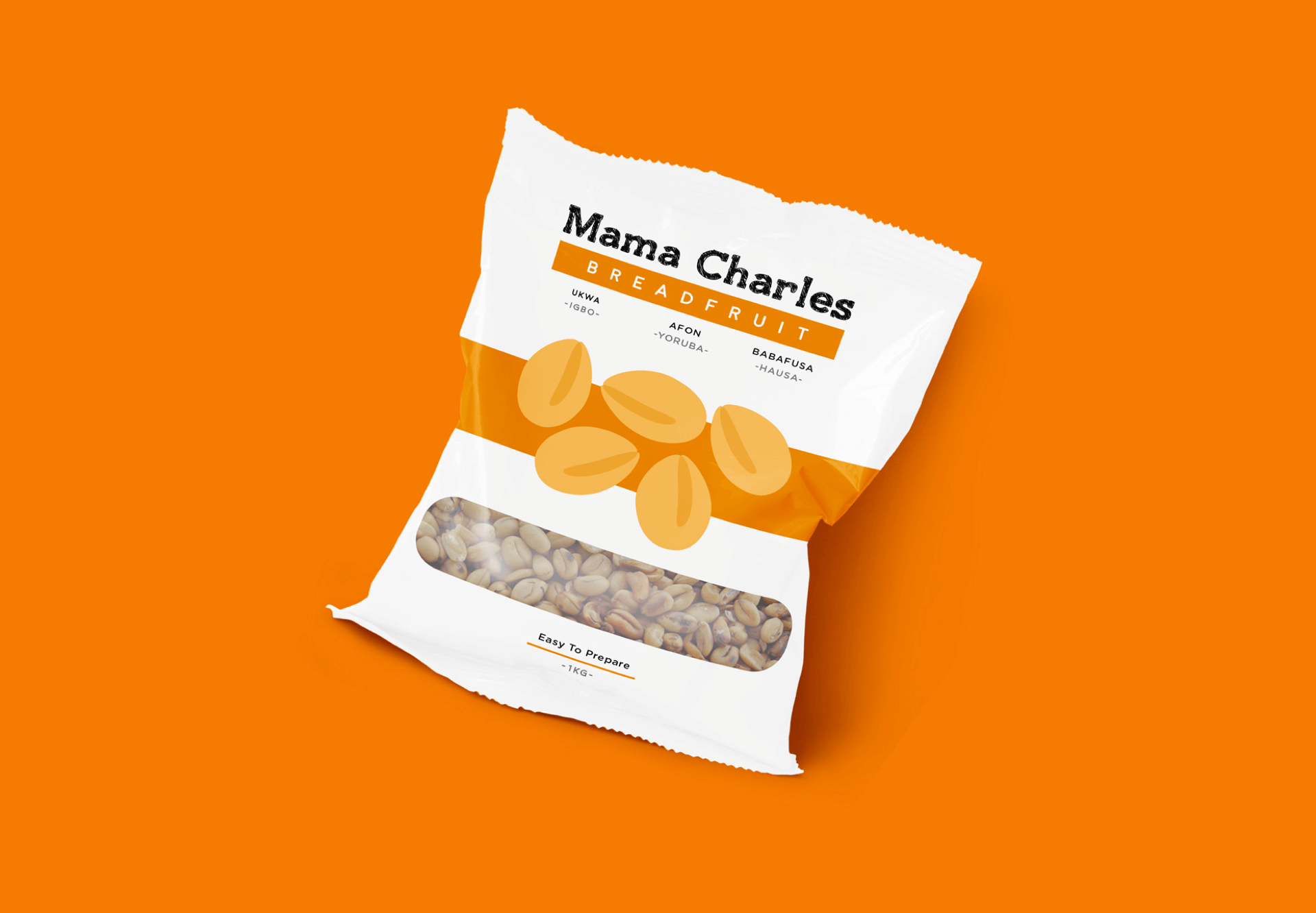
We were commissioned by Mama Charles, a food production company started in 2015 to create a package design for breadfruit seed, a product no one has ever adequately package designed for. The goal was to create an appealing design that effectively made use of typography and illustrations to present a native delicacy that has never been appropriately designed for in a beautiful manner.
Client
Mama Charles
Sector
Food
Office
Lagos
Discipline
Brand Identity
Package Design
Inspiration
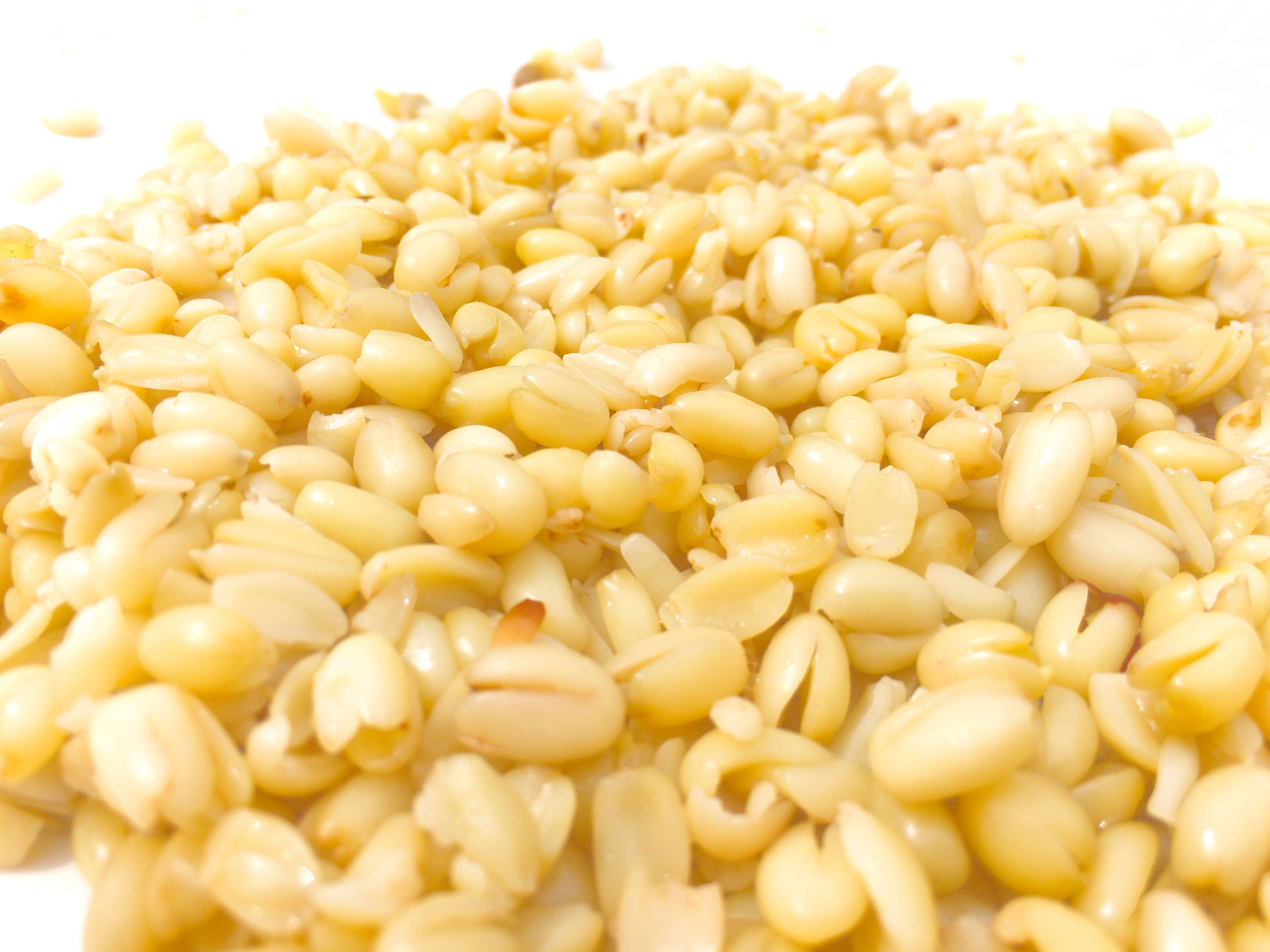
It was important to us that the identity of this package took its influence from the breadfruit seeds. These seeds are derived from the African breadfruit tree, also known as Treculia africana. It bears big round fruits that contain numerous seeds which possess high nutrition value. These seeds and the various forms they are consumed in are the inspiration for this package design.

Typography
We needed a typeface that was present in different styles, austere in form, yet bold enough to compliment the white space and minimalist illustrations used in the package. Gotham rounded was our typeface that met these conditions. With its rounded terminals, this geometric san-serif bears a similarity to the curves of the seeds while giving a soft feeling of ease of preparation and consumption of the packaged seeds.
It also contrasts well against the Mama Charles logo, which is a textured slab serif.
Accesibility
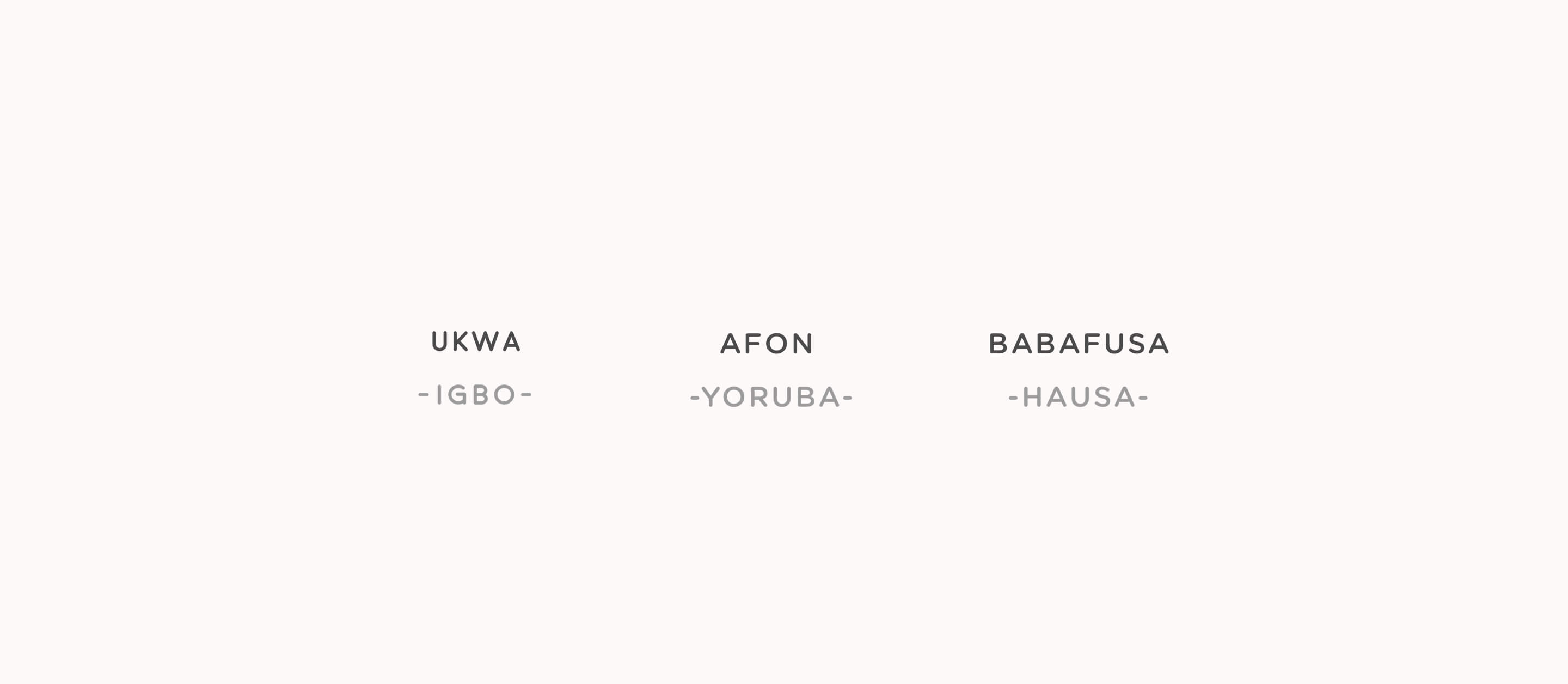
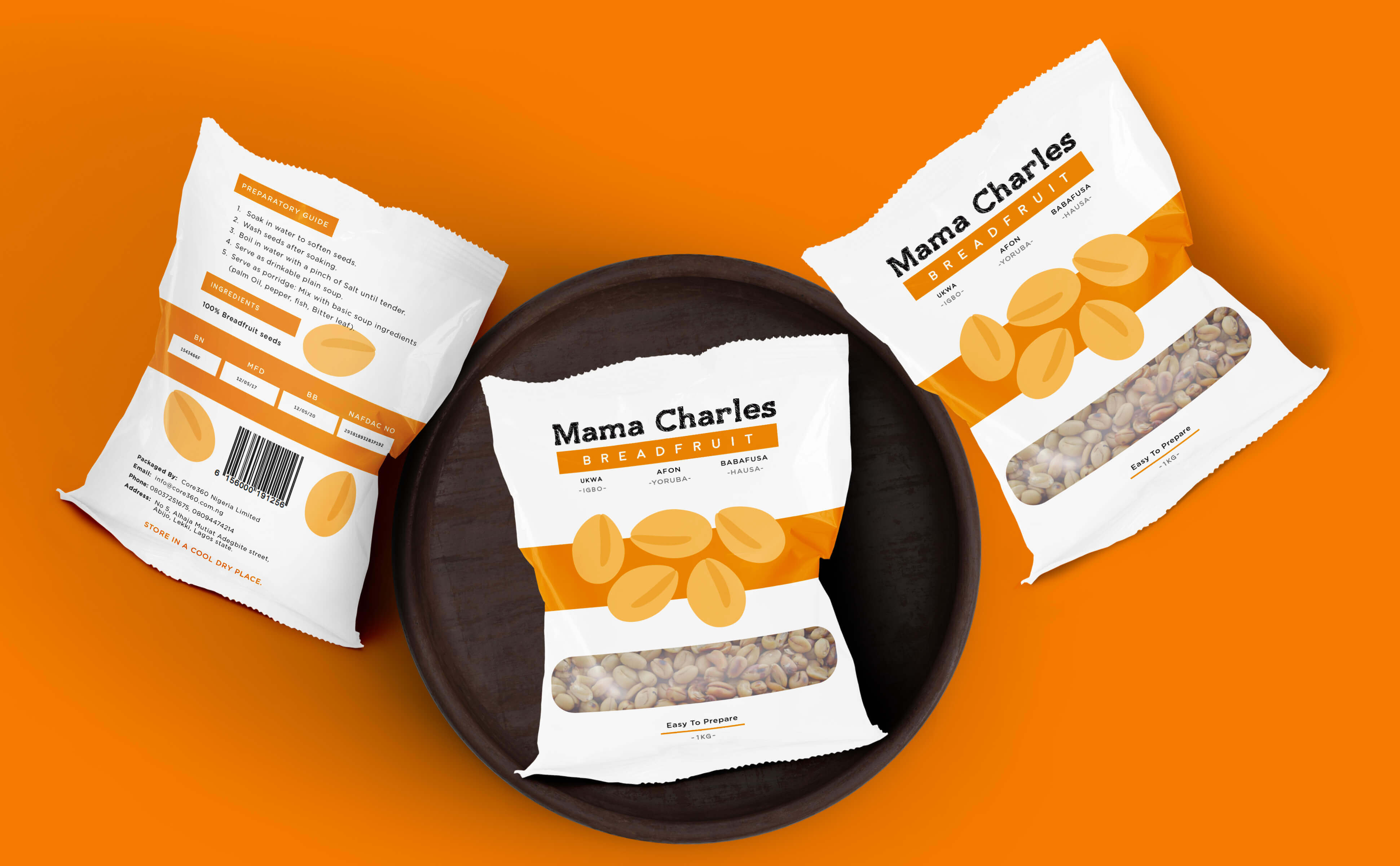
Although the English name is breadfruit, that isn’t the native name — of which they are quite a number. It’s known as Ize in Benin, Sobo in Ijaw, ediang in Ijaw, babafusa in Hausa, Afon in Yoruba and most famously as ukwa by the Igbo people.
Given all these native names, we chose to render the three most popular ones, allowing buyers who might not be accustomed to the English name recognize the product by its native name. This makes the design accessible and also befitting of the geographical market in which it is sold.




Illustration
This is the focal point of the design and is buttressed by the bar that acts as the background support for the illustrated breadfruit seeds. We created a vector style illustration, choosing to strip away excessive details by rendering the illustration in 3 tones of orange. This allows the colors work great together and most importantly reduces printing cost and the possibility of print error. The colors are vivid and also surrounded with adequate white space that allows the illustrations stand out.
Color
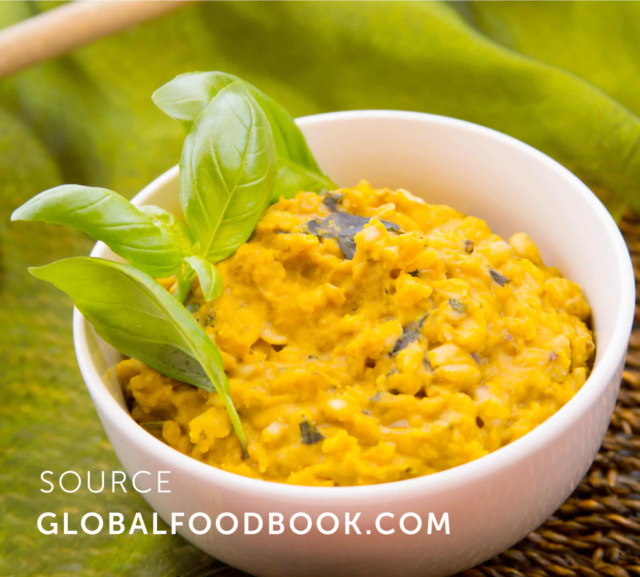
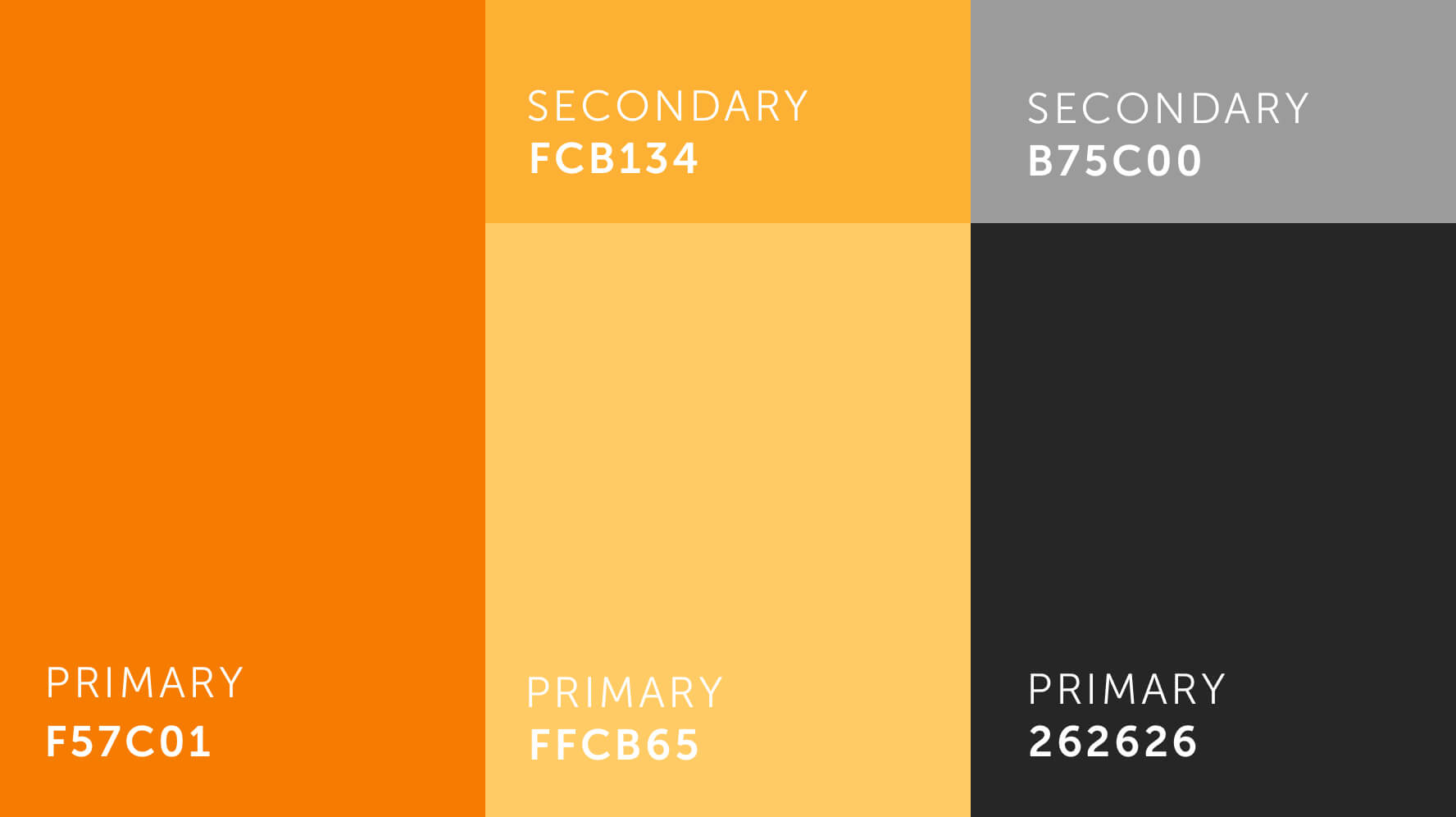
Color plays an integral role in the package as it makes up for the most vivid element — the illustration, in the package. The inspiration for the color comes from the color of the raw breadfruit seeds as well as the color of the breadfruit seeds after it has been prepared using Palm oil as an condiment. The color palette is chosen to be vibrant with great contrast aided by the white space.
We applied color psychology as well, choosing a hue that expressed warmth and energy. These expressions correspond to the nutritious and health benefits associated with breadfruit seed, enabling buyers instinctively know what to expect.
Aperture
We created a clear aperture, allowing buyers connect to the actual product they are buying and so they could ascertain the quality of the seeds at a glance.
The combination of all these features is a product that meets the goal of the brief which was to present a native delicacy that has never been appropriately designed for in a beautiful manner that would prove appealing to consumers of breadfruit seed and also convincing to those new to it 🙂

More Case Studies

Akanka 3.0
Welcome to our latest version